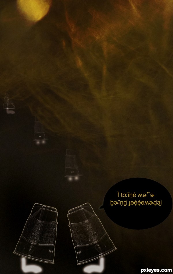
Is this what happens to the discarded cups? (5 years and 3052 days ago)
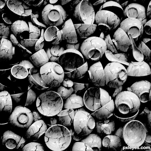
(5 years and 3276 days ago)
Very realistic...GL author! 
Thanks! 
Well done!
no doubt it's a texture map that did the trick... I like it 
Thanks lbadge and aheman! 
Thanks for the suggestion. I broke up most of the lines with the cloning. it looks better now 
nice effect you hvae here! Very appealing 
Very well done ... A thought for future enties ... you may get a better score if you can include a step-by-step (SBS) description of your work process ... just take screen prints as you go along, then post them with a brief description ... that'll do the trick . 
congrats
Congrats!
Howdie stranger!
If you want to rate this picture or participate in this contest, just:
LOGIN HERE or REGISTER FOR FREE
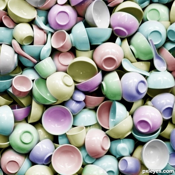
(5 years and 3279 days ago)
nice colorising.... brings live to the monotone 
This is very nice...wonderful colorization. The pastels work well with this image. Well done author...
Good job, clean and very creative!
Agree. great job and technique!
Here is a piece of art that can easily be underappreciated. This was a pain in the neck, eh, author? Your patience paid off - you did a great job with it!
thanks very much to aheman, itsmymoment, MossyB, lbadge320 & elemare like it!
Wonderful work, and nice palette you chose, GL!
.... I am looking at this piece and still liking it... can't explain 
Huge amount of work ... masking until you were almost blind, no doubt ...not sure if that is how you did it but however it is a great, if subtle, result!
Howdie stranger!
If you want to rate this picture or participate in this contest, just:
LOGIN HERE or REGISTER FOR FREE
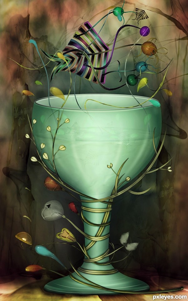
Source image, Photoshop and Illlustrator for the fish shape (5 years and 3474 days ago)
wow!!! Great job on this! I love it 
Yes, I was thinking on this chop, if there's anyone who can do anything with this source, it's you author.  Well done! Nice work as always! GL!
Awesome work, no idea who could have done this. lol.
is very flat with sharp edges, if you consider 2, 3 tones on your shapes and painting I thing that blow!
So very creative - always!!
Simply amazing ... an incredible work of art. I just keep looking and looking at this and still can't believe how lovely it is. What a wonderful mind you have!
You know you could give other people a chance for crisco's sake... I mean you don't have to be so fabulous all the time... (smooches my darling... you amaze my heart)
love it
Just amazing...as usual.... very nice work!
great work 
great job. good luck
Ditto that, Arca, and LOL, Drivenslush!
Gorgeous work as usual, author. Love how you incorporate the elements from illustrator.
wonderful !
Many thanks to all for the nice comments and support! 


Congrats for another first place in your collection, Cornelia!
Contrats, Cornelia. Terrific work as always.
Congrats on first place - lovely work!
congrats and another work of the master.
congrats !!
Thank God this won... my bet... congrats...
congrats Cornelia!!!!!!!!!!!!!!!!!!!! 
Congratulations on a stunning entry and wonderful work. It is inspiring to see your work!
Howdie stranger!
If you want to rate this picture or participate in this contest, just:
LOGIN HERE or REGISTER FOR FREE
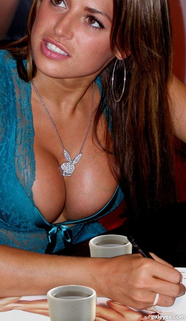
http://www.everystockphoto.com/photo.php?imageId=4312301 (5 years and 3713 days ago)
haha i was thinking along those lines but you beat me too it 
i think to make it better you could change the light sources on the cups...
Still looking for the source....... OH there it is!  Was a little distracted. I'm just glad she not pooping in them
But seriously, the cups are still showing the same brighter light source than the busty gal you chopped them into. Try adjusting the contrast levels on the cups layer or even dodge and burn. It would look more realistic. But hey, props to keeping me distracted 
hey.. where is the source image..? this should be off theme isn't it.. I swear I looked everywhere in the entry for source image..  btw jawshs is right.. take care of that..
I see I was not the only one distracted :P
I want to comment but that means scrolling away from the picture!
they look like collage... the luminosity and the contrasts are totally opposite. and being a free photoshop editing, i won't say the main subject of the creation is the center of attention, but i think it should be. Good luck
Two cups? Which cups? G cups? 
Sorry... Japanese tea cups are a bit small (or the boobs are a "bit" big...) and the backward one must be a slightly darker for shadows... 
thanks for the comments everyone, very helpful but seriously, who's looking that far down in the picture...i mean, come on now......
yea author.. nice picture..  and well said barracuda and erikuri..

Imagine whole set of cups...then no one could find source image parts...Good luck author,great cups,mistake idea,idea...lol
gud luck
luckily, being a female, and not breast obsessed, i can look past the image used for this one and see two chopped cups plopped down on a picture. There is so much more that could have been done with this idea. i get what you were attempting and all, but really, just because there is a pair of breasts in there, doesn't mean that its a decent chop.
work more on the execution of it. add dimension to those cups, shadowing to give them more "believable" standings in that picture. she is signing autographs, she'd have knocked over those tiny cups with her arm..or the obnoxious fake ta-tas.
don't know about all that but nice pair Author 

giggle! look at the varicose veins on the breast! she needs some "touch" up... hehe. and i firmly agree with jadedink, you just plopped the cups in. you guys really like that? hm...
not realy, just thought it'd be funny...
i dont know about vericose.
Howdie stranger!
If you want to rate this picture or participate in this contest, just:
LOGIN HERE or REGISTER FOR FREE
Howdie stranger!
If you want to rate this picture or participate in this contest, just:
LOGIN HERE or REGISTER FOR FREE