no sources to add (5 years and 3852 days ago)
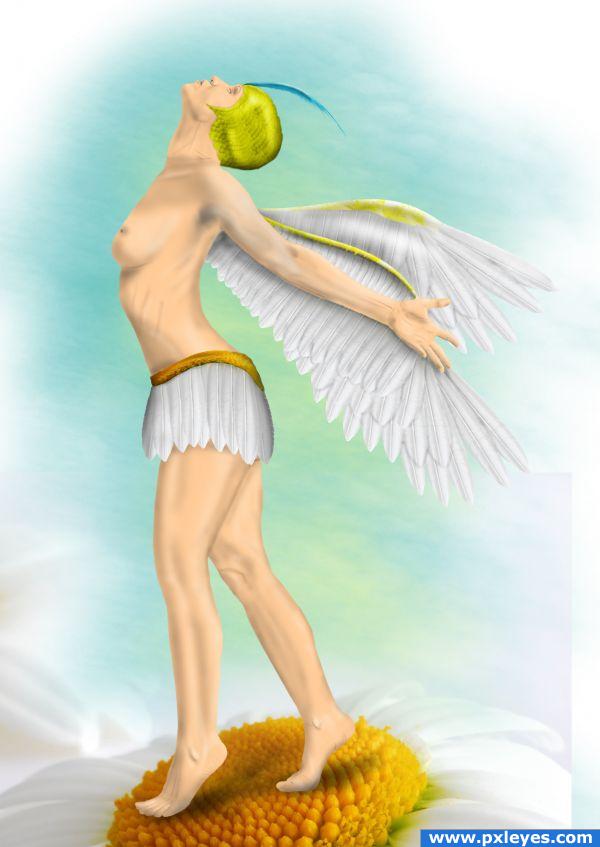
credit to mjranumstock from DA for the amazing reference image.....
(please have your "adult content" set to on in DA to view the reference image) (5 years and 3867 days ago)
I like the feel of this a lot! There is a green outline above arm and a white outline around hand/fingers. Fix that and this is... !! Love the color and composition of this.
EDIT: 
very nicely done.superb job and nice theme
good work
Nice image, but the wings don;t look quite rigtht, it sems like the one further away should be slightly lower. Good luck though, a very beautiful iamge.
o.o she dontlook so little to me XD
great ERTE' feel...  (and what Eladine said.. hehehe)
Beautiful!  The wings look great and I really like the blue feather. Good luck
This nipple is in the wrong place and there's a sudden change between the neck and chest which looks like her head was just stuck onto the body. Also the boob should have a very slight concave curve coming down. Fantastic job though.
Not bad there author  good drawing skills to me.
lovely! 
Howdie stranger!
If you want to rate this picture or participate in this contest, just:
LOGIN HERE or REGISTER FOR FREE
My favorite thing about this website isn't about winning contests or money, but about seeing what other people can create from another persons picture. And then get inspired by it and then create using your own imagination. (5 years and 3870 days ago)
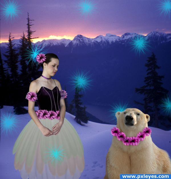
They're floating above the snow...
good point, i didnt mean to do that even though technically a dancer is supposed to "float" across the stage  . I fixed it the easy way, for now. Now I would love to figure out to to not make them float.
cute
use the transform warp to warp the flowrs so they actualy fold a bit with the neck of the bear now they look lasted on 
Howdie stranger!
If you want to rate this picture or participate in this contest, just:
LOGIN HERE or REGISTER FOR FREE
source
and my pictures (5 years and 3870 days ago)
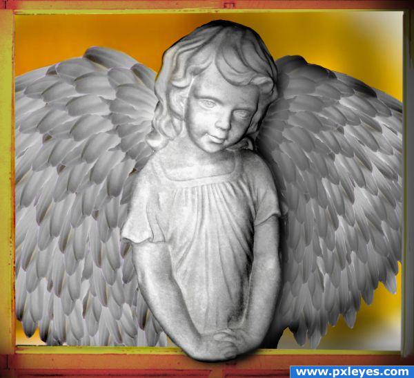
nice idea.very well done with the concept.but the image is not going nicely with the background and the frame,sharp edges when u copy pasted can be seen.
thanks nehayash..got it
Fixed the black wing..
image is beautiful ,i just dt get why u put right wing black,shadow? beautiful any way,good luck(to me shop dt have to look real for that we have photographs)
Too much burn on shadow side...
Nice idea, but i think you should brighten up the right side slightly, it's looking a tad dark. Good job on the creation of the image otherwise.
I like the angel, it's very well done, but I can't say the same for the frame and the background. I think that they don't match too much with the subject..
Howdie stranger!
If you want to rate this picture or participate in this contest, just:
LOGIN HERE or REGISTER FOR FREE
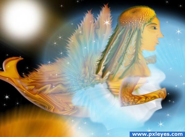
I used only the source image.
Wings and tail modified (5 years and 3872 days ago)
very interesting use of source
nice concept.if its a mermaid then mayb her tail should be little bigger and longer and its a fair u can turn those into wings or sumething else but i love this way too
I think her tail is too small.
Thanks for your comments and I modified the tail and add the wings
great work
Beautiful image and colors! 
Howdie stranger!
If you want to rate this picture or participate in this contest, just:
LOGIN HERE or REGISTER FOR FREE
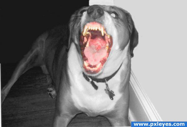
thats a good doggy !!!!!! Run!!!!!!!!!!
YIPE YIPE YIPE YIPE YIPE (right behind Reap)
Holy Scrap!!!!! I'll be the one in front of the running crowd! Great image!
Howdie stranger!
If you want to rate this picture or participate in this contest, just:
LOGIN HERE or REGISTER FOR FREE