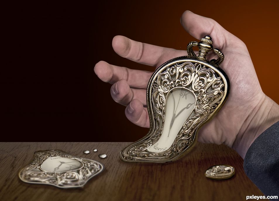
Time is dripping of my hand. A Dali like attempt. (5 years and 1617 days ago)
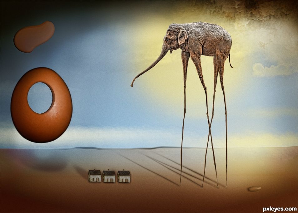
when I was 7 my mother went to art collage. she brought home a huge text book which I would look through quite regularly. My favorite pic was Salvador Dali's Temptation of st Anthony. I would stare at it for ever and imagine I was there in the scene. (5 years and 2409 days ago)
lookin' good
Good job
The right side is very good left side is a bit weak. but you are on the right path. gl
The right side is very good left side is a bit weak. but you are on the right path. gl
nailed it!
nailed it!
Congrats Nicky 
Thank you  Just wish I had not of missed deadline to upload improved version.
Congrats!!!
thanx! 
Congrats
Howdie stranger!
If you want to rate this picture or participate in this contest, just:
LOGIN HERE or REGISTER FOR FREE
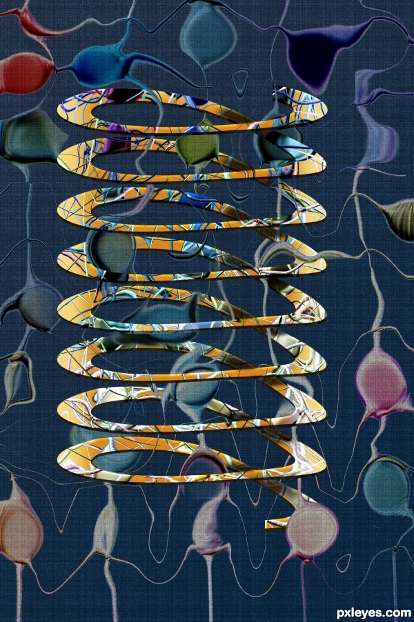
Old PST entry (5 years and 3397 days ago)
Excellent and very reminiscent of Sal. 
very interesting and creative work...GL author
Howdie stranger!
If you want to rate this picture or participate in this contest, just:
LOGIN HERE or REGISTER FOR FREE

"I created this image from scratch and is in homage to the great Salvador Dali. I did this thinking of a futuristic vision of his work."
I hope you enjoy!
(Take a look in SBS and High Resolution) (5 years and 3402 days ago)
in love with this..love the execution!
Great work ... just one little thing ...according to the guidelines the SBS should contain an image of the artist you are 'counterfeiting" ... or if you are concerned about copyright then a link to his work. I am sure everyone knows Dali but just in case someone has been asleep for the last 100 years it will help them to see what a wonderful job you have done!
EDIT: Perfect! 
Nice work, and I like your spin on it = )
NIce work, very Daliesque
I have to know ... is their a reason all the times are at :22:30:?
22:30 is the time that marked on my Windows clock when I finished the image, but in fact was 5hrs the morning. And the brand image but is actually 22:30 in the afternoon lol .... just an "easter egg "
Cool
Outstanding!!! 
Very cool! Love the concept!
Great interpretation author...all elements are handled well...best of luck
If only dali had access to a comp and some graphics software. Nice work
Sir, real good job! Good Luck!
This is fantastic job author., I like everything in it.., good luck to you 
AWESOME!!!!!!!!!!!!!!
Congrats  very surreal
nice composition and good skills.
Nice win..great image
Congrats for 1st fab
Congrats
Congrats!! Very nicely done!!
Congrats man, great image 
Howdie stranger!
If you want to rate this picture or participate in this contest, just:
LOGIN HERE or REGISTER FOR FREE
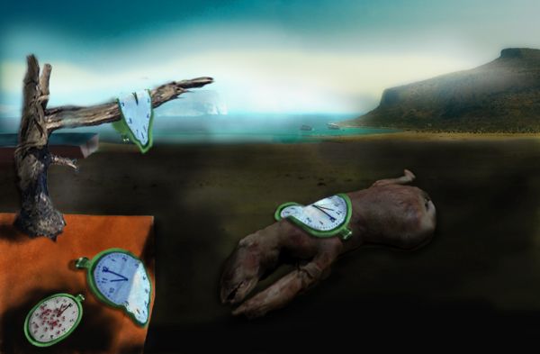
(5 years and 3783 days ago)
Wow! 
Nice work indeed...good luck! 
Nice melting timepieces! 
Dali would be impressed. nice job.
Two Dali's in one week......Nice work with this.....I loved the other one and this one as well. GL
Congrats for your third place, Ricky!
congrats!
Congrats!! 
Congrats!!
Nice Dali art...
Howdie stranger!
If you want to rate this picture or participate in this contest, just:
LOGIN HERE or REGISTER FOR FREE
Light source on the hand is from upper right. Shadows should be cast accordingly. You might want to soften (feather or blur) the hard edges of the hand, too.
Awesome concept author! Liquify works great to create the melt effect, you can also copy the bottom part of the watch of the melted section (copy) and perspective it so that it looks like it's moving toward you and on the surface of the wood instead of just touching the surface. Tricky, but it adds to the effect. Not necessary just a suggestion. Good luck.
liquid metal Thats nice
This is really cool!
I agree with CMYK46. IMO the drop shadow tool will diminish a great pic. Paint your shadows..you will have more control of where they lie and look more natural. For the hard hand edge, just make a second hand layer, Gaussian blur bottom layer, (about 30%). then take your eraser (50%) and erase only bits of the edges creating foreshortening. Same with table edge. I love Dali btw
Or select the area outside the hand, contract 1 pixel, feather 1 pixel & delete. Either way the entry will improve.
I agree with all of you guys, But time is not always on my side.
I did not change the hand with filtering, I just took a new photo of the hand with light on top of it. Thanx for the suggestions.
Howdie stranger!
If you want to rate this picture or participate in this contest, just:
LOGIN HERE or REGISTER FOR FREE