
(5 years and 3295 days ago)
(5 years and 3348 days ago)
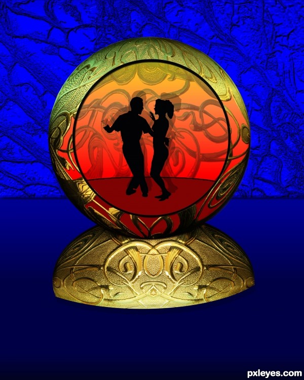
I really like this, if I had a suggestion though, it would be to move the dance floor down to meet the bottom of the circle / entry way. other than that, this is a great pic
nice construction author...gl
Hey Yhanks guys JamesP I thought about that after I put it in so when I saw your comment I redid ant better
nice job author
That's much better - its now a fav of mine
Thanks all I Just did a little more adjustment adding weed effect to backround and a different base
Excellent SBS author.. good luck on this, very well done!!!
Thank You all for comments They help making better projects and inproving my skills
I think giving the base a grounding shadow will keep it from looking like it's floating. Nice work author!
EDIT: Yeah...looks better...but I think I would remove the shadow from the sides and just leave the bottom area. Keep it feathered and smooth. Looking good, author! 
Hey Thanks pixelkid I added a shadow on bottom is this what you ment?
Edit------Thanks I took care of
good
Thanks kushpatel
Congrats again, Chuck! That was a great week for you! 
congratulations...
Congrats!!
Thank all..... I couldn't have got this far without all the comments You all have given me to help make my work better
Howdie stranger!
If you want to rate this picture or participate in this contest, just:
LOGIN HERE or REGISTER FOR FREE
nothing but the source (5 years and 3350 days ago)
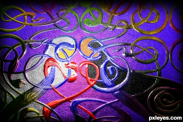
Nice vision. Didn't see figures from the original...but it's vivid and pronounced here. 
Nice, I see Mary and Joseph, Where is Jesus? I like it, a new vision for this glass, GL.
Great painting author...one of the best in the contest for sure...gl
Howdie stranger!
If you want to rate this picture or participate in this contest, just:
LOGIN HERE or REGISTER FOR FREE
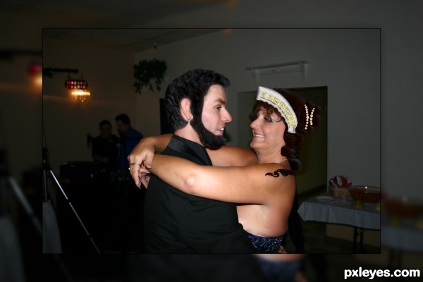
Had to do one in color. Was going to stay with full head until I realized how much the wife and son-in-law look like lady liberty and Abe... (5 years and 3378 days ago)
lol, creative = )
just between you and me.. you received WAY to low of score for this entry.. yes it could have been cropped but you really did a great job on this.. please don't let the low score on this effect your work.. (I get them all the time but I continue to endure)...
I feel ashamed that I didn't comment on this..but I'm always fighting the monsters.. good work all around
Howdie stranger!
If you want to rate this picture or participate in this contest, just:
LOGIN HERE or REGISTER FOR FREE
(5 years and 3379 days ago)
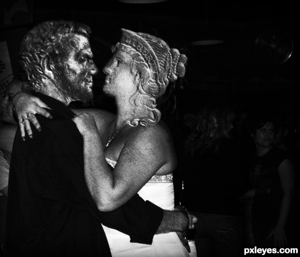
Good idea! Some color matching would really help.
Agrees with CMYK46...  Maybe adjust the Hue a bit
Thanks for the suggestion... probably not what you were expecting eh?
Well, this is a cheap way of making it work, but color matching would have been far better, and shown off your PS skills as well.
It's all good CMYK46; I'm just here kill'in time and having fun! If I had to rely on my mad PS skillz, I'd no doubt be a starving artist! 
haha well well indeed didn't expexted this solution...
You mayby could adjust the man head a bit more  !
!
Gl
Howdie stranger!
If you want to rate this picture or participate in this contest, just:
LOGIN HERE or REGISTER FOR FREE
Good colorizing on the head, although the figure kinda dies against the background...maybe create depth of field by blurring & slightly desaturating the background? Just a suggestion.
thanks CMYK46,
Howdie stranger!
If you want to rate this picture or participate in this contest, just:
LOGIN HERE or REGISTER FOR FREE