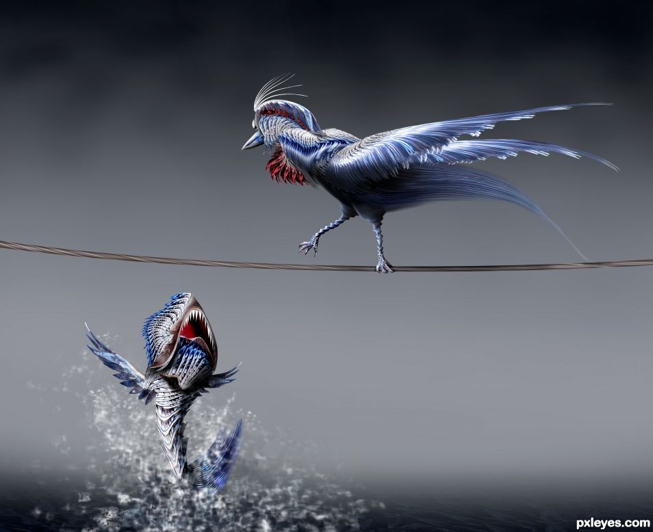
You better fly .... if you got wings (5 years and 1622 days ago)
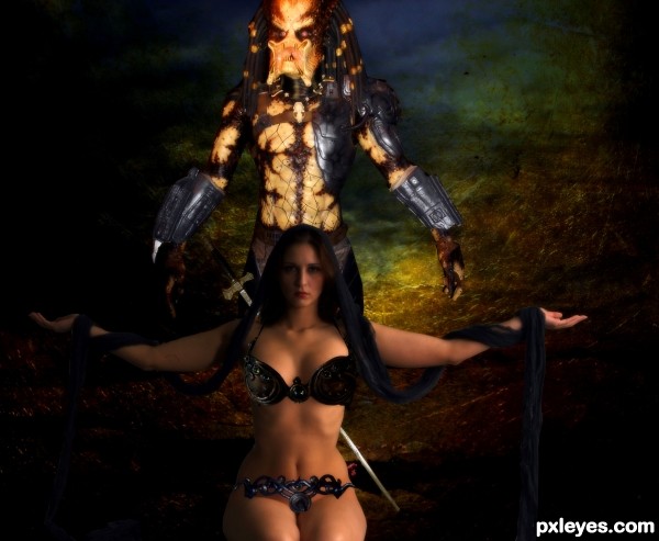
thanks to marcus j ranum
Colourize-Stock,MD-Arts
penywise ,muttstock
fantasystock
if anyone is interested in using the predator pic i have a better one and i dont mind .because i have a hard time finding pics like this one.we took them on a trip to gatlinburg tn wax musuem (5 years and 2792 days ago)
Nice work, where did you get the girl photo Shipleygirl.
deviant art i posted link and thank you
Creative image, I did notice the girl's head is blurry but her neck and below isn't blurry at all. Her arms are also blurry. The pieces you are using to cover her 'lady parts' need to be blended more to make them not appear as if they are floating above her 'lady parts'. You need to mess with the perspective of each piece so they appear as if she's wearing them. Good Luck 
Howdie stranger!
If you want to rate this picture or participate in this contest, just:
LOGIN HERE or REGISTER FOR FREE
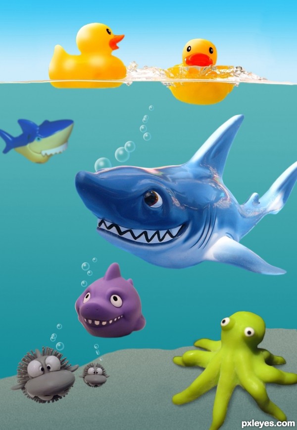
Who knows what lurks beneath the waves in toy land! (5 years and 3159 days ago)
Great concept, very cute and funny!
OMG! I ABSOLUTELY LOVE THIS! Wonderful work and lovely colors and characters! 
this is simply wonderful, love it!
bet me to to it author..  great image, love the construct of the image and colour usage. Over all out come is a wonderful but scary image..
Off to the favs with this one...
super choice of images with great blending
Thanks to all for your generous comments! I was lucky to find great source pics, and had way too much fun making this entry!
Awesome concept  Love it
Great choice of your sources author and excellent execution! Job well done!
Well that'll be $75 for the use of my pic! Hehehehe.  . I really love this and would love it on any kids room wall.
LOL..are you sure your kids are old enough so they wouldn't freak having this on their wall? 
I was wondering if I should print one for my grand niece, but I better ask her mom first!
I dont have ne kids so i guess they are. Hehehe
Fabulous ! love it 
Nice Job...clean
Very nice Author 
Good detailed work author, love the idea and the use of sources too. Good luck!
to cute well put together 
surb author... All d best..
improve the sand-dune (add texture then gaussian blur) so that it will look "bumpy"... now a little flat
WHAT A CUTEY!!! 
Cool! maybe alittle to much of a shine on the shark in comparisson to the ducks, but to me one phrase comes to mind:
" PLASTIC FANTASTIC! "
aLL THE BEST, DIRK JAN
very very nice..
Judging by the light on the ducks, the light on the sharks fin should be darker near the body, and a shadow from the ducks on the shark would have added some realism and maybe some pebbles in the sand. But I think you still have way out done the rest of the field. congrats old man.
Hahahahahahahahaha...ultimate humor and fantastic execution...one of the best entry's for sure...well done author and fav from me...GL
Charming sharks 
What a cool concept and clean! Best of luck author, one of the best!
Congrats.... you deserved a better place.... nice entry!
Congrats!!
Congrats
congrats CMYK46
congrats!
Howdie stranger!
If you want to rate this picture or participate in this contest, just:
LOGIN HERE or REGISTER FOR FREE
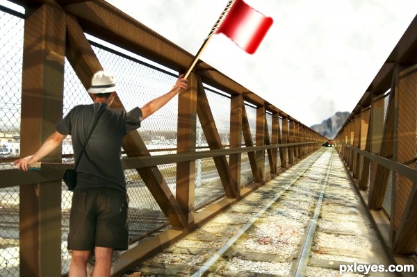
I used two external sources of man and train
thanks to
http://www.sxc.hu/photo/1331496
linder6580
http://www.sxc.hu/photo/913831
forwardcom
(5 years and 3328 days ago)
very nice ,i like the shadows that u made over the track ..good luck author.1 vote from me .......
Total three sources 
Thanks samanway 
very nice piece of work author...gl
I can almost hear the train
the alert flag waving guy looks very alerted almost panicky ...
good chop 
Thanks for your comments 
Howdie stranger!
If you want to rate this picture or participate in this contest, just:
LOGIN HERE or REGISTER FOR FREE
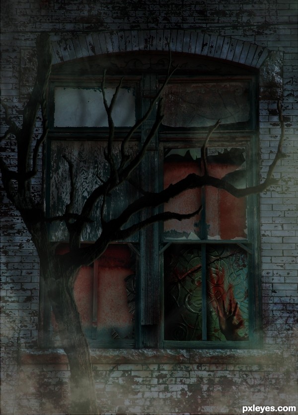
(5 years and 3345 days ago)
Nice idea all round... reaching out for the hand that is smacked.. Kinda Kate Bush... Suspended in Gaffa.. nice image
Nice job 
REally good spooky creation = )
Appreciate you comments 
Gruesomely eerie and interesting take on the source. Tree appears a little flat in places (could have used some shading to add come "curve" to the branches) but well put together otherwise.GL Author!
Congrats for your third place, Mad!
congratulations...
Thank you Lelaina and ramesan.
Congrats!!
Howdie stranger!
If you want to rate this picture or participate in this contest, just:
LOGIN HERE or REGISTER FOR FREE
Excellent work, author! My only suggestion would be to give the teeth on the fish some dimension and fix the blurry side of his head. The lighting is superb.
You are right CMYK I will try to fix it. Thank you for your advice !
Beautiful!
Thank you Wysiwyg
Very nicely done! I agree with CMYK46 but it's a minor tweak and doesn't affect the good score this deserves.
Thank you Spaceranger!
Beautiful work. Very good and dynamic figures
Thank you Hereisanoop!
I like the texture given to the bird and fish. Good job!
Thank you George
Great job using the source! Very creative! Good luck author!
Congrats!
Congrats!
Congrats!!
Thank you all for comments favs and votes
congrats for second place. great work!
Howdie stranger!
If you want to rate this picture or participate in this contest, just:
LOGIN HERE or REGISTER FOR FREE