Photoshop Pictures: Dangerous


results 1 - 5 of 17

Dangerous Road - created by skyangel


Dangerous Road
Favs: 0SBS: 4Hi-resRank: 9/19Score: 55.7% (0)9688 views

Warning.....Never sunbake on a road in winter. It is not a good place to sunbake. Wrong season for it too. If you do feel compelled to do such a thing, make sure you look out for stray trains which should not be on the snow covered road. (5 years and 454 days ago)

4 Sources:

avatar BWR
BWR says:

Pretty cool chop. Must have been a pain in the butt to cut out that train.

author says:

Thanks BWR. The train was not too hard to cut out using channel masks. Thankfully the sky and the top of the train had good contrast.
Channel masks are great.

(5 years and 454 days ago)


BWR says:

Yea I thought about that after I made my post. Good thinking on that technique. Such a time saver. You so smart.

(5 years and 453 days ago)


author says:

(5 years and 453 days ago)


avatar still26
still26 says:

Channel masks say the computer moron?! WOW will have to look that one up. I think this is a smack dab great entry on many levels. The technical is to my eyes very well done and I can see the shadow of hat on snow and it is correct. I also am taken with the colour palette, blue of course is cool and the icing on this well baked cake is that hat and arm....huh?! OUTTA place or what?!

author says:

Thanks Olga. If you are unsure about channel masks, check this tutorial....
https://www.youtube.com/watch?v=KX4FaF6QNYM
Channel masks work best on images with good contrasting areas.

(5 years and 453 days ago)


avatar still26
still26 says:

Hi, have just tucked that link into my Angelica folder...thank you.

avatar BWR
BWR says:

This was one of my faves. I thought you did a great job compositing this.

author says:

Thanks BWR

(5 years and 446 days ago)


Howdie stranger!
If you want to rate this picture or participate in this contest, just:

LOGIN HERE or REGISTER FOR FREE


Dangerous Games - created by M.Sh


Dangerous Games
Favs: 0SBS: n/aHi-resRank: 9/19Score: 58.3% (0)6724 views

(5 years and 2722 days ago)

3 Sources:

avatar thefinalcut

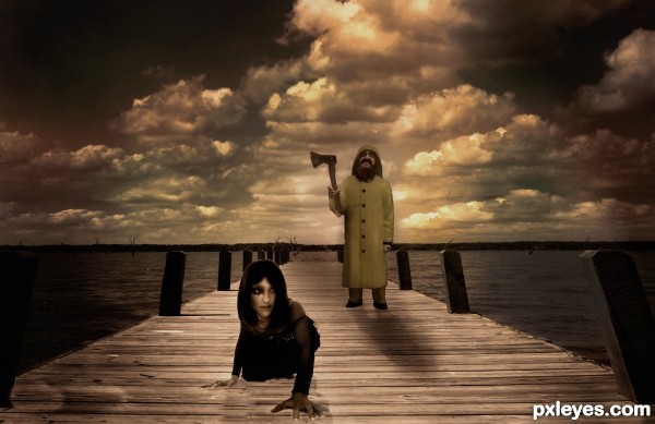
NIce, I like your idea. The axe looks too big and the shadows could be a little darker, but great effort.

avatar rusvelt2000

I agree with what "thefinalcut" said, moreover, the image is too dark, and the light comes too much irregularly. It seems to see the scene behind a dirty glass. The concept is good, clear, and creepy; so I suppose that it could be improved a lot by a couple of retouches.

author says:

Thank you both for your feedbacks!
Made some changes, hope it looks better now

avatar Mario
Mario [banned] says:

First of all you have a problem with shadows
If "sun" (light source) is behind the character fisherman shade is more sharp and girl is less sharp (more blur) .In your pic is reverse
Second I didn't see any source light direct to character so if "sun" is behind clouds this will softer the light so shadows didn't appear so sharp
And one more think ...try to change color of your clouds because you didn't have nothing red
Try this and your pic will be better
good luck!

Howdie stranger!
If you want to rate this picture or participate in this contest, just:

LOGIN HERE or REGISTER FOR FREE


A Dangerous Life - created by rusvelt2000


A Dangerous Life
Favs: 0SBS: 18Hi-resRank: 12/19Score: 60.6% (0)19918 views

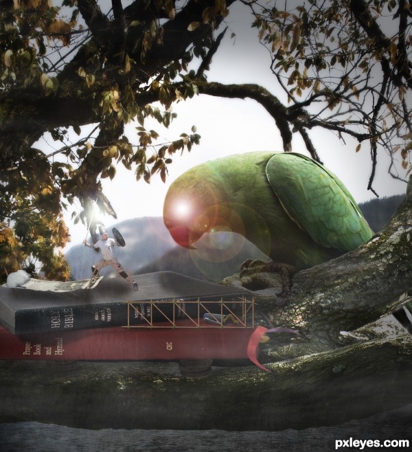
I hope you will appreciate my entry, this is my very first time I try it. (5 years and 2746 days ago)

7 Sources:

avatar vipinm
vipinm says:

IMO the worm and your size should be little bit same(or the worm can be bigger than you) and that look more convincing to the theme that's what i thought

author says:

It is a inchworm, so I supposed it was the right size. But thank you for the suggestion.

(5 years and 2747 days ago)


avatar CMYK46
CMYK46 says:

Lose the lens flare, and give the man a proper shadow.

author says:

Shadows are my weaknesses.... thanx

(5 years and 2747 days ago)


avatar Nav777singh

nice thinking

avatar kyricom
kyricom says:

Nice... but why can you see a light through the bird's head?

author says:

It is to increase the sensation of the parrot's aggressiveness. It's eye was too much cute.

(5 years and 2746 days ago)


avatar kyricom
kyricom says:

ohhhhh... maybe red, or some other "evil" color. Kind of looks like he has a hole in his head right now.

avatar pearlie
pearlie says:

Love your idea of the button, thimble and needle!

Howdie stranger!
If you want to rate this picture or participate in this contest, just:

LOGIN HERE or REGISTER FOR FREE


Dangerous Love - created by micoprego


Dangerous Love
Favs: 2SBS: n/aHi-resRank: 6/19Score: 65.5% (11)14112 views

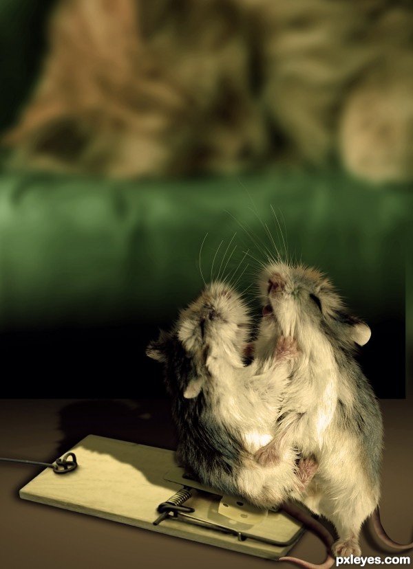
The sense of danger moves the passion...

GL4U (5 years and 2794 days ago)

5 Sources:

avatar CMYK46
CMYK46 says:

Good source find...very funny! (Just blur the shadow of the mouse trap & maybe lighten it a bit).

no avatar
Keiley22 says:

lmao nice thinking

author says:

thanks guys, I made the changes

avatar Sofie73
Sofie73 says:

Great artwork, I wanted to join the contest but when I saw your manip I thought it was impossible to make something better... good luck!!

author says:

thanks for the compliment Sofie73, I am very happy, but you're exaggerating. Your work is delicious, I really enjoy.

avatar SHIPLEYGIRL

very very well done very nice

avatar erikuri
erikuri says:

Oh, my... booty!

Howdie stranger!
If you want to rate this picture or participate in this contest, just:

LOGIN HERE or REGISTER FOR FREE


Dangerous ring - created by minnie


Dangerous ring
Favs: 2SBS: n/aHi-resRank: 4/19Score: 67.3% (27)11347 views

(5 years and 2860 days ago)

2 Sources:

avatar Drivenslush

GREAT THINKING!!!!

avatar lchappell
lchappell says:

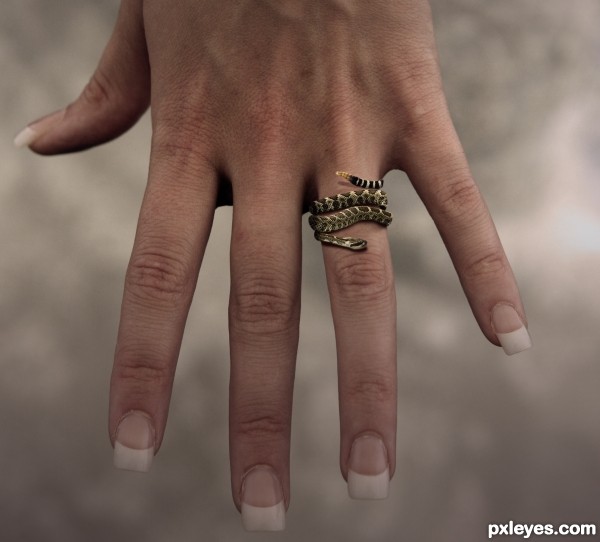
I agree with both the above, a little tweak to the color or brightness of that hand would be right on time.

author says:

I've given the hand a bit more color. I didn't realize it would look so "whash out". Is it normal that colors don't look the same in the web as in photoshop? Or it just happens to me...?

Thank you so much for your comments!!

avatar lchappell
lchappell says:

Looks better now, yes I have noticed colors not looking the same once uploaded myself.

avatar TwilightMuse

Great image, very creative way to use the subject.

author says:

Thanks TwilightMuse!

avatar CorneliaMladenova

Nice jewel anyway

Howdie stranger!
If you want to rate this picture or participate in this contest, just:

LOGIN HERE or REGISTER FOR FREE