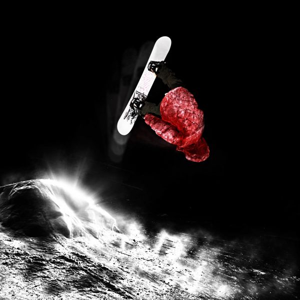
(5 years and 3826 days ago)
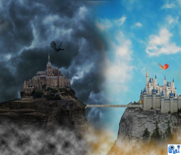
Nick -http://nara6200.deviantart.com/
Andreea's and Dianora's stock-http://ro-stock.deviantart.com/
dA's Best Kept Secret-http://peace-of-art.deviantart.com/
Laura-http://lausanne.deviantart.com/
Gift Giver -http://sammykaye1sstamps.deviantart.com/
Thanks guys for the great images and brushes.
Guys check the high resolution (5 years and 3886 days ago)
Good concept and choice of images. It would be nice if the clouds at the bottom would be more like the clouds at the top. Some gaussian or motion blurr would help.
i like these photo manipulating, all this staff i like it GOOD and EVIL!!!!
Thanks guys....a lot...Nator i had the same idea about the bridge but someone tell me,dont change the bridge,bridge is neutral...lol
Good idea and well done! But I think I kinda agree with Nator about the bridge 
Nice
one castle for your good days and one for your bad days? THis is a wonderful image . I like the dark dragon balanced with the red/yellow bird on the right. they provide an interesting focus in this image. GL
Howdie stranger!
If you want to rate this picture or participate in this contest, just:
LOGIN HERE or REGISTER FOR FREE
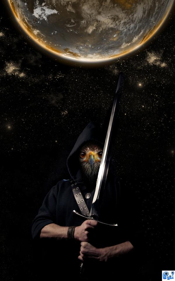
I created this protector of planets using the stock as mentioned.
Started with the adding of the eagle to the face of the man using masks. After that added the stars and earth and did some color changes to create the atmosphere I was looking for.
Hope you enjoy! (5 years and 3890 days ago)
Not bad, but a bit too reliant on DA images...
The only suggestion I would make is maybe make his arms more like the texture of the birdface.
I really like the idea, but i kind of agree with CMYK only in that you could find very similar sources in something like SXC, and it would've been a lot easier for you, author. Anyways, good luck, i really like it!
i too wonder what it would look like if the arms were feathered.like the sky and background images.
Howdie stranger!
If you want to rate this picture or participate in this contest, just:
LOGIN HERE or REGISTER FOR FREE
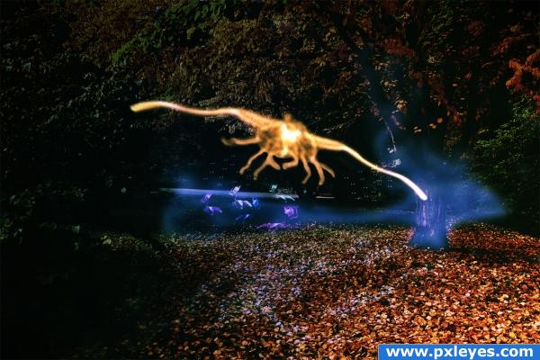
As lovely as the original scenery looks it is a different story at night! (5 years and 3896 days ago)
i just don't get it? what is that light thing?
@Keiley22: the SBS guide might explain it. In Step 8 I created this alien like ghost from smoke
Yeah, but what's the blue stuff?
Huh, I had this vision turning this into a night scene. That alone would be a little so easy I thought so I came up with some ghosts, fog and a creepy alien like figure. I think it turned out quite well but when nobody can see that I probably failed at it.
good effort  keep at it Author
i see what you did mate! and i find the result awesome!
i was not scared of the dark until i saw this. I like the blue spirit hue around the tree. spooky.
nice 
Howdie stranger!
If you want to rate this picture or participate in this contest, just:
LOGIN HERE or REGISTER FOR FREE
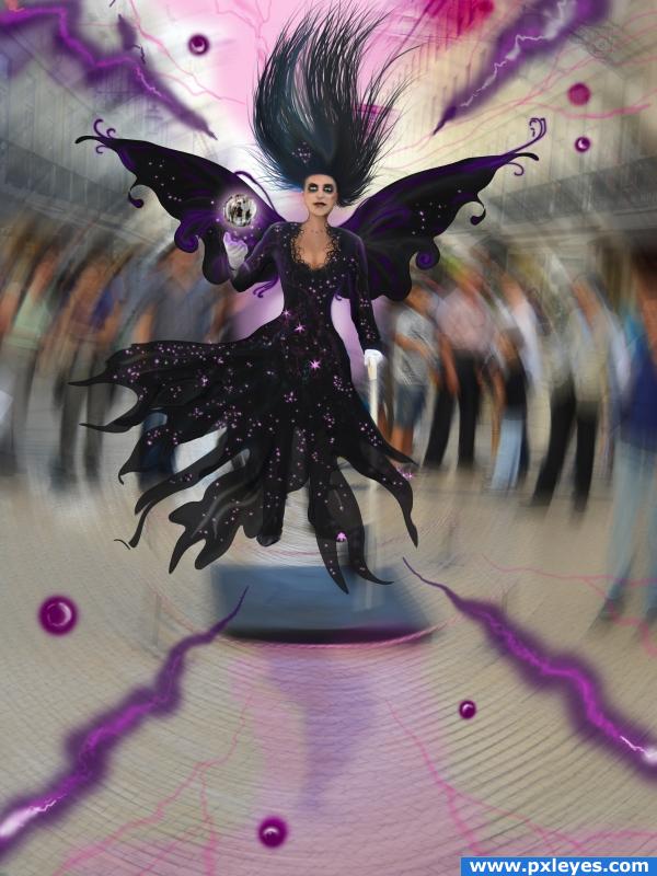
This one is an evil, dark fairy that likes to mess around with people.
Thanks oana for the photo! (5 years and 3906 days ago)
This entry is great! (Have one question: What brushes did you use?)
VERY clever and you have a unique ability to visualize!
Thank you all! Woodztockr, I used soft round airbrush at 135 px for the flashes and the floating balls. For the dress I used the same and made the patterns by erasing parts using a spatter brush and soft round brush, and then I used the filter embose, dodge and burn. For the stars the usual star brush at 30 px.
Wow! That was a man!! Well done. But I don't understand why you left the cane in the image at all.
Oh damn that's an evil banshee! :P
downoffthedragon intially I wanted to turn the cane into a fairy's rod. But I decided to let it as it is to show that the fairy is capable of capturing men's material possesions as well as their souls (in the globe she is holding).
Great work! 
very nice 
Congrats
Howdie stranger!
If you want to rate this picture or participate in this contest, just:
LOGIN HERE or REGISTER FOR FREE
This looks too simple to mel, try adding different elements, simply making a photo look nicer isn't considered a manipulation.
Howdie stranger!
If you want to rate this picture or participate in this contest, just:
LOGIN HERE or REGISTER FOR FREE