
(5 years and 2902 days ago)
(5 years and 2953 days ago)
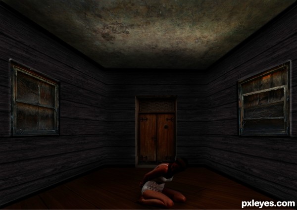
very dark, but once my eyes adjusted to the image i thought it was really good 
Howdie stranger!
If you want to rate this picture or participate in this contest, just:
LOGIN HERE or REGISTER FOR FREE
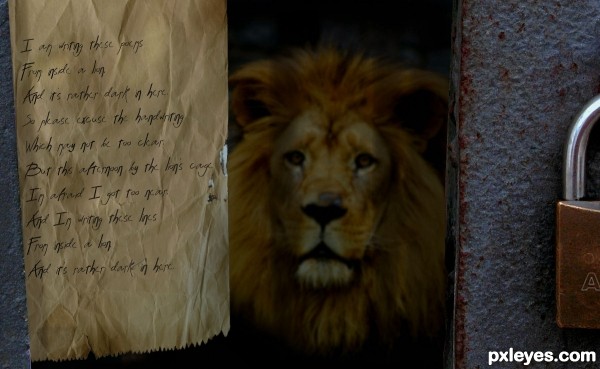
It's Dark In Here
I am writing these poems
From inside a lion,
And it's rather dark in here.
So please excuse the handwriting
Which may not be too clear.
But this afternoon by the lion's cage
I'm afraid I got too near.
And I'm writing these lines
From inside a lion,
And it's rather dark in here.
Shel Silverstein (5 years and 2977 days ago)
hehe great poem very funny 
hehehe.. reminds me a lot of the story "In a Dim Room" hehehehe
Great Job!
Gotta love and miss Shel. Nice job author!
Howdie stranger!
If you want to rate this picture or participate in this contest, just:
LOGIN HERE or REGISTER FOR FREE
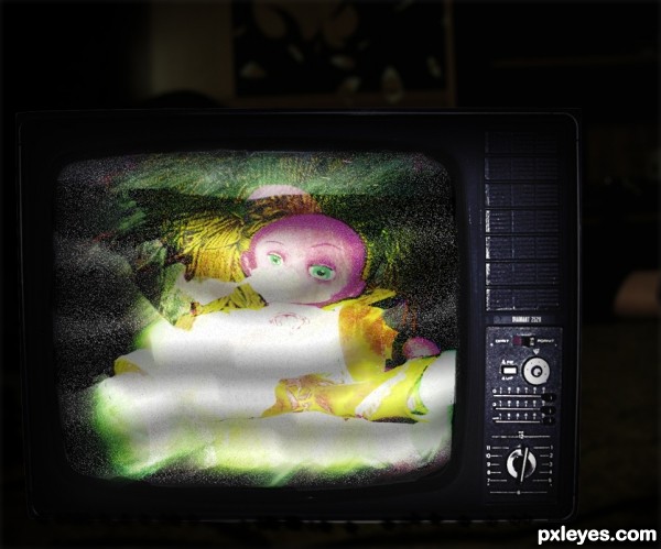
I used light effects and blending layers. Copy and paste it so many times..
Thanx to http://browse.deviantart.com/resources/?qh=§ion=&q=old+screen#/d19ash8 (5 years and 2987 days ago)
I paste wrong the tv link :http://ro-stock.deviantart.com/art/Vintage-TV-76086188
Howdie stranger!
If you want to rate this picture or participate in this contest, just:
LOGIN HERE or REGISTER FOR FREE
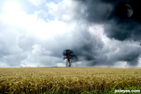
all images were allowed by morguefile.com
thanks. (5 years and 2994 days ago)
Howdie stranger!
If you want to rate this picture or participate in this contest, just:
LOGIN HERE or REGISTER FOR FREE
Perfect!..
Thanks Jordy!
Good image; doesn't look retro to me, more like modern.
Why do the white gulls call? hehehe.. great job
Not that retro.
I don't get how this isn't retro? would it help if I added scratches or fading to it? just saying "not that retro" doesn't help. it just says that it is retro, but only a little retro. I think it has an art deco feel to it which in my opinion is retro. Had I wanted to make this modern I would not have used just flat graphics with a slight gradient to give the piece some interest. I would have used a full figure of batman and a detailed image of a city. please give constructive criticism if you are going to critique someones art, so it helps them out. thanks.
Author, I agree with you. I really like your entry, but yes I think a little texture would have helped this make look more retro.
Howdie stranger!
If you want to rate this picture or participate in this contest, just:
LOGIN HERE or REGISTER FOR FREE