(5 years and 2938 days ago)
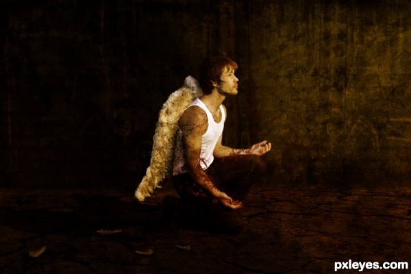
Thanks to tigg-stock for Angel photo (5 years and 2950 days ago)
I really like the end result, and in hi-res is it great too.
Thank you 
No wonder he's fallen...his wings are all stumpy & malformed. 
I hope you mean it in a good way 
Howdie stranger!
If you want to rate this picture or participate in this contest, just:
LOGIN HERE or REGISTER FOR FREE
(5 years and 3021 days ago)
Congrats, nice work 
Thank Nator & madamemonty.
Howdie stranger!
If you want to rate this picture or participate in this contest, just:
LOGIN HERE or REGISTER FOR FREE
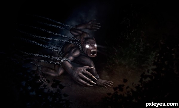
So I did what I'm sure we all have done at some point, and spent hours and hours on an entry just to find I'm a couple levels too low for that contest :( In other words I made an entry for the gorilla contest and then realized I need to be a slightly higher level. Oh well serves me right for not paying enough attention. Lucky for me there are a lots of Mixed Manipulation contests! My entry is 100% made from the gorilla source image and painting! (5 years and 3119 days ago)
This is great. Wonderful job author
Well thank you!
That is a nice work... It would have nice if you could have made your entry for the gorilla...oh well..... you will do fine here too....I think so.
Cool. I like the depth of field, although the lower chain off the near elbow might deserve some greater contrast/crispness. I think the eye rays should be focusing on a single point, so I would angle the upper ray down so that its eye appears to be looking at the same thing as the other eye.
Great work, shame it wasnt in the contest intended. With the great detail in most parts of the image it would be good if you could add more detail to the chain links in the foreground, they seem to flow into each other a little.
The nitpick doesn`t distract from the fact it is a fantastic image so very well done author! 
Thanks everyone! Great feed back, hopefully I'll have some time this week to do some tweaking 
awesome high resolution man.you are too good here
love it
high vote and fav for you author
Thanks a lot Kush!!!!!

Excellent transformation! 
Thanks a lot Pearlie! i=If only it could have been in the running for that actual contest it was meant for!!!
Congrats again Robert  awesome work.... he's so ugly
haha thanks, he most certainly is!!!
Howdie stranger!
If you want to rate this picture or participate in this contest, just:
LOGIN HERE or REGISTER FOR FREE
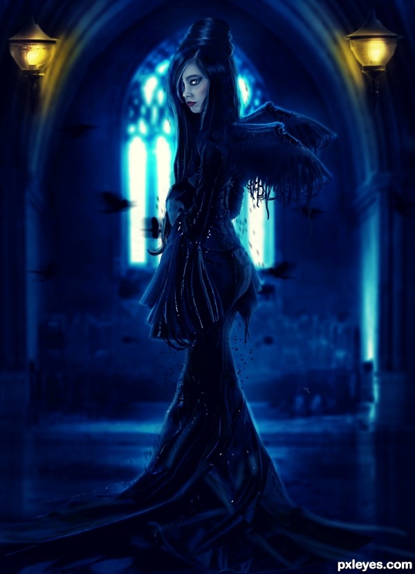
My dark style..
Stock + painting. (5 years and 3150 days ago)
great work
nice mood and colors
Beautiful...instant fav 
thanks guys 
Very, very nice!!!! Instant fav!
I liked his art but would like to see your SBS. Congratulations!
Background is too dark compared to the figure and reduces the illusion of depth. If you want to add yellow lanterns to the image, there would be yellow highlights on the figure. (Which would also nicely pull it forward from the background).
CMYK46 - Well, she is not close enough to be lightning like you're suggesting.. neither from yellow lamps or the window.. I think you should improve your lightning skills before to critique another one. thanks for your commenting anyway...

Author, if you're content with a flat image that's fine with me. For the lanterns to be that far back they are disproportionately large compared to the figure. I will vote accordingly. 
CMYK46 - Yes I'm happy with my picture and after checking your gallery I think you should try to be better in image edition instead of wasting your time making stupid comments like that. Thanks for your vote.
Awesome. Love it!
Author, this section is for comments on the work, not for personal attacks, which are expressly forbidden in the PXL guidelines.
That is not an attack imo it is an observation and a suggestion.
Agree with cabl and you author...too much talk out of the same culprit all the time.Once in a while is ok but constantly is asinine. HIGH vote from a HIGH vote power voter...great image irregardless of what the PXL resident critic says. Love the color and the mood. 
Masterpiece!!!...love it.
nice.... mysterious-looking.
only can suggest: lift up the wings' angle, now quite horizontal.
can use 'liquidfy' to make wings more beautiful.. like birds' 
thanks for all comments, I'm open to suggestions not to critiques.. theres a big difference
I think she has a great bottom 
Good job. I like the style.
Small suggestion: blurr the lanterns a little. They are too sharp compared to the arch and window.
fantastic work author..gl
i do love this image. is there a hi res/sbs?
and, i am going to be the person to agree with cmyk a little on this one.
if you want the lanterns to be further into the background as to not put a light reflection onto the girl, then they need to match the blurring done to the background and give it more depth. also adding some of that yellow lighting to the walls so that it "fits".
if you choose to leave them where they are, then they would leave some yellow lighting on the girl. not ALOT but there would be some.
there is a strange white-ish artifact on the viewers right hand side, also.
Jade, be careful...she's a sensitive "artiste" and will go off on you...
nice work, only i see that light on the right is more blurred than the left one
and i like her ass too
@CMYK - I dont have problems with jade despite of she's only a photographer and doesnt understand too much about edition.. My problem is with you who doesnt stopp critique the others and doesnt look at his own ass.. I mean, are you still here? you're wasting your time.. go searching photomanipulation tutorials at google.. this way you get better so you'll see how hard is to blend perfectly a picture.
Ummmm. Check my portfolio. I actually am not JUST a photographer.  you might surprise yourself to know that photomanipulations are my main reason for being here.
My advice was constructive and not insulting. I would still like to see a high res and an sbs. In high res I am sure I could get a better grasp on why you remain so set on leaving the lamps as in focus as they are while the rest of your background is such a blur.
And..that little white thing...likely a remnant from some erasing on one of your layers...its driving me crazy.
Your work is nice, but none of us are perfect.
Great job,good luck author ! 
The girl is superbe and so weel done, but i think you might cancel the two lights because they are not essential in this pics and are subject of a lot of critics, very very good work author and good luck.
As the Author you don't have to agree with suggestions about your work, you can create your image as you want. The suggestions made by CMYK46 and jadedink are academic and technically accurate and are in no way insulting. Your response is unfair and inaccurate to say the least. CMYK46 has the background and experience plus a long record of helping members improve their entries. Jadedink is much more than a photographer, she's proven to be a talented artist and a skilled "chopper". Suggestions are what helps members learn and improve and should be accepted in the spirit they were given. I do like your entry very much but It's a basic rule, never isolate a color. This hurts the rhythm of a composition, by adding the yellow reflected on the figure the eye will keep moving through the composition.
You are getting a high vote from me also, because I like your image but I also do think there would be a bit of yellow in the floor shine. Author it really is best not to get upset with the critics who mean to help. But of course you do not have to change anything ,that is up to your discretion, best to say nothing and let people vote as they feel. ( they will anyway ) But then you will not come across as a whiner. Disagreements should not be dragged on and on.
Congrats, well done 
Congratulations Author 
Well done congratulations! 
congrats...
Congrats!!! 
Congrats
Howdie stranger!
If you want to rate this picture or participate in this contest, just:
LOGIN HERE or REGISTER FOR FREE
Howdie stranger!
If you want to rate this picture or participate in this contest, just:
LOGIN HERE or REGISTER FOR FREE