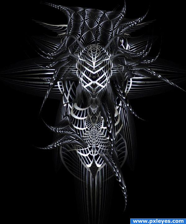
source only (5 years and 3917 days ago)
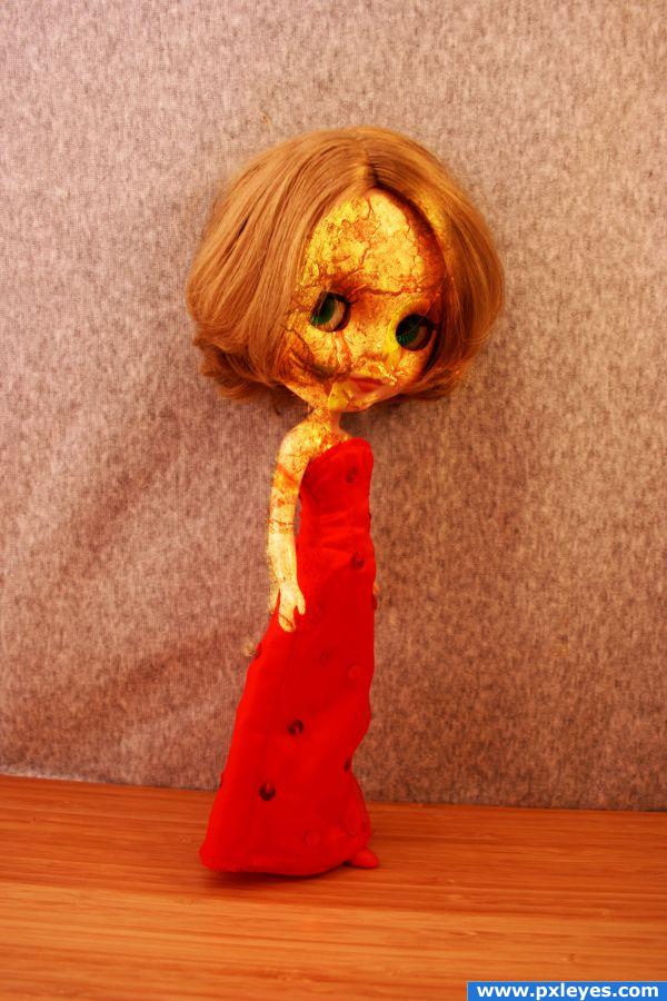
thanks to betsyjean79 (5 years and 3946 days ago)
whoa, creepy  nice work
nice
This image is called "Darkness Falls" but it is very bright. You should decrease the saturation slightly and increase the contrast to make it darker.
Howdie stranger!
If you want to rate this picture or participate in this contest, just:
LOGIN HERE or REGISTER FOR FREE
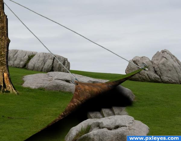
thankand credits to enimel and sxchu (5 years and 3973 days ago)
uhm o.o; what is it?
Hmm.. this doesn;t make too much sense to me, sorry :S
Good surrealism! 
awesome!
neat idea. I like how the "sod" is pulled up.
It would be easier to read if the steps when farther down into the pit.. but I get the Idea quite well... but head clearance would be nice to add to the chance that you could really run down into the hole (looks like Grendl's lair)
hmmm ?????
Lots of imagination here :P
This is a bit confusing at first! Good luck.
Howdie stranger!
If you want to rate this picture or participate in this contest, just:
LOGIN HERE or REGISTER FOR FREE
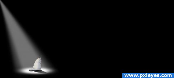
source only and Ps
edit: watch the highres or sbs to get the deeper meaning of my image.
Thanks (5 years and 3985 days ago)
it looks very nice.. a very lonely image. Good luck!
so simple but so powerful
since the contest is almost over, I'm going to give it away
PEOPLE LOOK AT THE HIGH RES AND LOOK UNDER WHERE THE PXLEYES.COM BLUE BANNER IS (I was hoping someone else would give it away hehehehehe, but since it's almost done, I HOPE YOU DON"T MIND AUTHOR)
(I hope other's catch it  ... ACK good job Creatfx hehehe.. you got it!!!
great mystery and fear effect... i sure expect something to jump out of the darknes at the poor cat... great work with the eyes... 
for me this image issnt lonly or feary. I had something diffrent in mind. Interesting to hear other impressions 

i like it! sometimes that empty space works well  you could though make make the lightened part of the cat become darker more gradually, insted of a straight line
good use thirds....so little in the image yet it says so much... great job
the image looks nice, the cat looks kinda lost in the image though the rest of the image is pitch black but i like it! high marks!
actually the dark area issnt empty at all. There is something in the darkness. (but may only the cat see it)  you also can see it in the sbs if you like to get the hidden story insinde. For all others, it´s just a black area.
In High Resolution you can see the mouse. Without your comment, I would have never seen it. Changed my vote completely. Good job author!
Glückwunsch für den 6. Platz! 
Howdie stranger!
If you want to rate this picture or participate in this contest, just:
LOGIN HERE or REGISTER FOR FREE
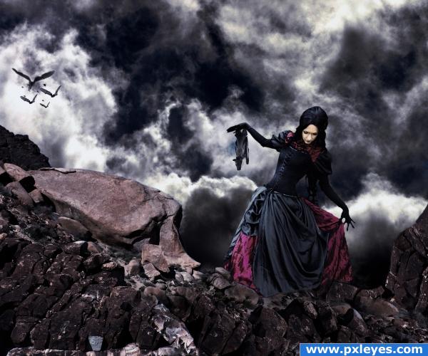
Thanks to Lisajen~Stock from Deviant Art!
Edit:
Special thanks to OliviasArts for pointing out my raven sources weren't allowed - i've reuploaded the image, this time using bats.
Thanks also to GolemAura for helping me out.
I personally don't like it as much as the first one, but i think that bats make the image a little darker. (5 years and 3987 days ago)
Really hit the mark with the lady find.. she really looks like she's walking on the rocks.. great job of blending the sources.. good luck
Thank you 
Nice dark & moody scene! would agree the lady is a perfect find you may want to bring her levels up a touch as she is pretty dark compared to the rock she is next too.
I was thinking about lightening her up, but then i took to account the rest of the rocks, and also her skin tone - she's pretty pale already, so i thought i'd just leave it as that. Thanks 
TOTAL AWESOMENESS! i love the way the hands look awseome!
Beautiful picture and mood! Her pose really fits just perfect! Good luck! 
the image is still lookin awesome!
looks great, I'd love to see high res
This is gorgeous! I really love the clouds and the boosted contrast. I also like the ravens' extended feathers -- definitely succeeds in making it feel otherworldly. Something you might consider for the future would be to make a stronger distinction between foreground and background, e.g. the woman looks rather big compared to the large rock face because it's a little difficult to see that she's much closer. Maybe a few larger plants in the foreground to contrast with some smaller ones over by the rock would help communicate the sense of depth.
nice work... unfortunately you cant use the raven image.... http://www.pxleyes.com/forum/viewtopic.php?f=9&t=322 this is a thread where i asked about those images, and got a NO lol see if you can find some normal photos otherwise the entry will get pulled.
I'll red flag the entry and ask, thank yoiu 
i like this... very nice colour match...
i think the bats look great  love the one hanging on her arm, it fits alot better with the mood
  well doen author and goodluck.
i think the bats look great  love the one hanging on her arm, it fits alot better with the mood
  well doen author and goodluck.
Thanks OliviasArts.. the double comment just doubles my self esteem xD
Very original! Love the mood of this image, really nice manipulation author 
the sky is awesome!!!
perfect source selection and fantastic work. goodluck!
Thank you!
Congrats Matteo! 
congrats ponti55  well deserved.
Congrats great image!!
congrats!
congrats!!
Thanks to everyone! 
Congrats!!
Congratulations for 2nd
Howdie stranger!
If you want to rate this picture or participate in this contest, just:
LOGIN HERE or REGISTER FOR FREE
Pretty interesting...I think it's great that you didn't make the pic totally symmetrical, which would have sucked. Might be interesting to see a color version too, but good luck!

please tell me what is it? i see it like a biker on a bike , should i pay a visit on my eye doctor? hehehehe nice work GL
awesome
absolutely fantabulous
thanks alot with the color im pretty happy, it looks also pretty good in different colors, but here the metalic look tuches me. @gitsadr: well, i left it pretty much open what it is. Actually it is a small pice of a entire world right now. Im thinking about to post some add´s in my sbs or maby also as an different entry. But to answer your question, for me it is an captured fighter in the wall of darkness (spare lighted)
  I made another version where you can see more of the "wall" he stuck in, but it is to distractive i think.
*edit: it´s viewable in my Step2 of SBS
I can see some H.R. Giger influence. Am I right? Great use of imagination. I think use of color is a matter of opinion. Well done author!
creative, thought provoking and kind of pretty in an artisitc way..GL
wonderful imagination.gl
Und das gleiche noch mal: Glückwunsch zum 1. Platz uuuuuuuund....
WOW 1st and 2nd again, congrats, absolutely awesome
congrats on your 1st and 2nd placements. great job
it's great work.....congratulation for the first
congrats!!!! great stuff!
Congrats!! Another 1-2 for you!
Congrats for the 1.+2. place!
Congratulations for 1st
Congrats! Well done!
Howdie stranger!
If you want to rate this picture or participate in this contest, just:
LOGIN HERE or REGISTER FOR FREE