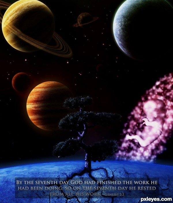
Hope you like it! Thanks for voting ! (5 years and 3187 days ago)
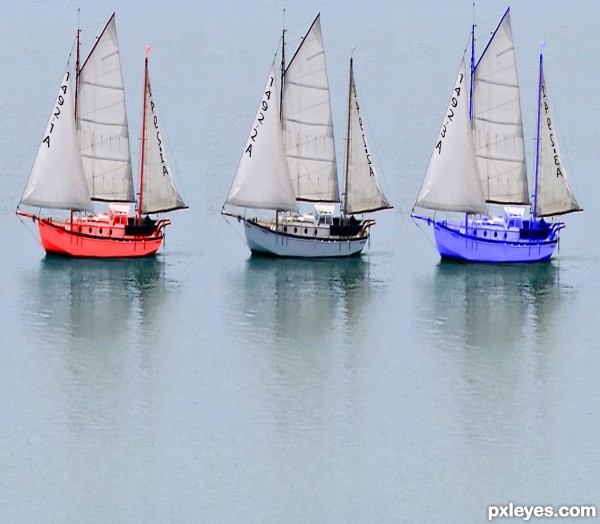
A race of 3 boats with same names (if you zoom in) to Celebrate the sailing of Columbus across the Atlantic Ocean in 1492. All sources are from source photo and text using Photoshop only. (5 years and 3191 days ago)
you can colorise the boats' body for adding more variety... or some more variations... 
Tried to add the Spanish Cross to the blank sail but it is facing the wrong direction and looked funny and fit the sail the way i wanted it to.
To amend my comment I made before- The cross fit the way I want it to but it looked funny because the sail was facing the wrong way.
Try to make details on the boats different, not just the numbers on the sails.
Colored a few of the boats. Open to more hints for improvements.
Nice concept, IMHO colors are too bright, don't look very real, GL!
Nice concept, IMHO colors are too bright, don't look very real, GL!

Was going for The almost HDR look on the red and blue boats
Howdie stranger!
If you want to rate this picture or participate in this contest, just:
LOGIN HERE or REGISTER FOR FREE
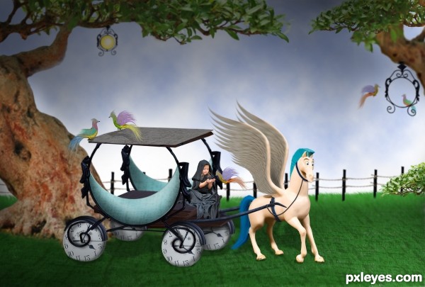
stocks mentioned and the rest is from pic provided and PS.... (5 years and 3196 days ago)

Extremely minimal use of the contest source.
hehehe...well, sorry, M. I know you must ask me SBS by saying extremely minimal use of the contest source,...SBS is here now,......not that extremely minimal I think....Thanks. M.
I like the Disney feel.. great job 
I like it .. has a sweetness to it that is very appealing (to me)
Great job on this using so many elements of the source. Love the human in the fantasy image, and the birds. 
Love it, great idea to create clock wheels 
Howdie stranger!
If you want to rate this picture or participate in this contest, just:
LOGIN HERE or REGISTER FOR FREE
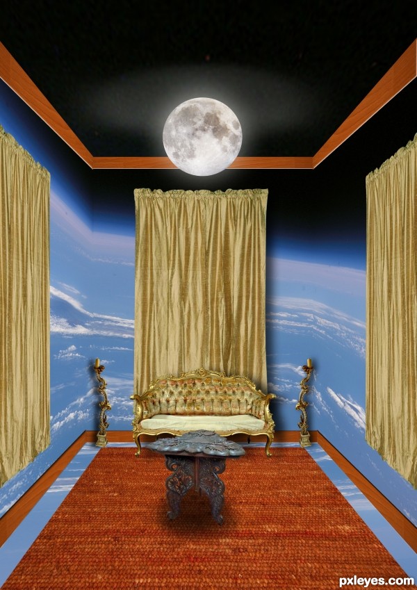
(5 years and 3199 days ago)
The bottom of the wooden baseboard is a bit too light, especially since you have a "shadow line" along the top where it meets the wall - the bottom should have a wee bit of shadow where it meets the floor.
But overall, this is a very elegant and well constructed image. Nice work!
The moon would be distorted on the ceiling...it's 2 different planes. The baseboard corners are off.
Howdie stranger!
If you want to rate this picture or participate in this contest, just:
LOGIN HERE or REGISTER FOR FREE
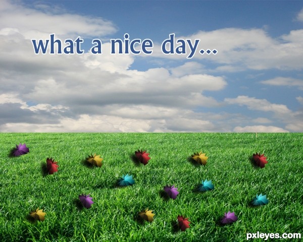
I used hue saturation to change the flower color (5 years and 3217 days ago)
Unless your goal was to make this into a Post Card, you should remove the text or at least change the title so they aren't the same... (comes off as a bit overkill..)
While I can see what you were doing with shadow casts, you may want to BURN the hard straight edge of each flower so they blend with the shadow/grass.. (they are sticking out harshly at the moment)
(all just IMHO.. what you chose to do with the entry is fine by me  )
)
Cute entry author, good luck
Howdie stranger!
If you want to rate this picture or participate in this contest, just:
LOGIN HERE or REGISTER FOR FREE
Howdie stranger!
If you want to rate this picture or participate in this contest, just:
LOGIN HERE or REGISTER FOR FREE