
(5 years and 3465 days ago)
(5 years and 3476 days ago)
Pow.. super well done 
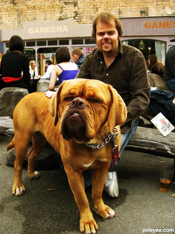
very nice work on both the dog and owner
haha really funny and good
 GL!
GL!
hahahah  good job
Even in the original they both are identical!... You just "enhanced" them! Funny... 
wow, another one, amazing
Very nice job blending them and the resemblance is uncanny LOL Best of Luck
Super cool...good luck
Stupendous ... hilarious ... and great work! Applause, applause!
congrats on third
congrats on third
Congrats
Congrats!!
congrats
Howdie stranger!
If you want to rate this picture or participate in this contest, just:
LOGIN HERE or REGISTER FOR FREE
Some of my favorites albums (5 years and 3486 days ago)
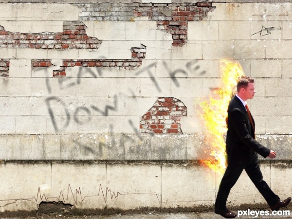
I think a little change in the perspective of the wall would be better, because we are seeing the man from the top.
Howdie stranger!
If you want to rate this picture or participate in this contest, just:
LOGIN HERE or REGISTER FOR FREE
Spec Thanks to MShades for use of two of his pictures
found on Flickr photo sharing.com in the park album (5 years and 3489 days ago)
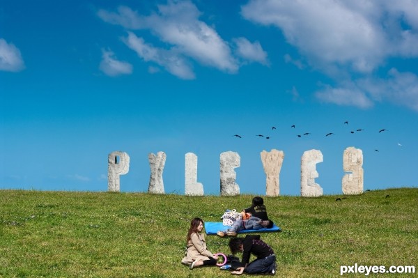
idea is fine -- execution needs some touch up -- all the holes need to have depth as was done in the "P" -- edges should not be straight lines as I doubt that stone would weather to a straight edge
Hey Thanks Alan2641 I did some touch up on what you said any better?
Author the touch-ups are still not quite right IMO, the edges are still too sharp and/or straight. You can try using the eraser with less opacity and fill adjustments. I would use it set at 10% and 10% so you can control it better. Good luck author
good thinking
Creative idea, but the letters need a lot more shadows on their under [ground-facing] sides. I would also consider moving the young adults to the left edge (with probably a horizontal flip and maybe having the kids in front slightly overlapping so the people form a single element) for a more-diagonal composition instead of having all the elements on the right-hand side.
Thanks all I did some readjustments but I maybe should have stayed away from the stone letters
cool idea...gl
Howdie stranger!
If you want to rate this picture or participate in this contest, just:
LOGIN HERE or REGISTER FOR FREE
thanks alot for the comments (5 years and 3493 days ago)
Interesting, but a lot of bad edges.
thanks i just fixed it
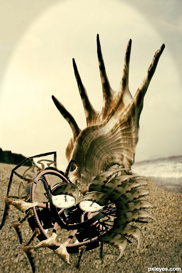
You have to work on the edges of the left side of the image, those spikes of the shell. They are undefined. Also the color is a bit too dark and while the details of the image are interesting, it's pretty hard to see them now...
i agreed CMYK46 and Giulia but u got nice creativity..
nice creation. The shadow need to be reworked, and also can avoid a tight close-up like this. good luck
Much better, good job author! 
Howdie stranger!
If you want to rate this picture or participate in this contest, just:
LOGIN HERE or REGISTER FOR FREE
Creepy but cool. Excellent blending. Very seamless and well done job.
GL!
Very funny ! Good luck author
LMAO ! That's great !!!
Howdie stranger!
If you want to rate this picture or participate in this contest, just:
LOGIN HERE or REGISTER FOR FREE