edit entry
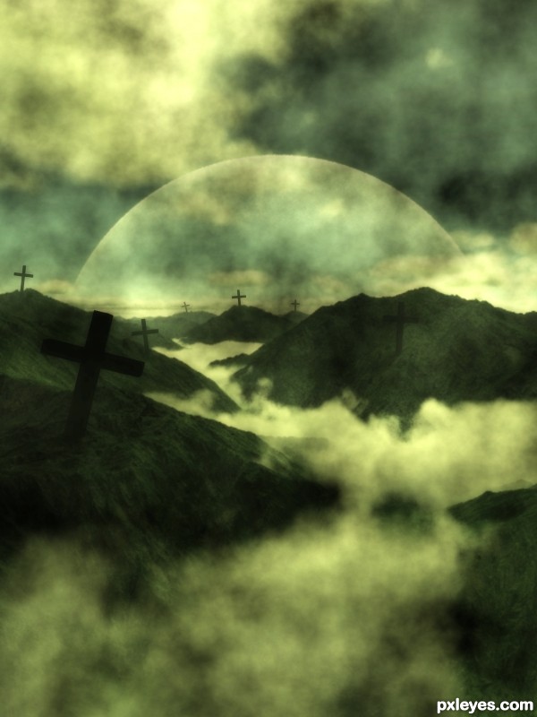
- portrait scale
- change 3d view
- change 3d clouds
- add 3d planet
- retransform the 7 crosses
- add 3 steps 3d sbs
(5 years and 3393 days ago)
(5 years and 3395 days ago)
Me likey!
very nice piece...gl
Howdie stranger!
If you want to rate this picture or participate in this contest, just:
LOGIN HERE or REGISTER FOR FREE
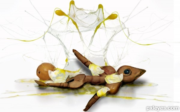
Used only given source with liqufy,burn,clone,CTA,chop, and mask (5 years and 3406 days ago)
interesting image author...good luck
Clever!
Howdie stranger!
If you want to rate this picture or participate in this contest, just:
LOGIN HERE or REGISTER FOR FREE
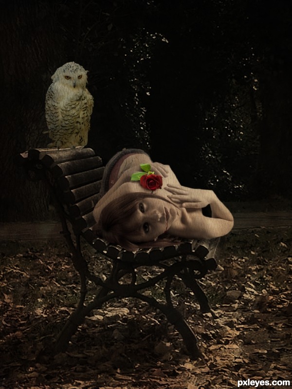
Thanks to:
- morgan capasso, pavel siamionov and Ralphele @ Photoxpress;
- calebkimbrough @ Flickr.
(5 years and 3421 days ago)
very spooky but very well executed! good luck!
Thank you! 
Quite eerie. I'm not sure if the texture on the body is necessary, though. Maybe lowering its opacity a bit more...
But meh, it is just me 
great mood author...owl is great addition...well done
Nice idea
I like how the owl is looking at the girl, nice work.
Congrats
Congrats! Well done sweetie 
Thank you! 
congrats !! 
Congrats!!
Howdie stranger!
If you want to rate this picture or participate in this contest, just:
LOGIN HERE or REGISTER FOR FREE
(5 years and 3422 days ago)
I would like to visit this place... 
Lolz!
wow....amazing work author...GL 
I love the mood you created in this image 
Howdie stranger!
If you want to rate this picture or participate in this contest, just:
LOGIN HERE or REGISTER FOR FREE
YEEEX... like something from Lord of the Rings combined with The Crucible... very very moody
Good LUCK author!!
great thanks Drivenslush...
It has a great mood, but there's a perspective issue, imo. Crosses closer should be bigger, further from the viewer should be smaller. I can see there is some difference in dimmensions, but it should be more accentuated, so that it points out the depht. Try it out .
.
great thanks greymval.., me d thougth of the perspective too... it s true there s a perspective issue showin the depth of field if the dimmension of the crosses r the same.., but at me point the dimension of the crosses r different each other...
Very very nice work author,with a great mood...well done
great thanks erathion...
The atmosphere of the image is great, but this is a problem that i thought would arise because of the given source.. the crosses could've been made with two rectangular selections and that's it.
Still, good creativity, good atmosphere and a very good 3D render.
maybe u r right ponti55.., great thanks ponti55...
Looks better indeed now.
great thanks again.., greymval...
Congrats on third place !!!
Congrats...
Congrats for 3rd
great thanks to u all...
Congratulations!
Howdie stranger!
If you want to rate this picture or participate in this contest, just:
LOGIN HERE or REGISTER FOR FREE