yeah..minimal use of brushes...however,i won't deny that i used some. thanks to the artists out there making decay brushes for this sort of application.
some hand painting and overlay...really quite simple manip.
(5 years and 3429 days ago)

Thanks to SaTaNiA, matazidah, and Cutspring at Deviantart!
All artists have been notified! (5 years and 3431 days ago)
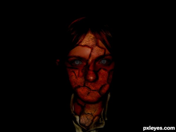
It's too dark. All you can see is a dark face.
Very nice work. Good blending.  (And IMO, you're not ugly
  as you said in your SBS)
nice entry author..it would be more cool if you can add some depths in to the cracks 
Made cracks appear deeper.
Darkened mask to match face a little more 
Not making it any lighter though...

Well I hope you get better, Becca.
I believe it would look more interesting to have only half of your face corrupted. Use some texture like this (http://www.sxc.hu/photo/1186892) instead of tree bark & fill the background with 2 gradients of oppossing colour, red/ black, blue/ white, you get the idea. This would bring out the duality that is present in every human.
Howdie stranger!
If you want to rate this picture or participate in this contest, just:
LOGIN HERE or REGISTER FOR FREE

qtvr panorama view... (5 years and 3437 days ago)
nice... i never about this... hmmm... good job!
cool integration author...best of luck
Howdie stranger!
If you want to rate this picture or participate in this contest, just:
LOGIN HERE or REGISTER FOR FREE

Give Me The Flowers While I'm Living
In this world today while we are livin'
Some folks say the worst of us they can
But when we are dead and in our casket
They always slip some lilies in our hands
In this world is where we need our flowers
A kind word to help us get along
If you can't give me flowers while I'm living
Please don't send them when I'm gone
Won't you give me my flowers while I'm living
Let me enjoy them while I can
Please don't wait till I'm ready to be buried
And then slip some lilies in my hand
Won't you give me my flowers while I'm living
And let me enjoy them while I can
Please don't wait till I'm ready to be buried
And then slip some lilies in my hand
No don't try to slip some lilies in my hand (5 years and 3473 days ago)
cool one there is no flower emoticon other wise i would have given a flower for u author

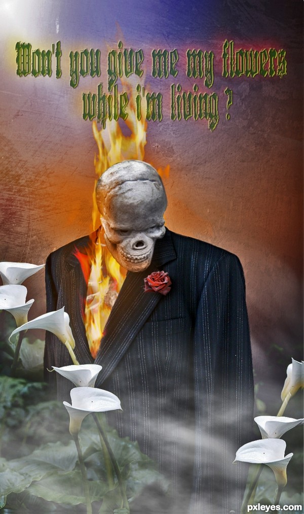
The font looks bad on the scene
Thanks nisha I know you are a sweetheart. Akassa explain please, do you just not like the font I chose, or do you not like the type on the entry period?
I like the Gothic font, it fits to the image. But this one is a bit difficult to read at first look. Maybe another sort of Gothic font - or a little more space among the letters; I like the background too, nice texture, and nice coloring. 
can read the font now.. very neat piece author 
Good work....font is ok....may be the color of the font making it dull.....but ok
Great concept and execution, love the "fire within" and the mist. 
Ghost rider looks so gentle here  . Happy Halloween!
Howdie stranger!
If you want to rate this picture or participate in this contest, just:
LOGIN HERE or REGISTER FOR FREE

Thanks to Felly1000, Pepo, Jascha400d,
Roppa uk & Dafeba for the very nice stock images ;-) (5 years and 3517 days ago)
Has a nice childre of the corn and pet cemetary feel! dont like the pretty pretty chops!
this is very scary thing...great job author
Thx erathion, woodztockr, please, what do you mean with 'don't like the chops?? 
Author I meant I like your spooky scary photoshop (chop) and not really the others that make zombies like pretty... g/l
Ok woodztockr, i understand  THX
THX
That spooked me! Convincing (as convincing as dead walking could be) Really nicely done.
Thx Sunzet 
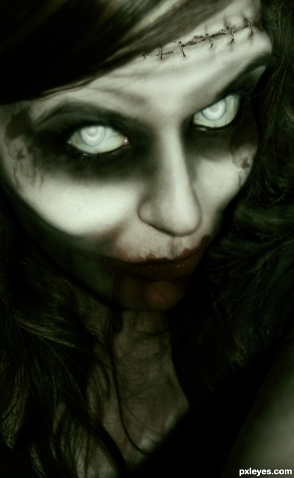
Her colour is very healthy for someone who's dead. Just my opinion...
Howdie stranger!
If you want to rate this picture or participate in this contest, just:
LOGIN HERE or REGISTER FOR FREE
It's well blended.
This is really great!
mmmmm she be purdy!!! in a rotting corpse kinda way
Creeeepppppyyy! Yikes!
See ya in the crypt
SPOOKY!!!! Nice work...Best of Luck
cool work author...totally in your style...gl
Gorgeous eyes
Look at you ... 1st and 4th ... not bad for a night dweller!
Howdie stranger!
If you want to rate this picture or participate in this contest, just:
LOGIN HERE or REGISTER FOR FREE