(5 years and 3764 days ago)
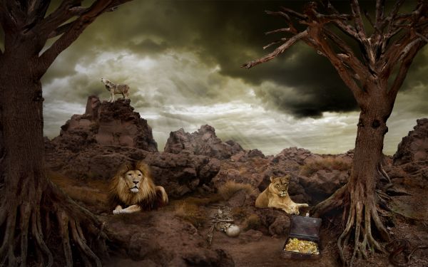
- 1: skeleton
- 2: treasure chest
- 3: wolf
- 4: snake
- 5: lion
- 6: tiger
- 7: landscape
- 8: tree top
- 9: tree roots
- 10: clouds
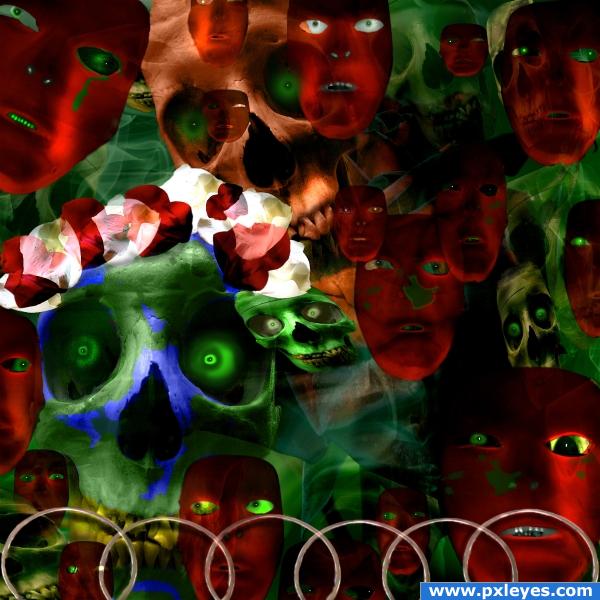
used one of my own pics and a couple of outside sources, used flowers petals and top of candle holder from the contest source. (5 years and 3831 days ago)
It's a good thing this isn't a spelling competition...
EDIT: LOL, that's better.
Opps!! Thanks for catching that CMYK
nice 
nice entry,good luck
Howdie stranger!
If you want to rate this picture or participate in this contest, just:
LOGIN HERE or REGISTER FOR FREE
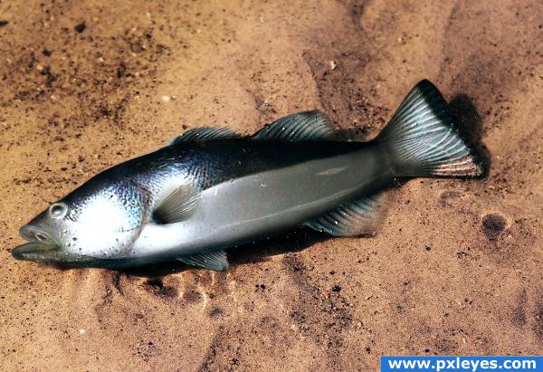
Another old entry. Unfortunately PSD and detail SBS has been deleted, found JPG from my collection.
used source for body.
Eyes, mouth and fins painted in photoshop.
Thanks to Elnias for background and fish picture
(5 years and 3834 days ago)
Very nice, good job!
yeah i remember this great work
Remember this too. Very nicely done fishy 
yup me2 throw him on the skilet 
Wow, i dont remember that. I believe you was never a beginner.
Good job.....G/L Author.
very nice 
Howdie stranger!
If you want to rate this picture or participate in this contest, just:
LOGIN HERE or REGISTER FOR FREE
(5 years and 3844 days ago)
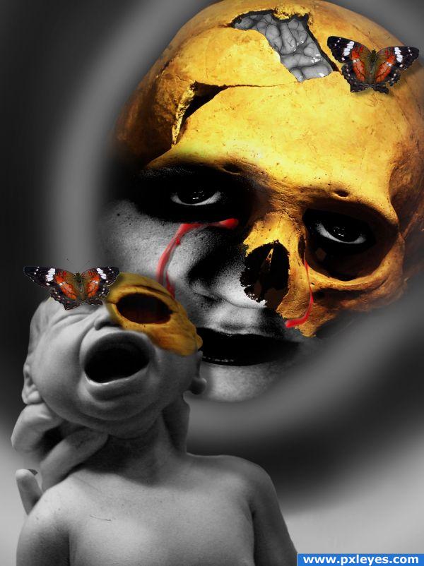
This is definitely one of the creepiest entries I've seen. Can I ask if the butterflies have a specific meaning, I can't seem to decide if I think they add to or detract from the overall effect...
just a suggest, maybe you can fix skull at the baby's head... 
:S fREAAAKYYYYYY!
Yup, this looks like a nightmare. I'm glad you added the butterflies, they make contrast with the gore and also might suggest the presence of hope. Butterflies come from maggots afterall.
greymval u understood me thanks.
Way too freaky and weird... so that means... I like it alot... awesome composition!
you can go to deviantart.com and under stock and resources, search for "human brain", here are a few specific links: http://da-requests.deviantart.com/art/Human-Brain-Stock-4667810 and http://absurdwordpreferred.deviantart.com/art/Brain-FREE-Transparent-PNG-130589663
this....is disturbing. wow nice work
this....is disturbing. wow nice work
spooky.. good job
Howdie stranger!
If you want to rate this picture or participate in this contest, just:
LOGIN HERE or REGISTER FOR FREE
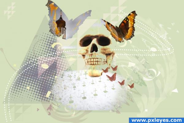
I have basically drew some geometrical forms, duplicated and scaled them, added a lot of swirls and stuff, and blended in the scull, church, graves and butterflies. (5 years and 3895 days ago)
There aren't a lot of these kinds of images on this website. It's more Creative Photoshop then Pxleyes. I like it a lot. Problem is that your first two sources aren't usable. Flickr has plenty of butterflies in their Objects for Layers group.
The first 2 sources are usable. Not sure what you're doing here author, but it won't get pulled for bad sources.
Yes, they should be usable, I checked that. But I didn't know about the layer stuff groups on flickr, so thanks for the tips!
downoffthedragon, why are the sources unusable???? This came directly from the source link given: "to Share — to copy, distribute and transmit the work...to Remix — to adapt the work...Attribution — You must attribute the work in the manner specified by the author or licensor (but not in any way that suggests that they endorse you or your use of the work). "
Interesting image, good luck.
I kinda like this!
I'm not sure about the significance of the tower, but I think your composition works well with how you combined the saturated colors with the pastels for emphasis.
Howdie stranger!
If you want to rate this picture or participate in this contest, just:
LOGIN HERE or REGISTER FOR FREE
Good image over all...minimal use of source...could even have been done without it.
thanks.
(...except for lions and coyotes) Just a suggestion, but why not put more of the tree source in the image? Another on the left somewhere would give your image more balance and less judged as minimal source. I was thinking it was minimal use too. I think your lions are a wee bit bright and the coyote, well it looks huge, considering where he is in the image.
Thanks for you comment. I was also thinking that something is missing. I ve added one more tree and worked a bit more on lions and wolf. It looks better now i think.
Lovely chop! Tiny details... the left lion's main fades into nothing instead of blending, and there are tiny little blends that could be done to make 100% integrated. Bits of shadow, blend between lines etc. every so slight. Great composition though! One thing... the wolf should be quite a bit smaller as it's off in the distance in the landscape. Great Mood!
very nice
I was going to say something about the lion's mane but didn't want to overwhelm you. You did a great job with the left tree. I was hoping you weren't going to make it look anything like the one on the right and you did well. Now just either bring the coyote closer or resize him, fix your slight blurred edges on the lion and I think you'll have a strong contender!
worked a bit more on lion and wolf. Hope it's better now
I think your chop was the best at step 8. Just step 8 is a powerful image. The animals and such just made it too much. The other tree on the left is good there though.
The coyote looks much better. The lion's main may need a wee bit more work but overall it's a good image now and I'd glad I could help. Good luck to you
beautiful,very good
very nice
And even congrats for a third place! That was a great week for you
Congrats! I thought it was a winner too
thanks jawshoewhah and thanks for your help on the entry
Howdie stranger!
If you want to rate this picture or participate in this contest, just:
LOGIN HERE or REGISTER FOR FREE