Photoshop Pictures: Death (page 8)


results 36 - 40 of 71

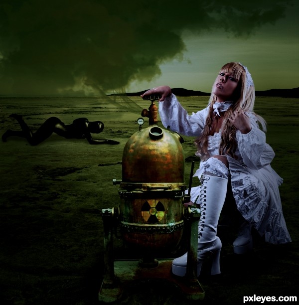
Death Becomes Her - created by solkee


Death Becomes Her
Favs: 0SBS: n/aHi-resRank: 5/16Score: 55.6% (15)10820 views

Never trust the seductive, innocent type as it could be the world's undoing.

Girl in white by tanit-isis-stock.
Girl in black by mjranum-stock.
Background by night-fate-stock.
Brass tank by spud.
Cloud brushes by redheadstock.
Smoke brushes by falln-brushes.
Toxic symbol and shadows were drawn in photoshop. Also girl in white's hand was manipulated so that she was grabbing the tap and the gauge was altered to read higher pressure. (5 years and 3246 days ago)

6 Sources:

avatar nilknarfsoive

is this lady gaga? lol... good job for this!

avatar Toothpick134

Mmmm spooky I like it GL

no avatar

Nice work.

At first sight i tought you made the machine from the given source, but when i checked sources i noticed u did not. So thats a complement on finding the right source.

First i'd like to say that personally i'd like to see the given image to be chopped to be used a little more, but that is personally.

I got a few things that might ( in my eyes ) need changes.

I think the girl in white, still is too much white.
The light source on the girl comes from the left and right hand side,
while on the machine, looks like comes more from top and front side.

For the person in the back ( i do not think it adds much to the image, but that is personal again) might need a color layer on the top of the person.
Also for the shadow u might want to duplicate the layer and give both layers a mask, then blur or stretch the 2nd layer.

These are just my ideas of improvements, and you can ofcourse disagree.
See this as help only and not as, someone trying to see only the bad things.

The idea is to help you get the most out of it.

Good luck in the competition.

avatar Syntek
Syntek says:

It may be my monitor, but I find it a bit too dark.

But from what I see you did a good job with your sources. Maybe a stain or two on the woman's white clothes may help to integrate her more in the image.

avatar erathion
erathion says:

Very nice work author...great source find too...u made super cool composition here...best of luck

author says:

Thanks for the suggestions, but due to the holiday break I never had time to get back to this.

Howdie stranger!
If you want to rate this picture or participate in this contest, just:

LOGIN HERE or REGISTER FOR FREE


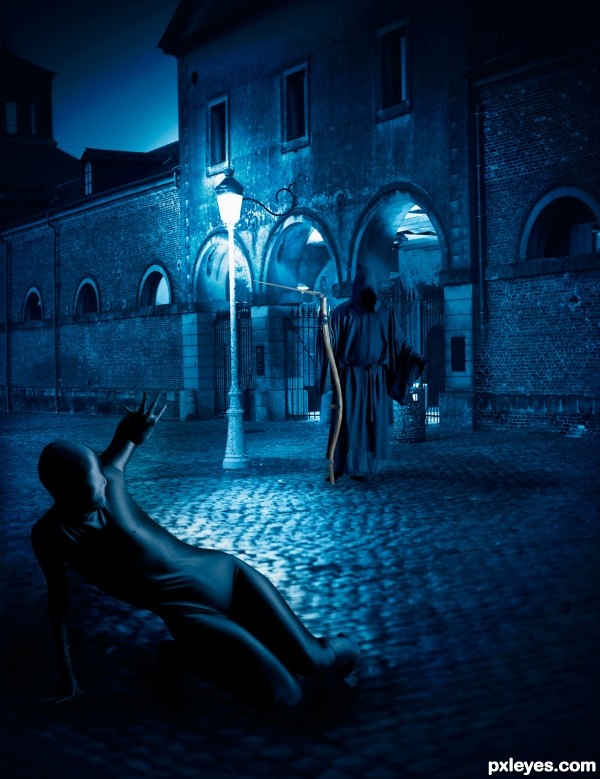
Death messenger - created by AdhirAnimator


Death messenger
Favs: 2SBS: n/aHi-resRank: 8/16Score: 56.9% (0)7443 views

Special thanks to mjranum for providing Zentai and The Grim Weedwhacker stock. (5 years and 3250 days ago)

3 Sources:

avatar ChristianDarmali

Great image,my friend....I like the concept and color. But IMO, the picture of the owl is less so in contrast with the color of its surroundings. So at first glance, people do not immediately recognize the existence of these owls. GL.

author says:

Thank you for your valuable feedback my dear friend.

I have updated the image!

avatar jawshoewhah
jawshoewhah [banned] says:

Wow!! my fav!!!!! GL!

avatar LEEBAOREN
LEEBAOREN says:

where is the owl?

author says:

@jawshoewhah: Thanks a ton for such a wonderful comments and fav.

@BAOREN: I removed the Owl as it was not too speaking to recognize its existence at first glance.

avatar erathion
erathion says:

great job...Latex girl.....RUN....he is coming...well done author

author says:

Thank you Nebojsa

Howdie stranger!
If you want to rate this picture or participate in this contest, just:

LOGIN HERE or REGISTER FOR FREE


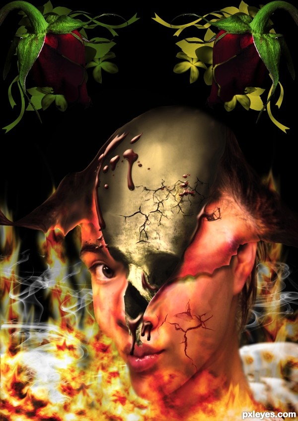
death rose face - created by andi


death rose face
Favs: 2SBS: n/aHi-resRank: 16/16Score: 52.7% (0)9361 views

(5 years and 3273 days ago)

7 Sources:

avatar jawshoewhah
jawshoewhah [banned] says:

I LOVE IT!!!!! and I'm happy to give it my highest approving comment:


---WICKED-COOL!!!---


Not that you need it much but GL!

avatar jawshoewhah
jawshoewhah [banned] says:

BTW, welcome to PXL!

avatar MossyB
MossyB says:

Disturbing, but very creative! The jaw is too warped and the LH side of the "flames" is a bit too high contrast, fighting the image for dominance, but the overall concept is wonderful.

avatar greymval
greymval says:

I'm glad that people like it, I don't No offence man, but there's just too much going on.
I get the skull breaking through her head skin, and the blood and the flames. But why do you need cigare smoke over the fire and 2 of the same rose on top?

Howdie stranger!
If you want to rate this picture or participate in this contest, just:

LOGIN HERE or REGISTER FOR FREE


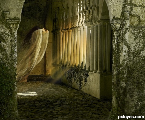
Like A Moth - created by arca


Like A Moth
Favs: 10SBS: 4Hi-resRank: 2/16Score: 62.1% (30)17201 views

Lady is from Marcus Ranum (www.ranum.com).

All other images used are my own (see SBS step 1, 2 & 3). Brush for ivy is the default "Ivy" brush in Photoshop.

I wrote a poem while I was creating the image to go with it. But as it is quite long I put it in the SBS Step 3 so you did not have to scroll through it to get to the next entry ;-).

NOTE: Source 2 is a "mature content" image on deviantart. SBS does not show this image. (5 years and 3281 days ago)

3 Sources:

avatar pearlie
pearlie says:

Wow, that's a cool poem, and you did really well depicting its message!

avatar ponti55
ponti55 says:

Amazing.. fantastic work with the colours. Wow.

avatar Akassa
Akassa says:

Very good scene, great blending and color balance!

avatar Christy
Christy says:

Your technique is hard to hide I look forward to seeing your work each week author....You never disappoint Best of Luck

avatar craigers
craigers says:

nice feel, like the lion, ...and others!

avatar hereisanoop

wonderfull mood.., good luck author...

avatar JPDesigns
JPDesigns says:

Beautiful creation! Great talent, author!

avatar Siddhartha

i like it !!! awsome

avatar swordfish
swordfish says:

BEAUTIFUL.........

author says:

Thank you all for the wonderful comments! And the favs ... I was not sure if this image would come across right.

avatar spaceranger

Lovely ethereal quality! Fine work!

avatar CorneliaMladenova

Spooky atmosphere and lovely pastel colors

avatar Lelaina
Lelaina says:

Congrats for your second place, Arca!

avatar JPDesigns
JPDesigns says:

Congrats, very beautiful piece

avatar erathion
erathion says:

Congrats...

avatar spaceranger

Congrats!! Lovely as always!

Howdie stranger!
If you want to rate this picture or participate in this contest, just:

LOGIN HERE or REGISTER FOR FREE


Close To Death - created by Geexman


Close To Death
Favs: 1SBS: 6Hi-resRank: 4/16Score: 58.2% (20)8853 views

Will add text to SBS images,sorry short on time (5 years and 3332 days ago)

2 Sources:

avatar Ressiv
Ressiv says:

Good idea. The clowd perspective is wrong, it looks like they are going down and touch the surface. Also the skeleton is to bright on the viewers side, since you've got a very dark shadow on the surface, the skeleton's own shadow should be the same darkness. Nice bird creation! Gl

author says:

Thanks Ressiv, valid points! I`ve changed the whole sky to something more fitting and shaded the lower parts of the carcass a little more

avatar erikuri
erikuri says:

Very dramatic and touching. I like it...

avatar greymval
greymval says:

I like how you assembled the picture from parts of the original, it's an impressive work. The thing is that the colourfull sky creates a too strong of an entity that puts the foreground on second place, therefore nomatter how many details you place on the eagle and the carcase, the prime colours (sky) that take 40% of the picture will make those fade away,

You could either make the sky only 10-20% of the pic, or making the eagle and skeleton overlaping it, or.. using the sky in the original pic: the grey purple one.

avatar EmiK
EmiK says:

Excellent work, I would only make the sun a tad brighter - just a thought.

avatar erathion
erathion says:

Great transformation author...well done

Howdie stranger!
If you want to rate this picture or participate in this contest, just:

LOGIN HERE or REGISTER FOR FREE