(5 years and 2615 days ago)
(5 years and 2841 days ago)
very compressed (considering how HUGE they are  )
)
Thanks, I think I should have made the head smaller, now that I look at it again.
Impressive work here very good job blending this. Nice results.
Why thank you Ichappell.
great !
Thank you
Well done author. It looks good
Glad you like it, thanks.
yes i like it...... well done ! .The contest is about making animals compact ,i think if all the participants would leave the 4 legs it would look more realistic.
I debated that, so I made some entries with two and four, and I can't decide which I like better, but you are right, four makes them look more realistic. Thanks for the comment.
Very realistic author. Good job! Good luck!
Thank you.
Howdie stranger!
If you want to rate this picture or participate in this contest, just:
LOGIN HERE or REGISTER FOR FREE
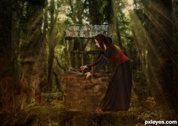
I used two outside sources from artists off of deviant art. With the exception of the source images all other pictures were my stock. (5 years and 2972 days ago)
I really like the composition, author...just wish the woman fit into environment better. Perhaps the lighting on her doesn't match the lighting in the forest. If you adjust this, it might place her there better. 
Howdie stranger!
If you want to rate this picture or participate in this contest, just:
LOGIN HERE or REGISTER FOR FREE
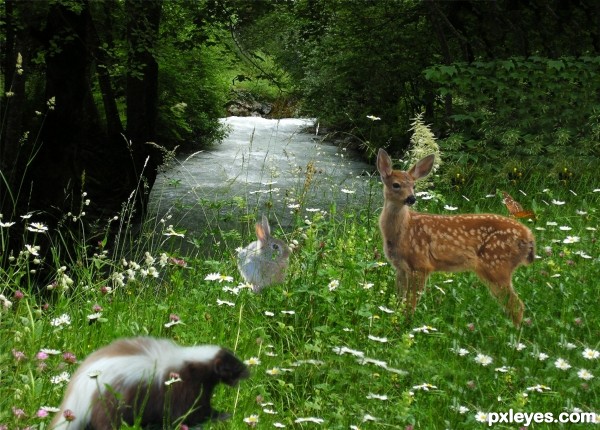
Reference: http://animals.timduru.org/dirlist/deers/Animation-Bambi2-YoungDeer-Skunk-Chipmunk-Butterfly.jpg
The butterfly and background are my own pictures. Unedited originals are in SBS. (5 years and 3254 days ago)
The lighting and focus of all three animals looks very inconsistent with the rest of the picture. The skunk is far too blurry and is lit from the top. The rabbit is far too sharp and is lit from the side. The deer is only slightly blurry, but is lit from the back and top right subtly, but too dim for the field...
The bunny also appears to be levitating above the ground, rather than nestled into the greenery...
This is a nice concept, but needs some adjustment.
You can call me FLOWER!
Howdie stranger!
If you want to rate this picture or participate in this contest, just:
LOGIN HERE or REGISTER FOR FREE
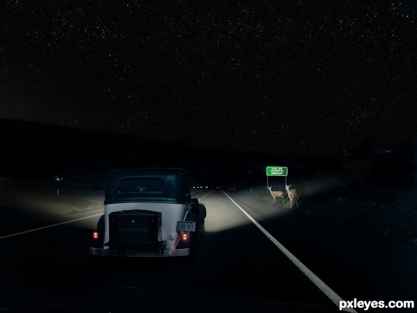
All photos are mine except the road sign. Thanks to AllWork on flickr for that. (5 years and 3356 days ago)
speed limit enforced by aircraft (Oh crud).. hehehe.. great idea author.. wonderful use of your own images 
High res looks good, and the sign adds a good touch of humor...GL author! 
Excellent work, very good technique!
Incredible work ... love the whole composition! Agree about the sign ... great touch there!!! In high res I can see the people from the original image in the car window. Not a big deal but IMO it would look better if they weren't there and would make this a top scoring entry for me!
Thanks for your comments! Great observation, arca!
Edit: I removed the faint pedestrians from the windshield. Can't believe I didn't catch that!
Didn't mean to be too nitpicky ... It was just when I looked at it in Hi res and clicked to enlarge the image it opened with the window right in my face ... I doubt I would have noticed it otherwise. Just a fluke and of course once I saw it I couldn't un-see it. I really debated even saying anything but it was such a great image that thought it should be perfect! Now it is! High marks from me! 
Fantastic work author...Great hit in the center of the contest goal...small nit pick...car is a bit more on a right side of the road then on left, so light from the car had to be a bit wider on right side...Now they are equal or even wider on left side...This is minor suggestion author,cause image is perfect and all elements are maintained perfectly...best of luck
great one!
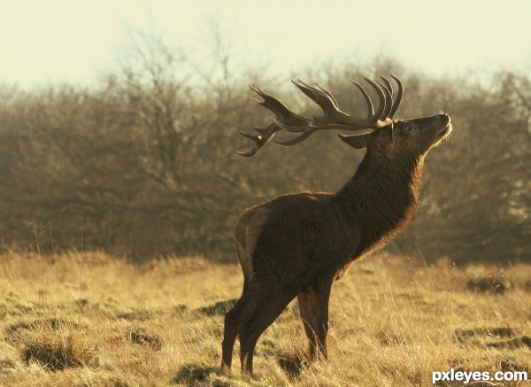
Great concept for this, and really nice exectution - I guess the former owner of this antique is still in control of it - I'd be as freaked out as the deer! 
Bravo and well done, convincing result for sure! Good luck!
it looks so real!  great image!
Pretty good work here. gl.
congrats on the 3rd place
thank you
congratulations...
Congrats!!
congratulations...
Congrats!!
Congrats man.... 
Howdie stranger!
If you want to rate this picture or participate in this contest, just:
LOGIN HERE or REGISTER FOR FREE
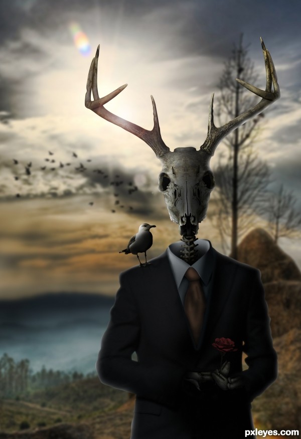
Might be good to get rid of the white line at right of the skull & blur out some of the noisy artifacts on the shirt. Otherwise it's a well made image. GL author.
The suit and shirt have been fixed. Thanks for the advice!
Nice image, i like the coloring. It would be nice if you could correct the shadow of the seagull. The shadows on the seagull itself and the skull suggest the light is coming from the left. Light from the back would never create such a shadow on a vertical plane.
Thanks, I will work on it.
EDIT: I changed the shadow cast from the bird. I also added more shadow to the skull the bird and the spine. and created bones for the hands that look like deer feet. I did this the same way I created the spine.
Good edit. It's much better now.
Thanks. I agree. Thanks for the advice!
PS: Author, you did a lovely job with the noise problem on the shirt, and the title change rocks!
Thank you and thanks for the advice you gave.
Amazing
Thanks! I love your work by the way.
awesome !! you simply have to win. Good luck !
Thank you!
Congrats, Terry!
Thanks Bob!
Howdie stranger!
If you want to rate this picture or participate in this contest, just:
LOGIN HERE or REGISTER FOR FREE