(5 years and 2999 days ago)
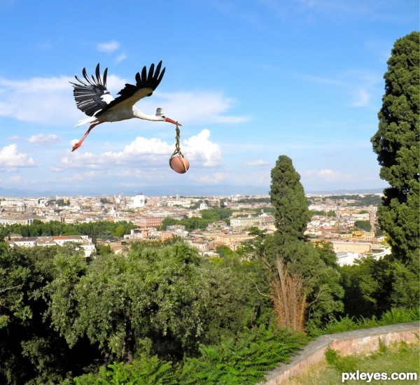
The "chicken" delivery service ! (5 years and 3001 days ago)
looks good on high res , i think it would have more impact if the stork is closer
good luck 
As gornats said the image would pop more if it was closer by but this is a great take on the source image, i think its funny and altho a cliche its still original i think. Another few things that wll improve it is the edge of the stork, theres a darkline on the stork on top of the neck towards the wings. the back of the wings doesnt look so nice this way perhaps you can draw/smudge with a fine brush the feathers a little back, to make it look more natural. i know it looks on the original the same but with the original background it doesnt pop so much and blends in well.
I was in Vocational Agriculture in high school. We had about 50 laying hens and when they layed, it was very noisy and sounded especially painful. I bet that they wished that it would happen this way! Well, upon further consideration, it would be nice if it worked this way for everyone!
ill sign for that downoffthedragon!
Thanks for all the comments, and i realy appreciate the time you have taken to leave the comment; So i can improve the image quality overall. Also thanks for telling and sharing the story it calls upon you. It means alot to me.
For the image, I totaly agree with the (lazy) cutout of the stork. When making the image i was tired ( but no excuse ). At the moment i can not find any time to improve on the image. I am sorry for this, but thats the way things are.
I just had to reply and give you people a big thank you.
So once again, Thanks for the great comments.
Howdie stranger!
If you want to rate this picture or participate in this contest, just:
LOGIN HERE or REGISTER FOR FREE
(5 years and 3009 days ago)
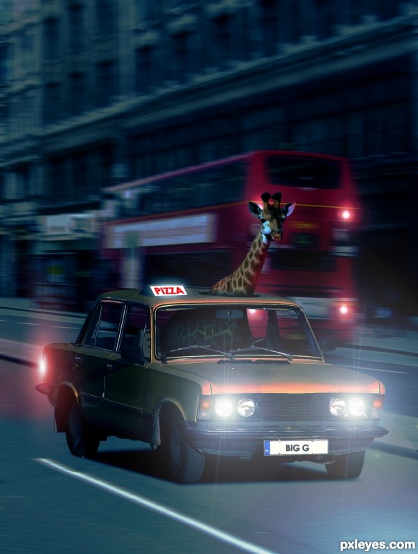
right into my favs, I had a simulair idea but not with a pizzaboy  great job
  ill try something else now
Thanks Eladine! 
Good blend & very funny! 
LOL love it!!
instant fav!!.
I LOVE GIRAFFES! great thinking!
great job with the lights
Gratz well earned!
congratulations
Howdie stranger!
If you want to rate this picture or participate in this contest, just:
LOGIN HERE or REGISTER FOR FREE
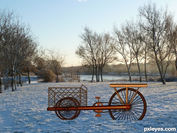
Spec Thanks to CorneliaMladenova for use of this picture found in member stock on PXLEyes.com & in cork& country album (5 years and 3296 days ago)
Interesting work...IMHO would be better with some other background..maybe a bit more dynamic instead of this one...GL author
Hey Thanks erathion Here's a different backround Any better?
Edit.......... pixelkid Thanks I did a remake couldn't get it in I darken it like you said looked better but I was to late
You did really nice work on the bike...using the source the way that you did...seems that it was very time consuming. However it looks slightly out of place on that background. It kind of looks like an illustration on an actual photo. Perhaps if you darken the entire bike and have the shadow follow the shadows on the trees...this might help. Nice work nonetheless! 
Interesting idea and many thanks for choosing my stock 
Howdie stranger!
If you want to rate this picture or participate in this contest, just:
LOGIN HERE or REGISTER FOR FREE
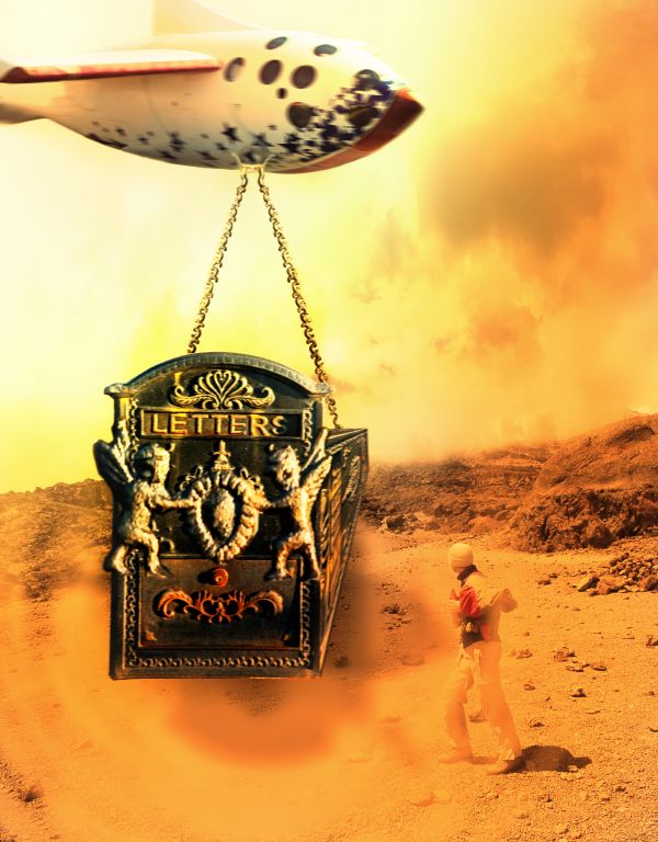
I used three external sources
Thanks to
http://www.sxc.hu/photo/152443
Author: cellulaer
http://www.sxc.hu/photo/1067049
Author: zatrokz
and
http://www.cgtextures.com/texview.php?id=28811&PHPSESSID=8bb0502a67afb075865d871e74e67cc8
Modified the shadows (5 years and 3704 days ago)
good idea....
The colors are nice, but the shadows don work for me. Right now they make the image flat, not sure if that's what you want. Good luck!
Fix up your shadows, maybe add some blur to them and play around to see where they would fall exactly  GL
GL
Thanks for your comments. I fixed up the shadows and added blur to them (still I have doubt whether it in the right place or not) 

It was better before editing...now is to much bluer at some parts....
The blend doesnt look very good....but a nice try....
Could have been much better blended.
very nice 
Howdie stranger!
If you want to rate this picture or participate in this contest, just:
LOGIN HERE or REGISTER FOR FREE
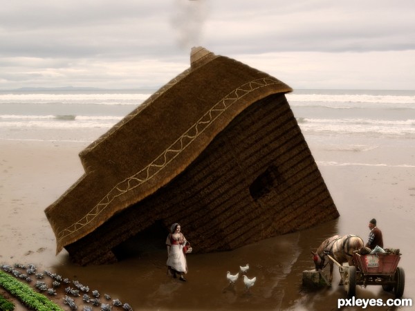
I like your reflections.
Howdie stranger!
If you want to rate this picture or participate in this contest, just:
LOGIN HERE or REGISTER FOR FREE