(5 years and 3148 days ago)

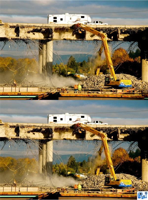
(7) differences.....used personal image (5 years and 3775 days ago)
Howdie stranger!
If you want to rate this picture or participate in this contest, just:
LOGIN HERE or REGISTER FOR FREE

Illustrator and Photoshop.
Brushes were taken out... (5 years and 3791 days ago)
looking gr8
Awesome job. 
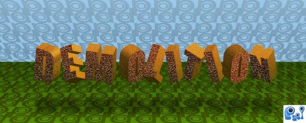
Sorry...no brushes allowed! You used a brush to make the grass and the rules state that brushes are taboo! It's a cool image however!!!
Why the word "demolition"? Why not "hovering, floating, suspended".
Jawshoewhah, it isn't the original entry. It was not supposed to be floating, but I had to take the brushes out (see the SBS) 
even thou you had to remove your brush work, image still looks good.
good 
Howdie stranger!
If you want to rate this picture or participate in this contest, just:
LOGIN HERE or REGISTER FOR FREE
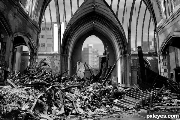
You should tear out a section of the roof ribbing - it looks too "perfect" for all the debris on the bottom.
Wow! Very convincing! Well done.
You might consider taking out some of the ceiling ribbing. to better match all the destruction and rubble. The roof is still too "perfect" looking.
Nice Blend Author.. Good Luck!
Good job; looks convincing (may be you could flip the background so it matches the direction of light on the church).
Good job, well blended (May be you can flip the background to match the lighting direction).
Well done, believable result. Nitpick would be that the background buildings get their light from the opposite compared to the foreground, but that would be a matter of flipping. The mess in front fits well, nice masking. Good luck!
Wow, good idea and lots of tedious work here, nice chopping (literally)!
Howdie stranger!
If you want to rate this picture or participate in this contest, just:
LOGIN HERE or REGISTER FOR FREE