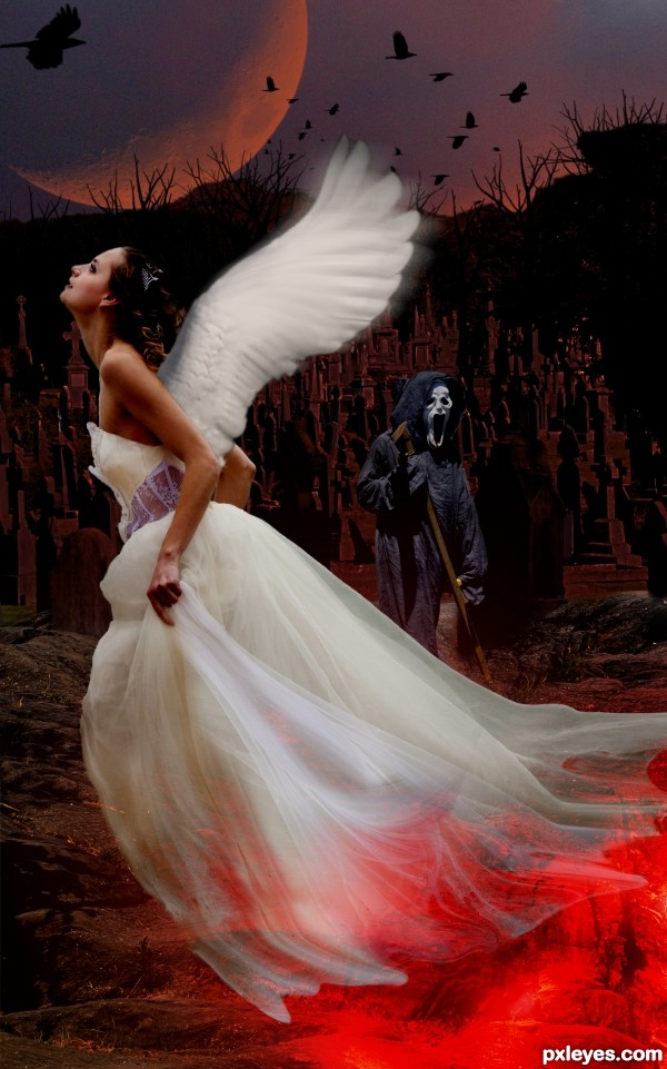
Thanks Norberto Lauria,Taiga.fesoj,asifthebes.yourdon,William Murphy (5 years and 3426 days ago)
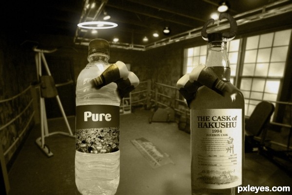
(5 years and 3427 days ago)
haha.. great idea GL..
Not a bad idea.The bottles are a bit distorted though and IMO,it would look better if the two bottles were on the ground with proper shadows than just levitating in the foreground. The horns on the bad bottle are very nice. GL ! 
nice idea
very nice idea author...gl
Howdie stranger!
If you want to rate this picture or participate in this contest, just:
LOGIN HERE or REGISTER FOR FREE
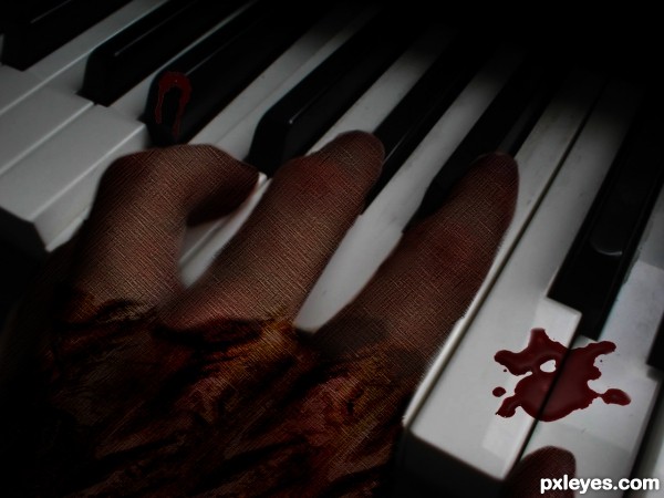
(5 years and 3533 days ago)
Why are all these piano player entries slathered in tomato sauce?
You need to work on the keys. They're extremely distorted and two of them are welded together. IMHO, this would be much better if you just used the original position of the hand and texturized it, rather than having to do so much smudging on the keys.
@ gamemastertips thanks for your suggestions i'll defiantly change it
@ gamemastertips i have made changes as u suggested
If I were you, I'd remove the "noise" on the hand. IMO.
The downside of the drip looks a bit blurred..
GL
@eriikuri thanks 4 ur advice i'll look through it...!!
@nickk thanks
@erikuri i have made changes
good idea....well i mean "bad" idea, get it? just kidding
@tuckinator thanks
Howdie stranger!
If you want to rate this picture or participate in this contest, just:
LOGIN HERE or REGISTER FOR FREE
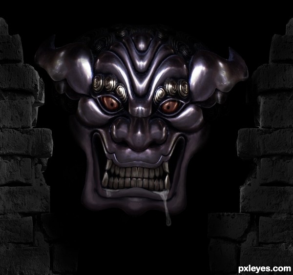
I had a couple of ideas to start this, but as it progressed, I thought of this final image as somewhat akin to a new style comic book. Thanks to mzacha @ SXC for the source. (5 years and 3578 days ago)
Great image.. very eerie.
Thanks Ponti, I guess it was my mood coming off a 54hr work week...lol!
Poor guy, looks sad and imprisoned 
He's just hungry 
Howdie stranger!
If you want to rate this picture or participate in this contest, just:
LOGIN HERE or REGISTER FOR FREE
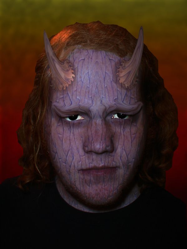
Made my brother show his true colors! I did this with elements so I did my best to make the cracks fit the face if anyone has a suggestion on how to do that in Photoshop Elements better let me know, I wish I had that sweet mapping buisness you fancy full version people have! (5 years and 3714 days ago)
Looks constipated...
What good are brothers if you can't play with them as subjects?  Lots of good ideas in the SBS, but the limits of Elements may have held you back, although using regular Photoshop would still have been a challenge. The cracks are a bit flat, not matching the contours of the face. You liquified features that warranted restructuring, but unfortunately the results look like liquification. The edge between the hair and the background is too hard (maybe an Elements limitation).
lol...
Nice.....
Howdie stranger!
If you want to rate this picture or participate in this contest, just:
LOGIN HERE or REGISTER FOR FREE
Howdie stranger!
If you want to rate this picture or participate in this contest, just:
LOGIN HERE or REGISTER FOR FREE