Photoshop Pictures: Desert (page 10)


results 46 - 50 of 111

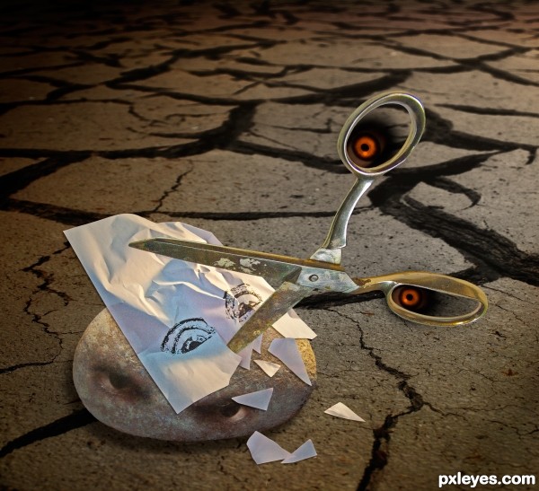
rock-paper-scissors - created by rsguetre


rock-paper-scissors
Favs: 1SBS: 4Hi-resRank: 4/8Score: 64% (20)22462 views

Photoshop montage with some photos of my own and some extra stuff borrowed. Scissors and rock are my photos, I printed a drawing of fearful eyes on a piece of copy paper, crumpled it and cut it up a bit before photographing it for this composition. Put it all together in photoshop and added the background and the rock's eyes. The scissor's eyes are added with the airbrush tool, lighting effects added, drop shadows, etc. (5 years and 2935 days ago)

2 Sources:

avatar Drivenslush

SUPER JOB, but author you must place your RAW PHOTOS in the SBS.. go to MY STUFF, MY CONTEST ENTRIES and enter the uncut source photos there... GOOD LUCK!!

avatar MossyB
MossyB says:

Very imaginative, and technically well done!

Howdie stranger!
If you want to rate this picture or participate in this contest, just:

LOGIN HERE or REGISTER FOR FREE


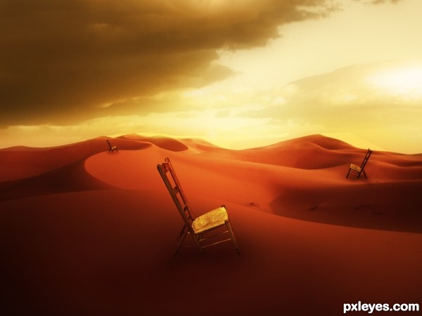
Desert manipulation - created by AdhirAnimator


Desert manipulation
Favs: 3SBS: n/aHi-resRank: 8/8Score: 63.2% (0)8636 views

Desert manipulation, thanks to -

ipxstudios (5 years and 2942 days ago)

3 Sources:

no avatar

surreal images are wonderful part of artistic creations and this is no exception... nice entry

avatar jordyponce

I like the mood and the idea author..GL

avatar rodrigo73
rodrigo73 says:

The context of image is awesome. Great Work

avatar CMYK46
CMYK46 says:

Not bad, but the hi-res image isn't any bigger.

avatar DanielaOwergoor

I loved the work in general, the colors and surrealism. Well done!

author says:

Thank you for your feeback.

@ CMYK46: I have low bandwidth internet hence I upload low resolution image.

Howdie stranger!
If you want to rate this picture or participate in this contest, just:

LOGIN HERE or REGISTER FOR FREE


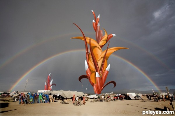
Desert Anomaly - created by pingenvy


Desert Anomaly
Favs: 1SBS: 13Hi-resRank: 4/8Score: 64.9% (24)13773 views

Thanks for creative commons useage from Washington & Jefferson College >>>>>>http://capl.washjeff.edu/browseresults.php?langID=3&photoID=304&size=l

and from john curley>>>>http://www.fotopedia.com/items/flickr-1309235895
(5 years and 2951 days ago)

2 Sources:

avatar Drivenslush

Very Burning Man good luck author

avatar CMYK46
CMYK46 says:

Nice color work on the object. Blends nicely with your great find for a background source.

no avatar

very interesting and creative work .. GL

avatar pearlie
pearlie says:

Interesting how/why the background shot has the sides skewed inwards. Very nice work on your 'anomaly' - the folks in the background appear puzzled by it, great find and chop!

Howdie stranger!
If you want to rate this picture or participate in this contest, just:

LOGIN HERE or REGISTER FOR FREE


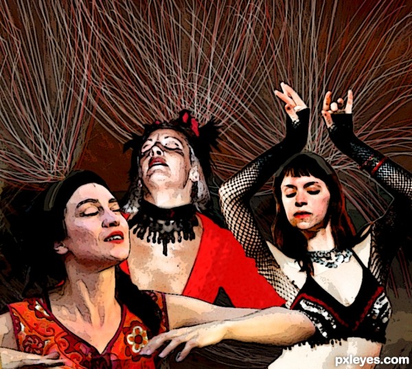
Desert Dancers - created by MGladden


Desert Dancers
Favs: 0SBS: n/aHi-resRank: 6/8Score: 56.7% (0)14973 views

Poster Edge filer
Watercolor filter
Basic round fan paintbrush
Match color
Blur
etc. (5 years and 2985 days ago)

3 Sources:

avatar MossyB
MossyB says:

Great concept, but a bit too heavy on the filter effects, especially the poster edges. You might try painting the dark artifacts out a bit more.

no avatar
bryonics says:

I really like it! At first glance I though it was from one source because it blends so well. nice job

author says:

Yeah I definitely overdid it with filter effects haha.
I spent too much time on trying to get the different levels of photo quality to match up and used filters as a way out. But hey, not bad for a first entry.
And thanks, Bryonics!

avatar Drivenslush

When images like this are taken to a printer (with proper resolution) a giant banner comes out super great.. good luck author.. nice image (looks like a History Channel Episode)

Howdie stranger!
If you want to rate this picture or participate in this contest, just:

LOGIN HERE or REGISTER FOR FREE


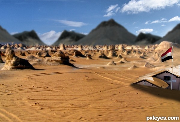
desert - created by maozbd


desert
Favs: 0SBS: 4Hi-resRank: 8/8Score: 55.4% (0)4689 views

(5 years and 3018 days ago)

3 Sources:

avatar MossyB
MossyB says:

The blurry background really hurts this image, because the distand mountains are in sharper focus than the blurred midground...
Also, the edges of the cut out contest source are too hard, and do not blend at all with the desert scene.

avatar aheman
aheman says:

the focus-thing is not done properly...

suggest:
1) clone some sand at bottom of hut
2) soften all edges of the mountains-peaks
3) make only ONE focal object (either the hut or the house on the right)

composition of image ... (don't be angry) ... lacks "wow" and "ooh"

author says:

thank you very much for the suggestions

avatar MossyB
MossyB says:

The focus looks better, and the composition is improved by getting rid of the small building. Now, you should re-color the snow on the roof to look like sand, then the building would look "buried."

author says:

thank you very much mossy
does it look better now?

avatar MossyB
MossyB says:

Good job of blending the snow into the sand. Big improvement from your original image!

avatar Derivatix
Derivatix says:

I don't see any blending of the snow, just replacement. First of all, I'd like to say that I find the idea very good. Your image does not look real, though. The house in the foreground is sharp, right behind it the ground starts to be out of focus, gives it kind of a miniature look. There are parts in focus still, for example, the first rock on the left. The tipp is out of focus, the bottom is IN focus. And there are parts in the middle that are in focus. The background mountains are way out of focus, yet the sky is in focus. You see what I mean? It just does not look real.

avatar aheman
aheman says:

.... the dark mountains don't look right.

if you like, you can change the color to dark brown or something

Howdie stranger!
If you want to rate this picture or participate in this contest, just:

LOGIN HERE or REGISTER FOR FREE