(5 years and 3496 days ago)
(5 years and 3496 days ago)
forgive me if I`m mistaken but I cant see the broken branch image, the idea is to incorporate the source image provided 
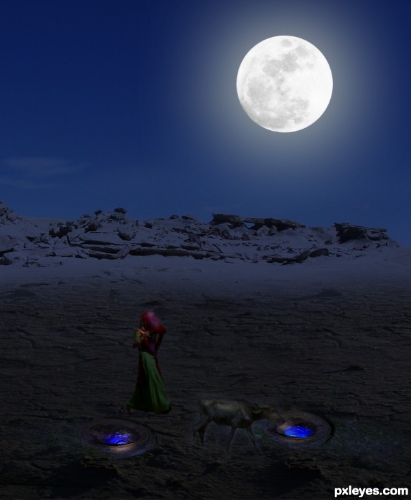
Look better  It's dark out there... Holes and surrounding are from the source image.
Not bad, but it looks like that most elements in the image receive light from the right side. Therefore I think it would be more logic that the moon would be placed more in the right corner too (for being the biggest lightsource). Good luck!
Sorry,,, but,,,, one SBS would be good.... I can't see the broken branch image too.
Howdie stranger!
If you want to rate this picture or participate in this contest, just:
LOGIN HERE or REGISTER FOR FREE
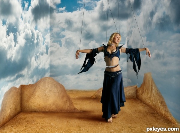
Thanks to ba1969 at SCX for the dirt texture, Mjranum at DeviantArt for the Dancer and to mqtrf for the sky image
Hope you enjoy it (5 years and 3501 days ago)
Nice job on the puppet and I really like the backgorund
Good idea and well executed!
excellent work ,good luck
I really appreciate the details on this. Also great idea for the background. Good luck!
Beautiful work, and nice effects with the background! 
Simple, but excellently executed as always.  The mountains are really well drawn...good luck, author!
Very nice job...., 
very nice work!
Wow! I'm sorry this didn't place in the top three. I think it really deserved it.
Howdie stranger!
If you want to rate this picture or participate in this contest, just:
LOGIN HERE or REGISTER FOR FREE
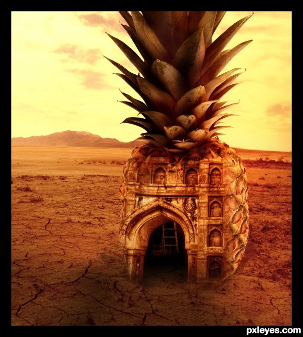
Sunset shot of an abandoned building in a desert. (5 years and 3513 days ago)
very nice work,great coloring...only thing that is wrong is shadow...light is come directly from the back of the pineapple,so shadow have to be in front...fix that author,this work is great...best of luck
Thanks Erathion 

Corrected the shadow.
Nice entry!
Tropical pineapple as a building form in the desert is an interesting concept. I'm afraid I'm going have to disagree with erathion, however. The light in Source 1 seems to be coming from the front more or less and the pineapple is lit similarly (as is still evidenced in the highlights in the leafy crown of your current entry). SBS Step 5 has good lighting to my mind, but nevertheless has some other problems: Pineapple shadow needs to be sharp, not vague, consistent with harsh desert light. Doorway arch needs both right and left sides. Similarly, faux right-side window arches require faux left-side window arches. (My solution would be no faux window arches.) Make the lighting more dramatic like your current entry (but without letting the pineapple blend into the background and without the black border). I think the interior ladder should be moved to the right so it's only partially visible -- or maybe just delete it as it seems kind of unnecessary without more interior light.
Thanks everyone.
Have made few corrections/changes. Hope it is fine now 
Very nice image author. Like it 
very cool!
Good image
Good one
thats really good art
love it..... interesting job....gl
Congrats for the 4th place
Howdie stranger!
If you want to rate this picture or participate in this contest, just:
LOGIN HERE or REGISTER FOR FREE
Tosaporn Boonyarangkul-http://www.sxc.hu/profile/tung072
Julia Starr-http://www.sxc.hu/profile/night_fate
Petr Kovar-http://www.sxc.hu/profile/kovik
Heitor Jose-http://www.sxc.hu/profile/tchor1974
Thanks guys for the great resources... (5 years and 3513 days ago)
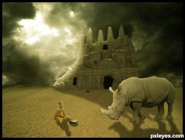
Even gathering so different images, everything looks so peaceful. I am fan of this coloring... nice mood! 
nice effect .......... 
very nice work!
w0w! amazing sweetheART fave ;} happy hippy hugglez
Howdie stranger!
If you want to rate this picture or participate in this contest, just:
LOGIN HERE or REGISTER FOR FREE
an accompanying step by step would really help advance your votes author.. something to think about.. this is a very pretty image and a SBS helps peeps see how the work was done
good luck
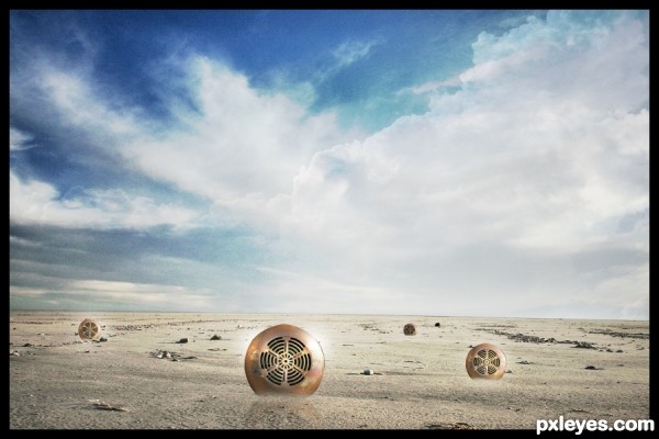
Very interesting. Although I usually question borders, given the brightness of the image, the modest black edging makes it stand out more against the standard white pxleyes background. The blending of the two cloud sources in the center seems odd, however. The bright glints on the vents would seem to suggest strong shadows, not nonexistent ones. A hi-res version would be nice. The front vent actually seems like it might have a reflection which is weird (made more so when none of the other vents evince one).
Howdie stranger!
If you want to rate this picture or participate in this contest, just:
LOGIN HERE or REGISTER FOR FREE