(5 years and 3485 days ago)
- 1: source1
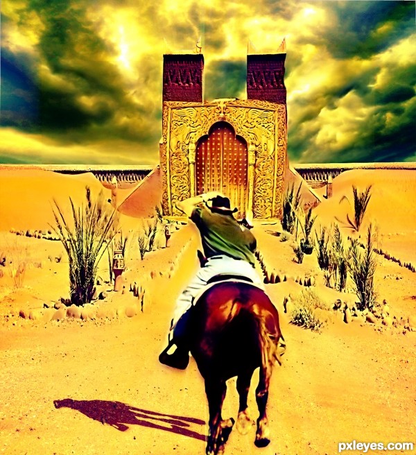
This cowboy finally found out the treasure of the desert after a long journey. He is rushing to the treasure which was hid behind the golden door, but what is waiting for him after that? next expisode? XD
besides, thanks for all the sources which inspired me alot (5 years and 3495 days ago)
Good job..!!
It’s a nice idea, the main door is a good source choice but could do with some refinement
Mostly the edges. And the shadow for the Horse & Rider is to small IMO and facing in the wrong direction, if you refer back to the original source (stone border) you will see what direction your shadow should be…..
very interestng
Nice. Love the sunny mood! 
Howdie stranger!
If you want to rate this picture or participate in this contest, just:
LOGIN HERE or REGISTER FOR FREE
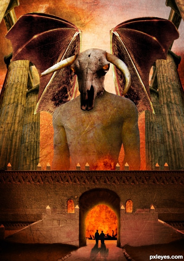
Thanks to Tilemahos Efthimiadis, Joyrex, Dave Hamster, Scallop Holden, Zeusandhera, Night_fate, Thomasje, Iversonic and Mimiliz for the lovely stock images ;-)
I found the inspiration for this work in a photoshop magazine of a friend. The name of the artist who describes a tutorial of something similar to this one is Adam Smith. Thx ;-)
comments are most welcome... (5 years and 3496 days ago)
Dunno why the wings are transparent, but it's a good idea & mood. IMO a bit texture heavy, but that's just me...good luck. 
Thx Cmyk46, i'm going to leave it like that for now  but like i said, comments are welcome. I spend a lot of time on this one
woohoo, love it author  its out there for sure :p
The scale is fantastic.. you can really tell you spent a while working with this one. I personally don;t like using textures much but i think you used them very well on this occasion. The silhouettes are a nice touch, but the building should cast the same strong shadows as they do.
Great overall work  Good luck!
Pretty nice scale on the things. But I would make the wings a lot bigger and work with the edges of the wings, as well as making them non-transparent. Could add some bones/veins or something on them to make them more realistic. They look pretty much cut/copy/paste/too big pencil when cleaning the edges now. Or you could try inner shadow effect for the wings. There are also some bit careless masking of the edges. Work with the windows and there is a major left-over from a colour mask on the right edge of middle part.. some dark trash there. Nice colours and eye sockets, worth working a bit more..
Very nice entry, that reminds me an illustration about mythic creatures. GL!
wow, awesome!
Thx Widiar, i will do something about those problems 
Good job with the wings, looking so much better now..
Thx for the nice comments 
great concept author...good luck
Thx 
Wish nobody to get to that gates 
Yep, it won't be a lot of fun 
Howdie stranger!
If you want to rate this picture or participate in this contest, just:
LOGIN HERE or REGISTER FOR FREE
Spec Thanks to AL Hikes AZ
for use of his picture found on Flickr photo sharing.com
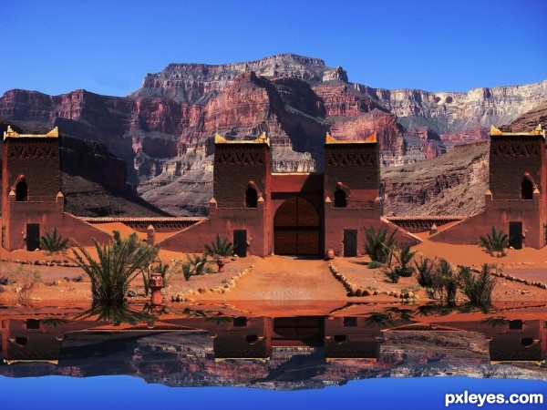
Water reflection done with vm natural called lakeside reflection.
Thanks to Tapiona for suggesting source picture for contest. (5 years and 3499 days ago)
gud job...nice idea...!!!
gud job...nice idea...!!!
cool idea the reflection is too distorted though
Ok Thanks guys I took the blur out I thought their was supposed to be a slight blur on reflections. I also took the bend of buildings in reflection because water is dead still no movement
the sky colour looks wrong
What do mean sky color looks wrong? It's almost same as original on source.
very good work......
@leebaoren, the sky isn't wrong it's your lcd monitor and the angle your looking at it. Move your head up and down to see that your screens color changes as you do so. I would suggest a displacement on the reflection though. Here is a good tutorial. http://photoshopcontest.com/tutorials/26/displacement-water.html
The buildings & mountains are far enough away that they wouldn't be reflected in the water, just the sky.
Howdie stranger!
If you want to rate this picture or participate in this contest, just:
LOGIN HERE or REGISTER FOR FREE
I think that the first picture I've edited it's copyright so I have made another picture.If somehow I was wrong as I posted another picture I apologize. I didn't know! Thank you! (5 years and 3505 days ago)
Author, you don't need to post link 2, because it's the same as original source. To pick up the image that is given to be manipulated you just click on the image - it will direct you to the download page. Then you simply drag it to PS (it has to be opened). Or save it in a folder. 
thanks
pretty neat
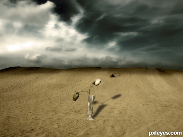
the shadow is opposite to the lite source and the part where the sky meets the sand is too dark... try and blend it better.. maybe use a smooth brush tool or blur a little....
it is a nice idea
The shadows have opposite directions, but i love the sky and the idea of having the vase in the desert
Howdie stranger!
If you want to rate this picture or participate in this contest, just:
LOGIN HERE or REGISTER FOR FREE
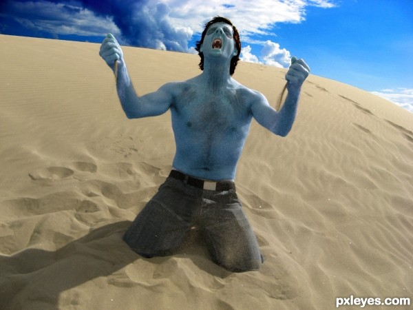
he's not sparkling like a twilight vampire..which would tell me ....he's about to burst into flames at any point in time. :lol: real vampires don't do sun. :lol:
he's kinda smurfish. the blue hue to his skin...
I guess you've never read the Vampire Chronicles, Jade. Maybe the author is referring to the scene in the 4th novel "Tale of the body Thief", where Lestat tried to kill himself by going out into the sun, only to realize that because he drank the blood of an ancient, he is too powerful for the sun to kill him, but merely give him a tan. I honestly thought of that of that part of the book when I saw this. But he does seem a little odd to be blue.
Vampire legions of all different imaginations seem to all have their own set of rules. Some of us just have to remember that.
nice
Looks like an Avatar vampire to me. LOL.
A paler color would be better...
Howdie stranger!
If you want to rate this picture or participate in this contest, just:
LOGIN HERE or REGISTER FOR FREE