Photoshop Pictures: Desert (page 16)


results 76 - 80 of 111

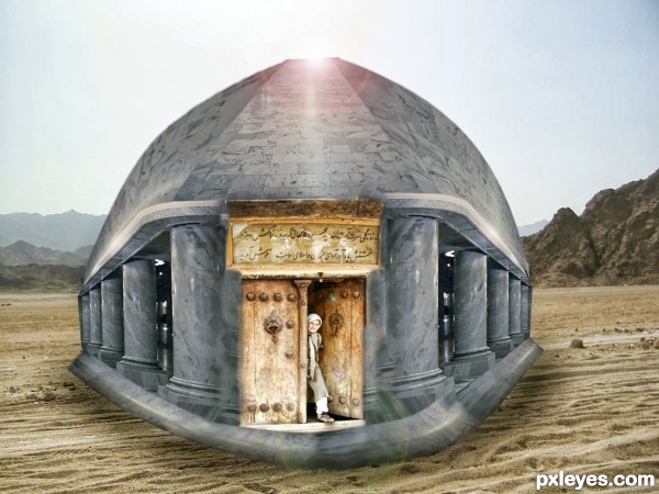
A Dome At Desert - created by silencer32


A Dome At Desert
Favs: 0SBS: n/aHi-resRank: 10/21Score: 53.1% (0)5804 views

First i took and cut the floor then make it as celling.Second,i cut the pillar and make it two sided.third,cut the floor again and make it a down floor for dome.Fourth,cut source 1 and paste as door.Fifth,flatten the image,paste into source 2.Finally,i use shadow and highlight,colour balance,HDR tonning,level,Brightness and contrast for adjustment (5 years and 3420 days ago)

2 Sources:

avatar erikuri
erikuri says:

It needs more work on pilar bases, they are distorted. And the whole dome seems floating on the sand, it needs shadows, since lighting source is behind.

Howdie stranger!
If you want to rate this picture or participate in this contest, just:

LOGIN HERE or REGISTER FOR FREE


Desert Transport - created by nasirkhan


Desert Transport
Favs: 0SBS: 1Hi-resRank: 19/21Score: 53.5% (0)7110 views

(5 years and 3424 days ago)

3 Sources:

avatar RAZ0R
RAZ0R [banned] says:

Howdie stranger!
If you want to rate this picture or participate in this contest, just:

LOGIN HERE or REGISTER FOR FREE


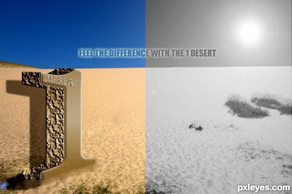
The 1 Desert - created by Joenn


The 1 Desert
Favs: 0SBS: n/aHi-resRank: 10/21Score: 50.7% (0)5240 views

A Gate on the desert

No external source except the wallpaper (desert) (5 years and 3445 days ago)

1 Source:

avatar MrHack
MrHack says:

shadows are wrong. its totally opposite. try darkening the front side or removing the sun from behind. good luck

avatar jawshoewhah
jawshoewhah [banned] says:

He's right.

author says:

I did some changes hope you like it..
Thanks for the advice

avatar MrHack
MrHack says:

yes, its better now. hope to see more entries of you here author. keep practicing. good luck

avatar dollmommy
dollmommy says:

best of luck to you, I like this.

avatar jawshoewhah
jawshoewhah [banned] says:

It's better. GL!

Howdie stranger!
If you want to rate this picture or participate in this contest, just:

LOGIN HERE or REGISTER FOR FREE


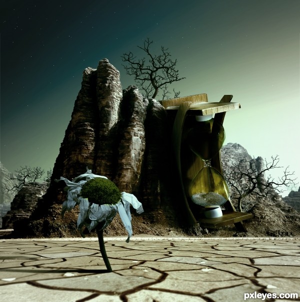
Time's Up - created by artist3001


Times Up
Favs: 3SBS: 14Hi-resRank: 2/21Score: 59.3% (30)19211 views

Now a lifeless world.

Thanks to pepemczolz for the flower image. (5 years and 3461 days ago)

4 Sources:

avatar Alan2641
Alan2641 says:

Good choice of sources and a very nice blend

avatar Toothpick134

Well done author! This looks really creative and nice to look at. Keep up the good work!

avatar Toothpick134

Well done author! This looks really creative and nice to look at. Keep up the good work!

avatar loopyluv
loopyluv says:

Stunning...

avatar Drivenslush

love how the hourglass is leaning on the mountain... very nice blend

avatar westfall
westfall says:

very good!

no avatar

i have to say. this is pretty freakin cool. i like it a lot, good job

avatar jawshoewhah
jawshoewhah [banned] says:

Fabulous! One of the best I've seen! GL!

avatar itsdesign
itsdesign says:

good luck

avatar Drivenslush

CONGRATS!!!!

avatar Lelaina
Lelaina says:

Congrats for your second place!

avatar RichieMB
RichieMB says:

Congratulations for 2nd

avatar nasirkhan
nasirkhan says:

Congrats! for 2nd

avatar loopyluv
loopyluv says:

Congrats on 2nd place

no avatar

luv the idea.... congrats...

Howdie stranger!
If you want to rate this picture or participate in this contest, just:

LOGIN HERE or REGISTER FOR FREE


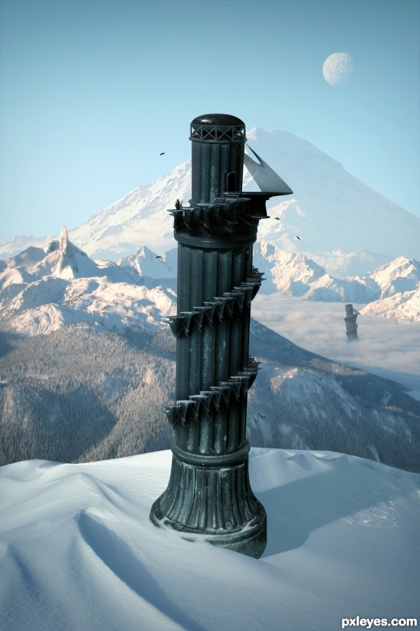
Mountain Towers - created by artist3001


Mountain Towers
Favs: 5SBS: 29Hi-resRank: 5/21Score: 60.3% (15)23880 views

Edit:
- Fixed some masking problems.
- Decided to go with a colder climate than the last image. (5 years and 3474 days ago)

3 Sources:

avatar erikuri
erikuri says:

Beautiful work...

avatar Lamantine
Lamantine says:

great great work

avatar wazowski
wazowski says:

Pretty fast submitted entry! I like the idea, you may want to mask the top of the pawn a bit better (some white edges here and there). Good luck!

avatar JamesD
JamesD says:

Pretty good, but room for improvement!

Im not entirely certain, but wouldn't the shadow be bent outwards over the slope rather than inwards? - the shadow from the furthest tower is too dark in relation to the closest - and - maybe a little addition to some shadows from the terrain would help place everything better - especially from the mound covering the foreground tower as it's casting nothing...

Oh and the glare fom the bottom of the 'tower' it's not true to where you're placing your shadows from, so maybe get rid of it and add some highlights to the relevant side

author says:

Thanks for the comments.

avatar DanLundberg

Cool over all. I personally don't think the duplicate background towers add anything, however. Also, the palm trees look fake. And the hi-res version highlights the white edge around the tower's top and the fakiness of the tower-bottom and sand-dune edges.

avatar hereisanoop

The top of the tower still remains sharp and white spots are there . but this is a good image... you have to make some touches there... good luck...

avatar PhotoRepair

Great but as above you could just try the matting controls, use the "layer" / "matting" from the top drop down menus and remove white matt or defringe to get rid of them, Then quick select and feather those edages slightly.

avatar swordfish
swordfish says:

nice creation ................ i like it ........ Gl to u ..........

author says:

Thanks for the helpful feedback. Image is now complete.

avatar sunzet
sunzet says:

Very nice, like the Pizatower, but in the mountains

avatar jawshoewhah
jawshoewhah [banned] says:

I like it! GL!

avatar JamesD
JamesD says:

yeah a much better image!?!... GL

avatar RAZ0R
RAZ0R [banned] says:

avatar westfall
westfall says:

i like the colder climate version!! great job!

no avatar

This is why I don't participate in this contest

avatar Arryko
Arryko says:

Nice work, and well done, gl

avatar Clinge
Clinge says:

Very nice, good luck

avatar erathion
erathion says:

Fantastic work author...IMHO u don't need other tower...any how this is great,high marks from me...best of luck

avatar itsdesign
itsdesign says:

nice

avatar jaskier
jaskier says:

Good.

avatar dollmommy
dollmommy says:

GL

author says:

Thank you.

avatar CorneliaMladenova

Super! It looks like the tower will fall out of the image at any moment

Howdie stranger!
If you want to rate this picture or participate in this contest, just:

LOGIN HERE or REGISTER FOR FREE