(5 years and 3690 days ago)
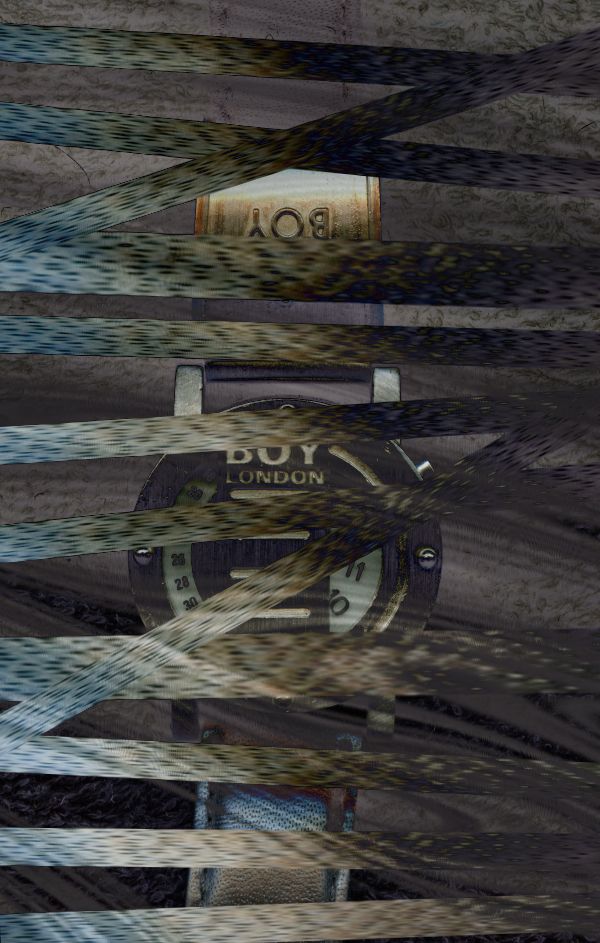
I will post the sbs probably tomorrow.
(5 years and 3696 days ago)
remember to post your sources.. as for the strans above the watch, try using teh dodge and burn tools (dodge on the inside of the strands, burn on the edges) to create some depth.
i'm 14 is back... wtf...
Perhaps you should have used external sources.
umm I don't get this
I dont get this one...what the stripes represents?
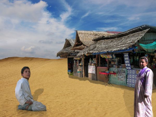
Desert? What desert?
??interesting??
Howdie stranger!
If you want to rate this picture or participate in this contest, just:
LOGIN HERE or REGISTER FOR FREE
Thanks to Jvr, Clshearin, Cyanocorax, Night_fate, Jakewill, Straymuse & Doc (5 years and 3703 days ago)
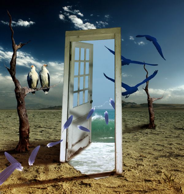
If there's a different place beyond the door, why does it have the same sky & mountain in background?
I am going to sleep over it  Maybe i will change it. It's surreal, so there are no rules...
Big improvement, author...good luck! 

Really love how the shadow is cast from the door frame onto the sand and the feathers are a wonderful touch! Love the birds too! Great! 
Nice, I like this image also, but why are the birds sheading so many feathers ?
It's the feathers blown throw the door that become the birds :-b Don't think to much about the logic, there isn't any 
cool 
Dreamy and surreal! 
XD nice one
Great idea...feathers are to bright and sharp and because of that they look copy/paste
very good work!, looks like a Dali! 
Good image.
congrats 
Congrats clinge on 1st place!! 
Congrats for your first place, Clinge!
Congrats!
Thanks on congrats 
Congratulations on the first place!!! 
hi dude keep it up........nice work ...
Howdie stranger!
If you want to rate this picture or participate in this contest, just:
LOGIN HERE or REGISTER FOR FREE
Jenna S.C. -http://venom-stock.deviantart.com/
Piotr Bizior-http://www.sxc.hu/profile/bizior
My hero has real wings.-http://wingsofahero.deviantart.com/
Mila Vasileva-http://milavasileva.deviantart.com/ (5 years and 3709 days ago)
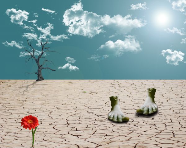
Lighten the shadow a bit maybe....
this is pretty.. although why is there a single Gerb. growing out of stone???
Howdie stranger!
If you want to rate this picture or participate in this contest, just:
LOGIN HERE or REGISTER FOR FREE
Allison & Morgan-http://b-squaredstock.deviantart.com/
Tosca-http://tosca-stock.deviantart.com/
Inspbylife-http://www.flickr.com/people/inspbylife/
David Brauhn-http://www.sxc.hu/profile/wawal
Thanks guys for the great images...
(5 years and 3718 days ago)
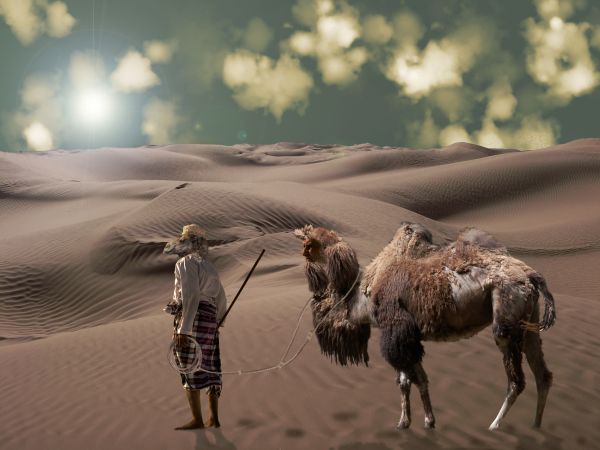
Try using a real sky, and make some realistic footprints.
good job... good luck!
Thanks George,thank u very much...CMYK for footprints,yeah i maybe have to made better ones,but for sky i like this custom made,and original sky create opposite light at the objects so i am gonna keep this one...but thanks for the comment
Looks better in high res. GL!
very nice 
Shame about the sky and footprints.. still, nice manipulation.
Howdie stranger!
If you want to rate this picture or participate in this contest, just:
LOGIN HERE or REGISTER FOR FREE
this looks flat, and the shadow is way off.
Agree with jello there ...
Shadow's are wrong,light sources too and kid is to huge...try to fix that author...good luck
plz use some ambient for the shop otherwise nice work author
The shop is floating!! :O try making everything work and have them feel like one because I have the impression it's just copy/paste (I know it's not but..) you get what I mean?
Howdie stranger!
If you want to rate this picture or participate in this contest, just:
LOGIN HERE or REGISTER FOR FREE