(5 years and 3819 days ago)
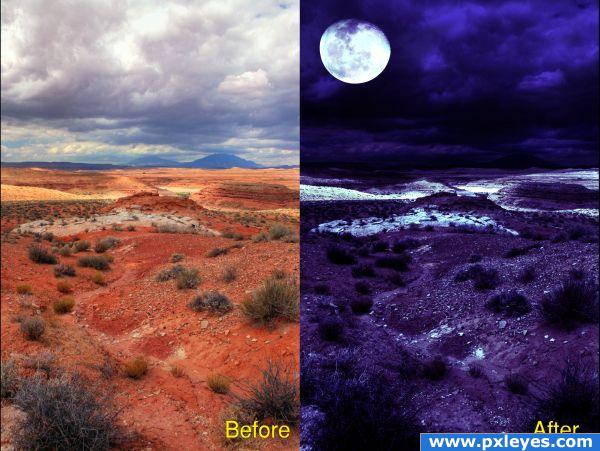
Step 1 Add a exposure compensation adjustment to original image and under expose to give the whole image a darker look.
Step 2 Add a Hue/Saturation adjustment and reduce the saturation to dull the whole image and reduce the vibrancy of the reds
Step 3 Add the image of the moon ensuring the background to the moon is completely black and then change the layer with the moon on to Screen to hide the black background
Step 4 Add a gradient adjustment layer from left to right of image starting from a dark blue through to a white on the right hand side to give the allusion a night sky
Step 5 Add a curves adjustment layer to brighten up the image as the gradient adjustment level left it slightly darker
*All layers were clipped to the original image
(5 years and 3819 days ago)
Except for the moon being in front of the clouds, it's pretty good...
Verry Nice be nice if tacking night photos was this easy
It's a succesfull attempt, except what Cmyk said, but you can replace the sky or erase some parts of it.
Wow!
Howdie stranger!
If you want to rate this picture or participate in this contest, just:
LOGIN HERE or REGISTER FOR FREE
Enjoy!
credits and thanks:
http://www.cgtextures.com
http://mizzd-stock.deviantart.com
http://peace-of-art.deviantart.com
http://hatestock.deviantart.com
(5 years and 3835 days ago)
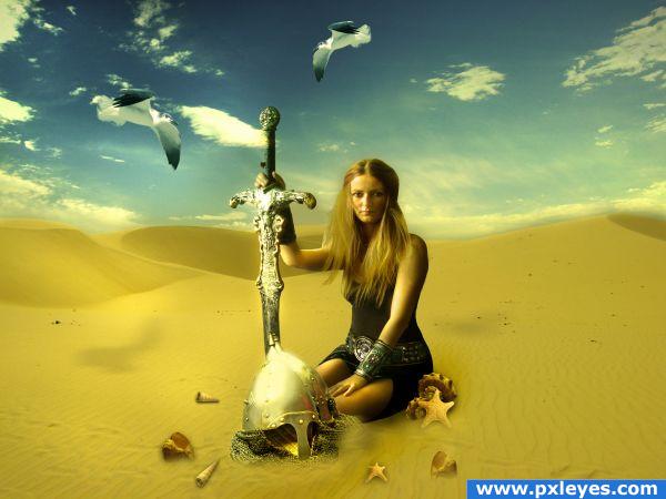
Shadows need work...stuff is floating...seagulls & shells in a desert?
Also seaguls are flying too close to her.
love the colors and mood, but agree that shells girl and helmets appear to be floating. Try to make them interract with the sand, think when you sit on the beach or a sand dune, you sink into the sand a bit, it should overlap on the objects. I like the surreal quality to the gulls and shells with the vast dunes. Good luck! (here's an example of how sand interracts with the weight of a person: http://www.jiunlimited.com/en/search/close-up?eqvc=2207156&oid=6298765&a=a&pt=&k_mode=any&k_exc=&cid=&date=&ct_search=&f_c=1&f_b=1&f_h=1&f_v=1&f_n=1&f_i=&f_o=&f_l=&big=1&k_var=sand&bl=%2Fen%2Fsearch%2Find
Frostmourne?
Howdie stranger!
If you want to rate this picture or participate in this contest, just:
LOGIN HERE or REGISTER FOR FREE
(5 years and 3853 days ago)
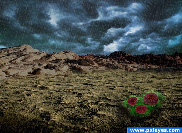
Interesting image, i think you should add some shadows.
thx ponti55.i added some shadows and looks better...
Howdie stranger!
If you want to rate this picture or participate in this contest, just:
LOGIN HERE or REGISTER FOR FREE
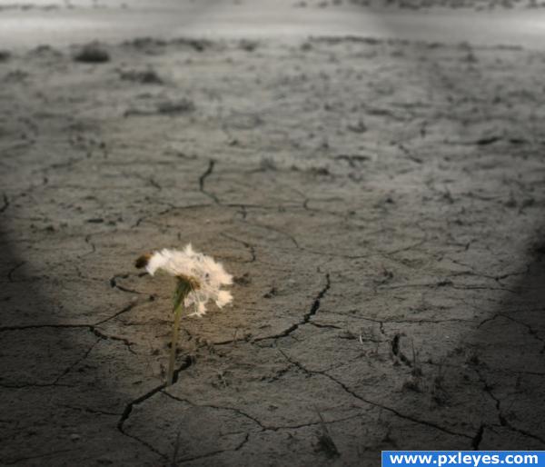
The last living thing in a field of desolation. (5 years and 3861 days ago)
I really like the image... fearing dandelion is our last hope... lol... Nice job and g/l
i love the idea 
A bit cliche, but good luck!
i love it... 
Too blurry
the overall image is a little too blurry, but i like the idea and the title
Howdie stranger!
If you want to rate this picture or participate in this contest, just:
LOGIN HERE or REGISTER FOR FREE
Beautifull... gl
I really like the mood here, and the lighting is exceptional, good luck!
Thanks for your comments guys. It helps a lot
Very nice one, the light is perfect, the shadows are not bad and it's very original =)
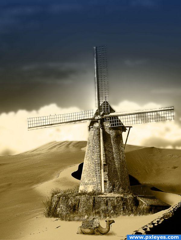
Nice mood & color. The camel's too big...get him proportional & this will be great.

great
Thanks CMYK46, but I think that it's not the camel that is too big, but the mill that is too small ... Fixed, I think...
great...but you forgot to mask the fan of the mill. Looks weird the fan at the right side
very nice colors! the camel still looks big tho
Great
a lot of comments about the camel size, saying that it is big, but comparing with the wall at the foreground the camel is veeeery little. Author, i suggest you to think about that! Other thing is the perspective of the mill is off.
Thanks for the comments people. About the camel size: please take a look at the sketch I uploaded and consider that the average height of a man comes up to about the beginning of the camel's neck. Having Fun, if I have time, I'll see about the perspective of the mill ... Thanks.
nice
This is just a totally awesome composition! I think everything looks great!
great mood , i like the contrast with the sky. About the camel: "a fully-grown adult camel stands 1.85m/6 feet at the shoulder and 2.15m/7 feet at the hump" so you could calculate how big it should be, but it doesn't matter that much. Great entry.
really nice mood! bravooo!
Great mood!
truely one of my favs in the contest... im a sucker for camels.
Thanks a lot people. Scratzilla, I'm happy the work had met your taste
Howdie stranger!
If you want to rate this picture or participate in this contest, just:
LOGIN HERE or REGISTER FOR FREE