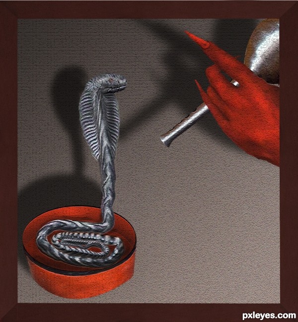
(5 years and 3081 days ago)
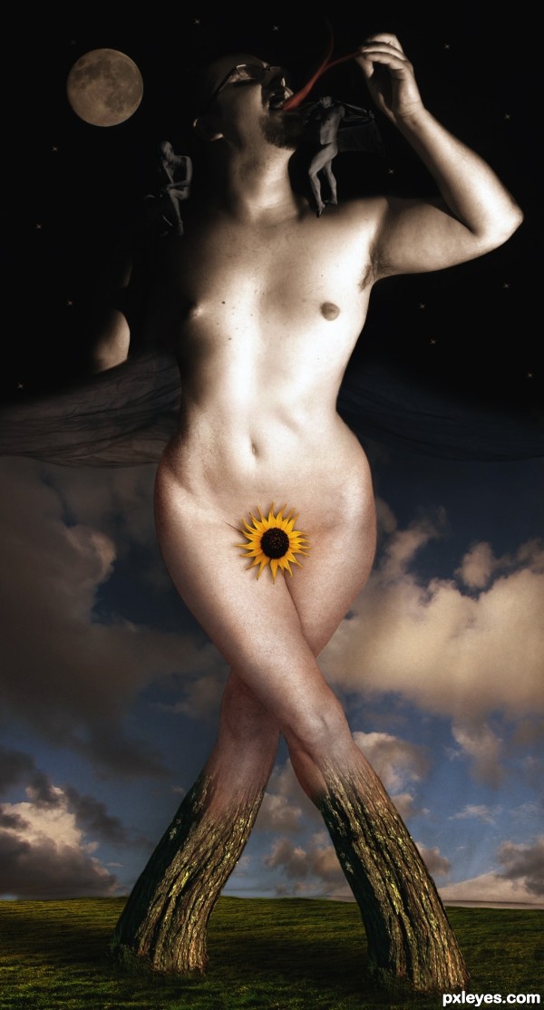
2 more sources in SBS (5 years and 3122 days ago)
I like it, but why so dark?
Made it lighter Jay 
Didn't realize it was that dark 
BWAHAHAHAHA! Nice work, author. 
very cool work..!!
Nice work!...my fav
good work author nice imagination
good luck
high vote and fav for you

Congrats Rob  wonderful work
Congrats Rob, well deserved win. 
Congrats Rob, well earned!!
Congrats!
this is hilarious!!!!! Now everyone knows what Steve would look like if he got a sex change 
Nice Job Congrats on First Place Win!
Howdie stranger!
If you want to rate this picture or participate in this contest, just:
LOGIN HERE or REGISTER FOR FREE
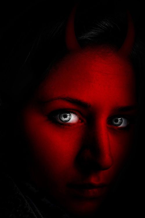
(5 years and 3146 days ago)
Good that you added an sbs, or I wouldn't see how you used the source. Your use of source is quite minimal.
On the horns...they look very 2 dimensional, and not actually attached to her head. Perhaps work on blending them in better. They also are not evenly spaced or balanced on her head either. Look at pictures of horned animals to get a grasp on what I mean, but pay close attention how those horns grow from the skull of the animal, not just sit atop the skin. Your horns need to be better seated in the skull.
I hope that's not to crtitical, I just think it would help.
good work author gl

Take Jade's advice. This isn't a great use of the source, but you can easily improve it.
Thanks for all comments!!..I'll try to make some changes soon.
Too minimal a use of the source, and a somewhat lackluster manipulation because the overall values are too dark. The horns are barely visible at all.
Yes to minimal use of Source Image, the Main Source Object is the light bulb not the Red light from the Background. The Horns looks 2D, not realistic, not authentic.
Howdie stranger!
If you want to rate this picture or participate in this contest, just:
LOGIN HERE or REGISTER FOR FREE
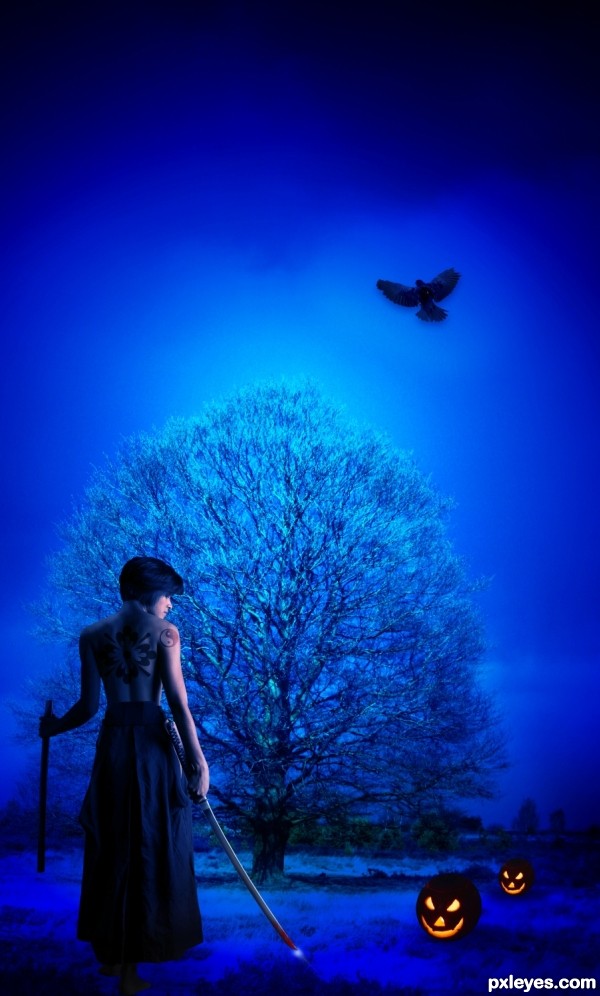
She is fearless "Devil hunter", hunting devil is her duty and for that she is ready to take any kind of risk!
Thanks to mjranum for the stock - http://mjranum-stock.deviantart.com/art/samurai-schoolgirl-E-2-132726667 (5 years and 3171 days ago)
suggestions:
1) eagle smaller maybe better
2) add a sparkle on the blade
 nice...
Thank you for suggestion my dear friend, I have updated my entry! 
The bird and the pumpkins are too dark for the very bright lighting of the image. The bird should show some back lighting glow, and the pumpkins should have some light on the top, not just be black shapes with eyes. Also, if the ground is so illuminated, why is the back and the ground behind the woman so dark? She is not under the edge of a tree or building, and the light appears to extend at least to the trees in the far background, so having everything turn "instantly" dark when it reaches her is a bit far-fetched, rather than "moody."
Hi MossyB,
Thank you for correcting me in my mistakes, I have updated my entry please let me know if it still need improvement.
Once again thank you my dear friend. 
A step-by-step would have been nice 
Love the spooky blue and the evil smiles of the pumpkins 
Howdie stranger!
If you want to rate this picture or participate in this contest, just:
LOGIN HERE or REGISTER FOR FREE
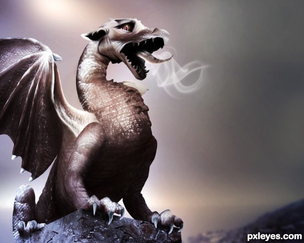
All source with reference :)
*Edit : Added eye, smoke, darker background and fixed the nostril. (5 years and 3187 days ago)
Very creative. Good luck. Nice SBS btw.
WOO HOO! (sbs has only one step?!?!) hehehe
Yup, one long SBS 
suggestions:
1) add nostrils
2) add eye's pupil
3) lift ears more upright (look more fierce)
4) some smoke coming out of mouth n nostrils
5) add a darker, gloom-doom background will enhance the atmosphere
Great DI work 
Thanks aheman I made some changes 
BWHAAA HAAAA HAAAA HAAAA..... lovely changes .. now he's all worried and sad.. hehehe.. LOVE IT... still as great as the original author.. WOO HOO HOO HOO
Hehe..he is worried cos he is trying to get some fire out and no luck! Either that or he needs a tick tack for his stinky breathe ahahhaha ,,,,awww my poor dragon :p
What else to say, looks amazing! His expression makes me feel it's scared, is it? xD
Akassa..he is like going : "cough, cough, cough...no fire" hence the lookon his face :p lol
Wow! Brilliantly done. Nice imagination to use various parts of the source the way you did for textures. Not sure I would ever have the patience to do such work. Really nice job!
Awsome work!!!! SImply Flawlessss...... hope he get's well soon :P hehe
Tons of patience doing this contest, nice work, good luck!
Nicely done.... I like the changes made to the first image.... good luck...for patience and creativity.....
the best part of the competition, is to have fun, express your ideas freely....
nice improvements from previous, congrats 
awesome
Incredible work on blending and choosing the parts! Great job!!!
very good , nice sbs
Great work!
He's got cough, I guess. Most of the dragon was done very well but somehow the skin on the chest is not fitted to the body. Nice job in overall, and it's interesting to see the battle of dragons in this contest. Best of luck to you 
Congratulations, Loopy 
Congrats
Thank you 
Congrats on the second place 
congrats.. knew this is Top 3 stuff 
Congrats !!!!
Howdie stranger!
If you want to rate this picture or participate in this contest, just:
LOGIN HERE or REGISTER FOR FREE
its "CHARMING"
It's "charming" but try to remove the white edges & soften others.
the white was caused by craqualure texture ..I tried to adjust that a bit but perhaps u like the original SBS12 better? ...since I am still learning here I would appreciate the feedback..I love all the feedback
in this case your opinion really is important to me
thanks
Love the title, pretty nice job on the snake, especially the head.
Howdie stranger!
If you want to rate this picture or participate in this contest, just:
LOGIN HERE or REGISTER FOR FREE