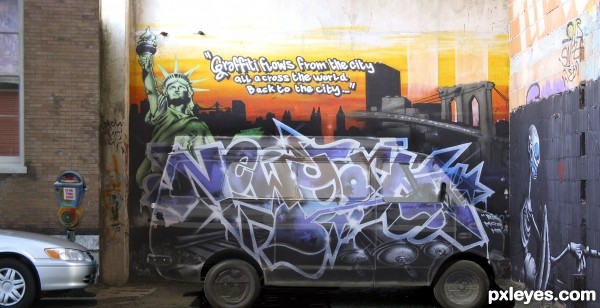
Title says it all
Van was given, used #5 (5 years and 3266 days ago)

(5 years and 3336 days ago)
OUTSTANDING!
 omg, this is great! Perfect shot.
hahahahahahaha.....so cool work...best of luck author
Nicely matched expression with the shirt = )
Howdie stranger!
If you want to rate this picture or participate in this contest, just:
LOGIN HERE or REGISTER FOR FREE
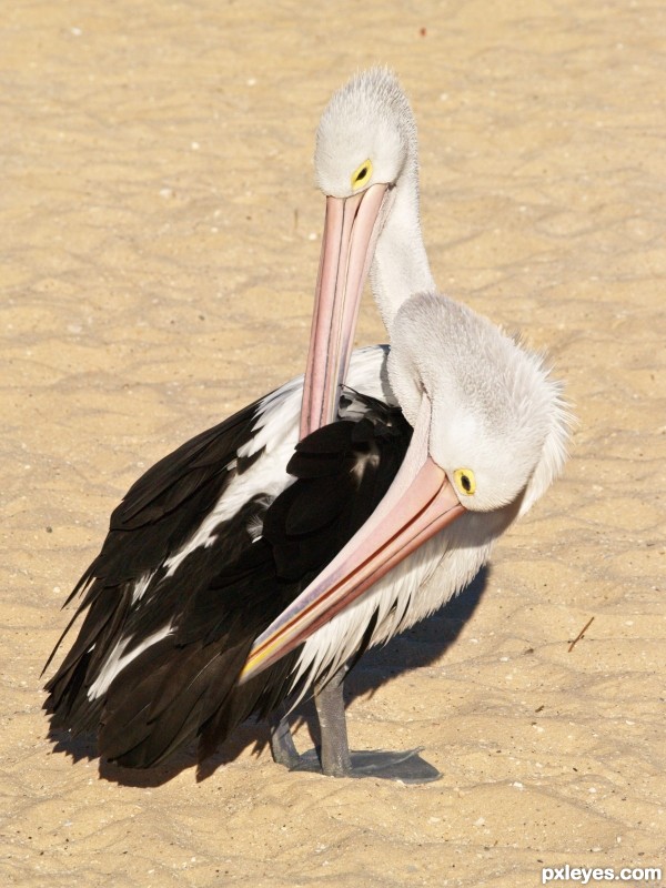
my pelican photos (5 years and 3461 days ago)
Great images and nicely blended -- funny as well
Good image, great title! 
Perfectly and realistically done! 
good work
very nice work author...GL
Howdie stranger!
If you want to rate this picture or participate in this contest, just:
LOGIN HERE or REGISTER FOR FREE

Thanks to etherealities, woodztockr, artgirl1935, mqtrf, MnMCarta and Vorseth for their photos! (5 years and 3481 days ago)
nice job -- good to see the sites stock being used
Love the way that her expression seems different from the original. I think it is the way you have her lite! Great imagery ... and the variety of the boxes contents is wonderful.
Thank you Alan and Arca for your comments.
Howdie stranger!
If you want to rate this picture or participate in this contest, just:
LOGIN HERE or REGISTER FOR FREE
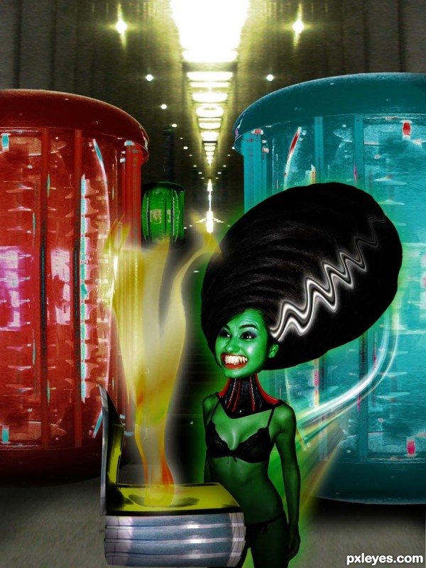
all sources in SBS (5 years and 3481 days ago)
This is hilarious!
LOL@ the girl
soooooooooooo funny 
ROFL @ her wide smile ....

gl author
She shows a nice grin! 
hahahahaha...
Howdie stranger!
If you want to rate this picture or participate in this contest, just:
LOGIN HERE or REGISTER FOR FREE
nice man cool work
Author if you sharpen the outer edge of the van (and burn the back wall) it will give the van more density , it will make it look like a van is painted like the back wall
As it stands the Van looks like it's PART of the wall painting (not sure if that was your goal)
But it's a very clever and well done image.. (even the greatest Trompe l'Oeil has little give a ways... shadow being the biggest fouler)
Good LUCK though, fun image!!!
Was supposed to look hidden but I will try those suggestions ..I am still learning ...and this type of feed back is welcome
THnaks
Very creative to go beyond the confines of the van with your graffiti. But I think your intention of 'hidden van' (which you've achieved) is misguided. 'Blend in' would be more appropriate and realistic IMO, so instead of a ghost van (what this looks like), a clearly physical van parked in just the right place would be more compelling.
I appreciate your viewpoint but think you may have mis-read or limited your interpretation of the directions ."Use one of the provided van images and place graffiti on it"...when I read stand out, I read "make it different " and I believe I have achieved that ... thank you for your comment .as u are allowed to disagree
I really like this one! I do kinda wish that the van was in more solid form. Nice job, author!
Howdie stranger!
If you want to rate this picture or participate in this contest, just:
LOGIN HERE or REGISTER FOR FREE