Guardian of the Skies.
The ramp source has been OK'd by Rob. A couple of the images are in a Gallery, so I put down their gallery numbers.
SBS has been updated to reflect changes. (5 years and 698 days ago)

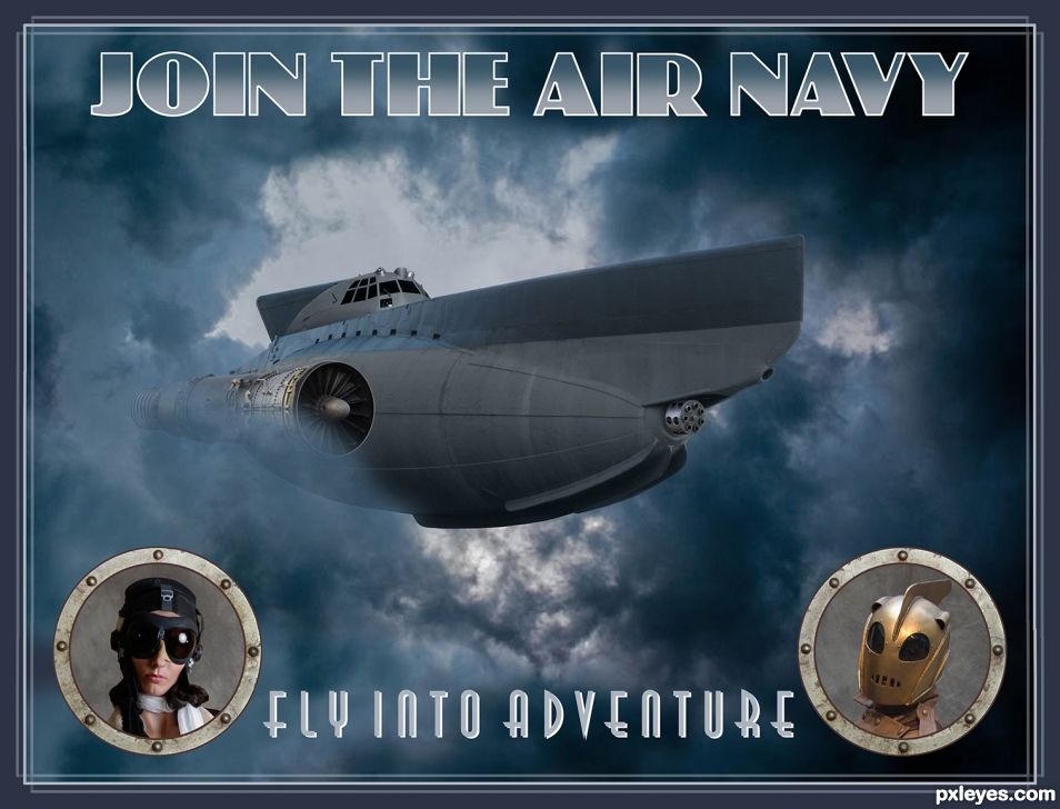
A recruiting poster from an alternate reality. Rather than just having a Dieselpunk image I wanted to add the graphics which I find adds an interesting touch. Looking at the source reference I really liked the various poster designs so I thought I'd go that route myself.
Most of the work went into the vehicle with a great deal of fixes and modifications. The Rocketeer appears in many Dieselpunk images so I added him to mine as though he's endorsing the recruiting campaign. This is a real fun genre with many design possibilities.
Type from DaFont
http://www.dafont.com/decotech.font
http://www.dafont.com/phatt-phreddy.font (5 years and 1513 days ago)
Nice job. 
Thanks Bob!
Very nice work, great source finds.
Thank you pearlie! I actually had most of the sources and was hoping for a chance to use them.
Well shuck my corn and call me grits! hehehe instant Fav...
Thanks Grits! 
Cool work!
Thanks, it was fun to do. 
Great job, congrats! 
Thanks Bob!
Congratz!
Thanks Roel!
Woot WOOT! 
Thank you Ernest!
Congrats!!!
Thanks Franklin!
Congrats Rein 
Thanks Megan!
Howdie stranger!
If you want to rate this picture or participate in this contest, just:
LOGIN HERE or REGISTER FOR FREE

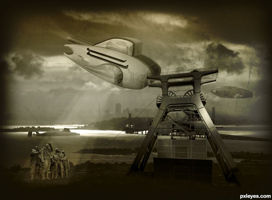
This time, instead of chopping apart things and reassembling, I thought I'd try to make a creation in 3D. Beyond the beginner stage, I consider my techniques at this point to be intermediate - I've got more to learn, but am satisfied with this. SBS shows stages of construction. (5 years and 1519 days ago)
The bomber command figures and the coal mine machinery are both up shots, and don't match the perspective of the rest.
I'm aware, thanks.
Flash GORDON! King of the impossible!
Ack! I'm channeling Queen hehehe.. pretty cool 
Woo HOO, great job 
Howdie stranger!
If you want to rate this picture or participate in this contest, just:
LOGIN HERE or REGISTER FOR FREE
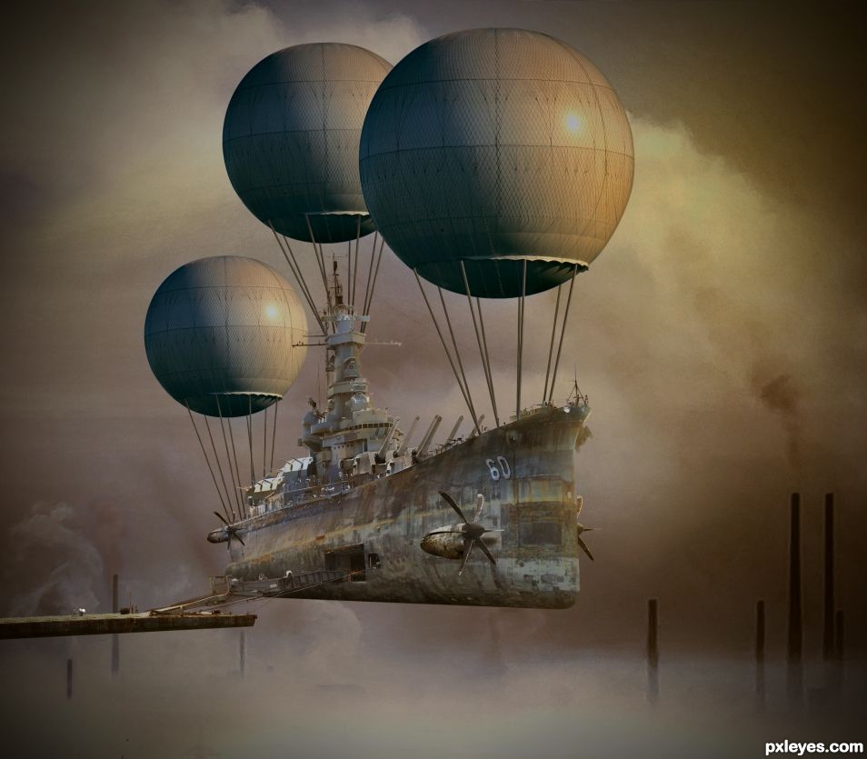
This is a well put together chop, lots of imagination and work put into it. Be that as it may, there is something about the shadows bothering me. Specifically the tones and consistency. It seems to me that those gun turrets, the ropes from the balloons, and the side of the ship need some shading. Also, I'd think there would be some shadows cast onto the fog from the different elements in the scene.
I like the mood you're trying to set, a few tweaks would bring it over the top IMHO.
Good luck.
Thanks Ichappell. I re-did a bunch of things. Too much to type out but it is all written out in the first step of the SBS. TY for the suggestions. I didn't do any fog shadowing though.
Nice changes, especially those cables/ropes holding the balloons.
I really like the surreal dream like quality to this chop and I'm not so sure about shading because without it the end result is otherworldly. It is only an opinion on my part.
Image has been updated. the old version is in the SBS if you want to compare.
I read you SBS....HOLY CRACKERJACKS you need to get paid! HELLO ADMINSTRATION ! ! !
Thank you so much for being here, you are another great teacher.
Holy crackerjackers. Do you really say that in real life? BTW I do have Paypal.
It should sell well.....naw, I usually say "crap".
Play with the levels and curves maybe.
Thanks for your help with this. I didn't know what you specifically meant by "Play with the levels and curves", but I did darken the entire boat/sub some with Curves.
Congrats BW
Congratulations.... good job
Congrats!
Howdie stranger!
If you want to rate this picture or participate in this contest, just:
LOGIN HERE or REGISTER FOR FREE