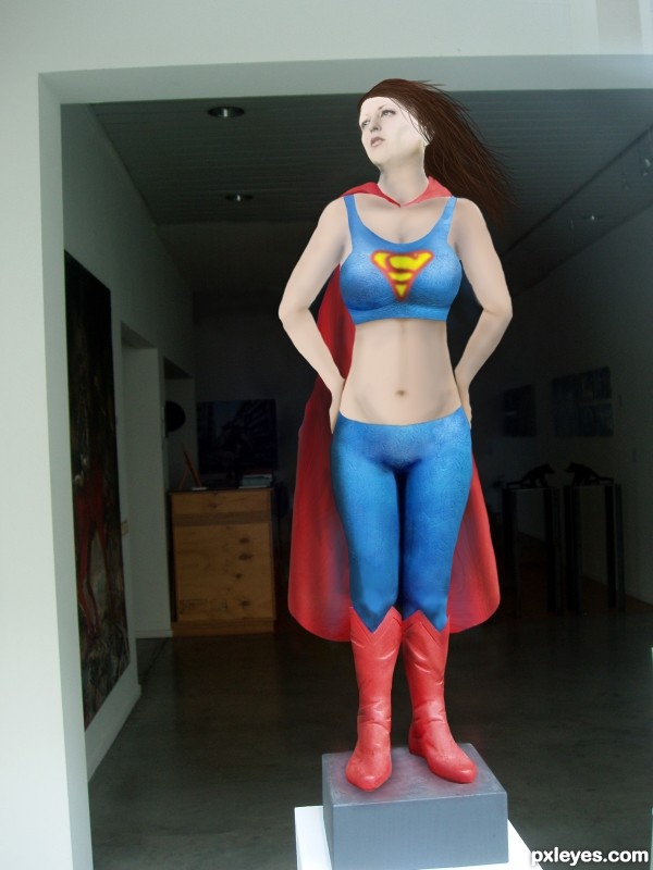
After some time in the gym, a good diet, and some therapy Super Woman got back on the pedestal. (5 years and 3019 days ago)

(soft pop music in the background)
Are you a horse?
Do you have a few extra pounds you need to lose?
You tried everything and no results?
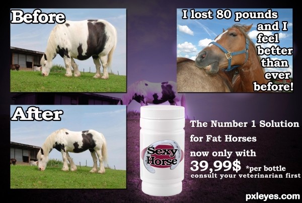
Don't worry Sexy Horse diet pills will help you to get the great body you always wanted.With just 39,99 $ you get one + one FREE bottle.If you call us now you 'll get a FREE pair of horseshoes. (5 years and 3437 days ago)
Cute Idea author... one suggestion would be to put all the text in white and use BLACK STROKE 3 - 10 PXLs (see what effect it has on the drop shadow) the split color doesn't work on the 80 pound text) Also try to keep all the fonts at the same size... (Before and After should be the same size as the font on the right... (Unless you are offering information text boxes.. like in a newspaper.. then the font would have to be shrunk to look like newspaper text) ... also center the text on the bottle and sphereize it vertical so it wraps around the bottle (adding a nice label shape oval etc.. is always fun..
You have a great base and I'm sure more peeps will be along to help more, I'm just giving you some suggestions to start.. great IDEA!!! good luck
EDIT: MUCH IMPROVED.. can only get better!!!
Thanks Drivenslush.I think it looks better now.
Funny idea and nice fix. Good tips from Drivenslush. My only suggestion is to bring the label down just a little and it should curve a bit to match the bottle shape. Love the before image... looks like a horsapottomus!
The "testimonial" should not cover the body of the horse. You have a lot of "empty space" with the sky.
I lost 80 pounds, and I
................feel better than
....................ever
...................before!
(the dots are the horse outline)
would be a more "dynamic" text placement.
Also, the "Before" and "After" should be placed better on top of each image, not straddling them and the background
Thanks for the tips spaceranger and MossyB. I appreciate that you helped.
Oh and horsapottomus describes perfectly and funny the before image.
Nice refinements, looks really good! 
=))..awesome
lol good idea made me lauph. good job
Oh wow. lots of nice comments.
Thank you people
funny, good job
Great idea and nice improvements ... it is a wonderful concept. Your creativity and willingness to learn is impressive. Bravo!!!

Lol great humor! I love your description! haha
funny...gl
Howdie stranger!
If you want to rate this picture or participate in this contest, just:
LOGIN HERE or REGISTER FOR FREE

Touch me not! (5 years and 3656 days ago)
Cute. 
It'll be really cute after metamorphosis... 
More realistic it's impossible! 
I hate that bug!!!!!!!!! and love if it shows somebody's talent... exlnt
Very nice!
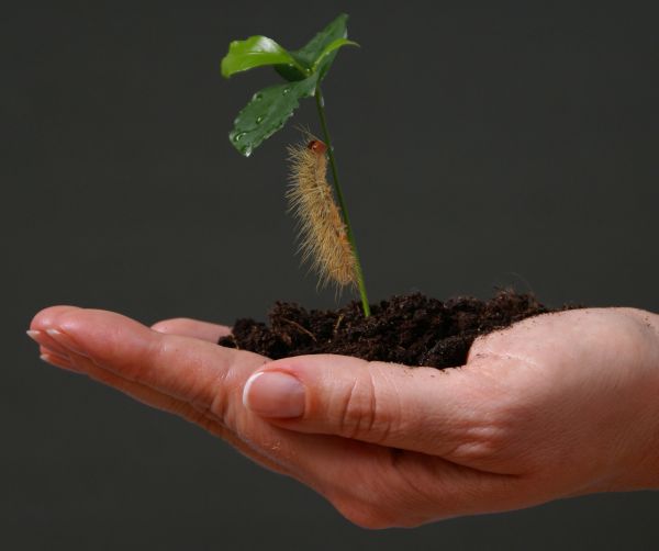
absolutely brilliant ... well done masking around the spines, shame there is a bit of pixelation on the hi-res, holding vote to see if you can rectify this ... my fave !! 
thanks. can't seem to find the pixelated parts i'll try to view this in another computer later.
nice work....GL
Nice job author...gl
i've clone stamped the area around the caterpillar in hope i could get the pixelated part that i can't see in my old monitor lol. thanks again.
cute worm.... gl..
gl..
it look so real . nice work author .. GL
Howdie stranger!
If you want to rate this picture or participate in this contest, just:
LOGIN HERE or REGISTER FOR FREE

Decaf and low-calorie. (5 years and 3760 days ago)
very simple and creative
Nice job.. convincing work!
very clean XD
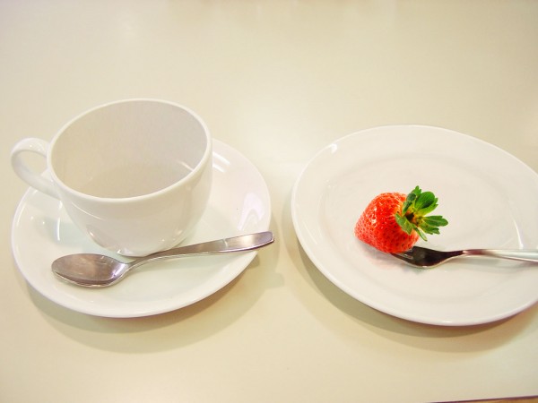
This kind of work is highly underrated on this site. But not by me. Excellent. Perhaps just a tad more shading inside near the inside bottom of the cup would be great! Is there an SBS? 
I didn't make a SBS yet, it's just a ton of cloning, pasting and masking. It took me a while.
Please make an SBS so such a simple yet clever idea for the source will not be removed. 
Sweet work, but SBS could be better...
Good work.
congrats 
Congrats! for 2nd 
Congrats,
Howdie stranger!
If you want to rate this picture or participate in this contest, just:
LOGIN HERE or REGISTER FOR FREE
What's the source for the "S" on the chest, and why is the yellow area green? The red area should be the same red as on the costume, too.
Pretty easy symbol, no source. green is coming from the layer being multiplied with the blue below it. Same with the red, its the same color but just tinged due to multiplied layer.
No source? Then please show how you made it. And you could easily adjust the color to match the costume.
Adjusted colors. I'll add the symbol creation into the sbs in a few minutes.
Considering that the 'S' is a Specialized font, I too would like to see its creation in the SBS...
SBS now includes how the symbol was created.
Well now, that wasn't so hard, was it?
The SBS clearly states you did not draw the 'S', and it is not a common font, so where did you obtain it from?
Hi Mossy,
The SBS does clearly illustrate how i created the logo. No matter how many times you say it, or accuse me of "obtaining" it, its not going to make it true. It was drawn...plain and simple. I am having a hard time understanding why that is so hard to see. As a matter of fact, it seems like it would be easier to go find a free stock image of this symbol and use it instead of creating one myself, as I did. I don't have video capture capability on this computer or i would do it that way, the best thing i can do is show you the process in the steps provided.
The Superman symbol is a copyrighted logo so really should not be used. The "S" is not a type font at all it is a hand lettered graphic incorporated in a triangular border. A type "font" is the term for the entire alphabet, numbers and symbols based on a particular design. There are "Superman" fonts in existence now based on the logo and also those based on the 3 dimensional comic book titles.
Your right it is a copyrighted image. I figured if it was drawn it wouldn't be an issue for this contest. With all the flack I'm getting for it I don't know if its worth it keeping in the image Your avatar says mod, so if you need me to take it off her I will. Just say the words.
Used the smudge tool to make the logo unrecognizable in relation to the copyrighted one.
Howdie stranger!
If you want to rate this picture or participate in this contest, just:
LOGIN HERE or REGISTER FOR FREE