(5 years and 3491 days ago)
(5 years and 3655 days ago)
Fix your source link. It takes me to the log in page. on SXU.
Interesting.
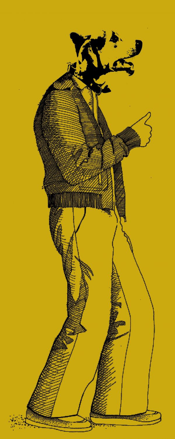
We can't see the original image... 
Head doesn't match the line style of the body...
Howdie stranger!
If you want to rate this picture or participate in this contest, just:
LOGIN HERE or REGISTER FOR FREE
(5 years and 3710 days ago)
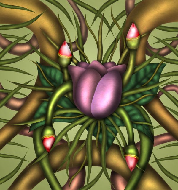
Looks like a painting....Good work.....Though there are some apparent things like the flowers look in the front layer....Overall nice effort...
very metallic.. nifty 
Did you use only the burn tool for the shadowing? If so, you're an expert!
Excellent work!!! good job!
Nice shadows and highlights! Good job.
lovely flower!!
Love its vibrance! 
I like it!
Nice shape and color work. 
Howdie stranger!
If you want to rate this picture or participate in this contest, just:
LOGIN HERE or REGISTER FOR FREE
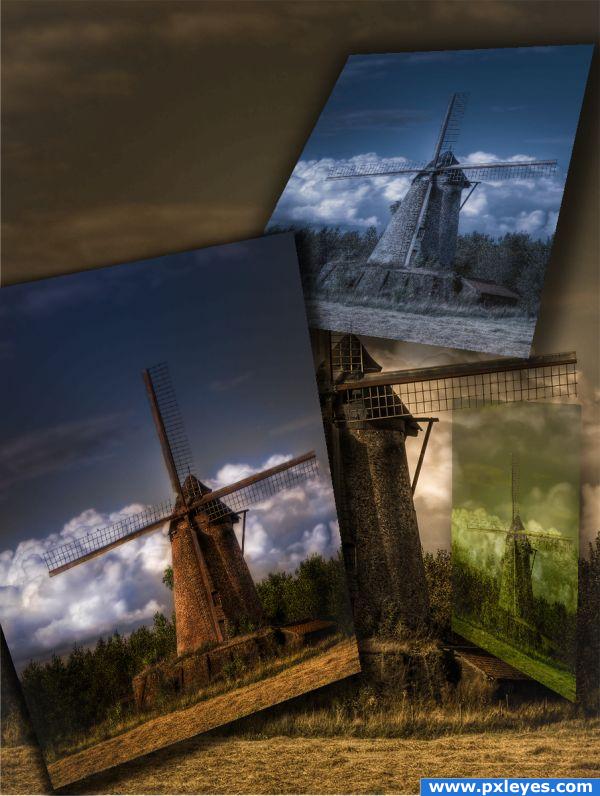
Processed in 4 different ways, to achieve optimum colors to blend together with masking. Then transformed with 3d postcard tool in photoshop going from beginning image to final more colorful version (5 years and 3814 days ago)
nice concept
you win im sure!
great entry would be great with a step-by-step guide.
really super splendidly, you go win hear!
Very original, good luck
Lovely work. GL
Would be better without the upper shadows...
Amazing! 
nice filters and colour changes.. GL
Howdie stranger!
If you want to rate this picture or participate in this contest, just:
LOGIN HERE or REGISTER FOR FREE

No external sources.
(5 years and 3826 days ago)
The wings could use a little thickness.. you could bevel emboss or burn them ... IMHO.. the text on the picture is redundant to the title (text makes an image into a greeting card.. not a bad thing but it may be frowned upon by some voters.. if you leave the text in the image/change the title... only if you want to.. sweet vision over all.. good luck
i agree with golem
Howdie stranger!
If you want to rate this picture or participate in this contest, just:
LOGIN HERE or REGISTER FOR FREE
Very sparkly!!! WOO HOO!!!!
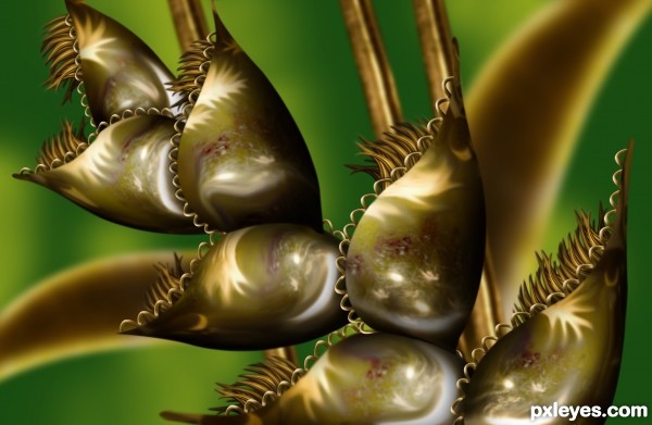
Looks like made of precious metal
Howdie stranger!
If you want to rate this picture or participate in this contest, just:
LOGIN HERE or REGISTER FOR FREE