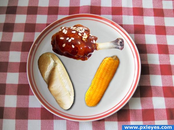
Cut out glazed meat, corn and bread and placed on plate adding drop shadows. (5 years and 3906 days ago)
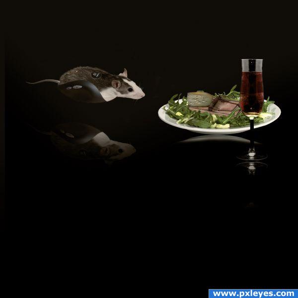
Special thanks to authors(Kai Kuusik-Greenbaum,Jasper Kuperus,Peter Galbraith,Nick Normann,Piotr Lewandowski and Helmut Gevert) of great pictures which i used for this project . (5 years and 3913 days ago)
You should tweak the reflection a bit... Looks like they are floating... But if you intended to make them look as they are floating then it's okay... 
Thanks for the suggestion i change the reflection little bit...
You would only see the bottom of the plate in the reflection, and it should be closer to the plate and the reflection of the glass is crooked...
I hope it's better now...
the reflections should be directly beneath the objects. which means you cannot select everything, flip it and put it lower. this way the plate and the mouse look like they're floating. also, this looks like a flat surface these objects are on so there would be no distortion on the reflections.
Extraordinary!
cute
reflections are hard to get correct for sure.rule of thumb is usually remember reflections connect with the original image and either reflect in the surface below or stretch out depending on light source.. love your creation  GL
GL
Howdie stranger!
If you want to rate this picture or participate in this contest, just:
LOGIN HERE or REGISTER FOR FREE
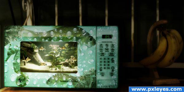
I found the picture of a microwave, cropped it to get a closer focus on the microwave itself, selected it using the pen tool.
Selected window, copied it separately and deleted the center. Added the fish tank environment, resized it to match the size of the window, softened edges, added fish, added the window on top, changed blending mode to linear light and lowered opacity under 50% to get a better transparent look.
Colored the microwave using color balance and hue/saturation, added bubbles, fish and sea horse on the exterior. Added bubbles inside as well.
Added shadows and lights using adjustment layers and gradient tool. (5 years and 3958 days ago)
you are weird author.... absolutely brilliant.. but still coo coo bananas.. marvelous mind
EDIT: WOW!!!!! would have never guessed  You amaze me

really like the idea but the fish and bubbles on the outside of the microwave kinda is to me a bit overdone it takes away the focus from i nside the microwave
omg............ i feel bad that i just re-heated pizza lol ( extra anchovies please)
Need to agree with Eladine. Good job...right on theme!
good take on the theme. nice job on the micro.. however, i think i will keep my pets awAy from you just the same, if you dont mind. : )
wow, nice to see an entry that actually follows the title of this contest... creative FISHTANKS.. not creative fish eyedroppers, or creative fish oil pills. XD anyway, if i had fish, and i saw this 'fishtank' i would probably buy it. nice work!
Howdie stranger!
If you want to rate this picture or participate in this contest, just:
LOGIN HERE or REGISTER FOR FREE
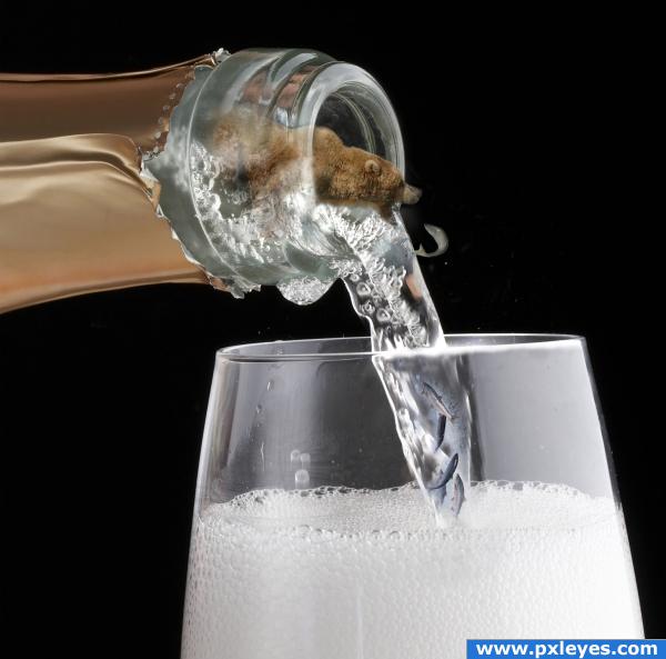
Thanks to David for bear and salmon pictures.
I'm very new to this , I've only had PS about 7 months and was so intemidated by it. I've just now two months ago have been teaching myself how it works. I'd like to give a BIG thanks to all the talent out there for making Tutorials. Thats the only way other than really screwing up on a trial and error basis that I have gotten this far. It's hard for me to remember what I do but , but mostley its just cut and paste on layers using a soft large brush, and some dodging and resizing. I hope to get to where I really understand PS as well as some of you. I'm in AWE at some of the things I see being done with it. Totally amazing! (5 years and 3983 days ago)
There are soooooo many resources out there for you to learn PS. Free ones, too. This website is GREAT. I have learned so much in the few weeks I have been here. The most important thing I've learned competing here is to really pay attention to the details. If you piss your way through a project they will call you out on it. It makes you want to try harder. Also, if you are having trouble making a concept work, often there are people here who will give you pointers.
what is that? yep downoffthedragon is right! i learned that my first couple of weeks too
Now as far as this entry, your blending is pretty good. The concept is excellent. I think that the bear is a little blurry but it's hard to tell. Please upload a high resolution of this so that it can be better judged. You also need to post a link to where you got the pic of the bear.
Wait, were those fish in the bottom there a couple of minutes ago? I didn't see it the first time. I love that!
I like it. Really funny. Though you should get rid of the fish in the glass. You wouldn't be able to see it if it were in the bubbles. Perhaps add a more-faint shadow of it on the left side of the glass where the light would shine through
WOW
should get rid of the fish in the glass........Your right deahhizooke2001 , I removed the fish.
@ downoffthedragon....When I reloaded the updated picture I ticked the box include full version,but I don't see it anywhere.Maybe I did it wrong. Like I said I'm new to this place . And far as a link, my friend David that lived in Alaska for awhile sent me the picture that he took by email.
Okay, took care of the high resolution......Thanks everybody.
Howdie stranger!
If you want to rate this picture or participate in this contest, just:
LOGIN HERE or REGISTER FOR FREE
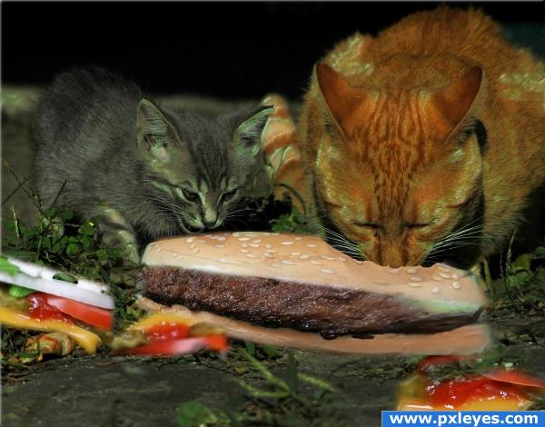
(5 years and 4020 days ago)
i think you need harder edges, they look a little blurry, but it's a nice idea. Good luck!
you could add a touch more pink to the bun to make it look more like cat food.. not that it's needed.. it's a very well put together image.. good luck
Cats are too green, edges need work...
awwwwwwwwww...kitty!
just... weird, kinda creepy, GJ
good idea
Nice idea and the cars are purrfect but you need to work on the edges of the burger a little bit 
nice
I like how you took the time to crop out all of the condiments and leave them in messy, strewn about piles on the ground. It really helps to sell the idea that these two cats are tearing into this thing. Still, the burger looks a bit too stretched and I'm not sure whats happening with the blurry green smudge on the right hand side (is it mold?). I would fix both of these issues by replacing the current burger with a smaller, less distorted one. Nice job, though, and keep it up!
poor cats! 
was it intended that the cats look green?  or maybe it's food poisoning... lol, nice attempt
Howdie stranger!
If you want to rate this picture or participate in this contest, just:
LOGIN HERE or REGISTER FOR FREE
just a quick tip, to make things look more realistic, pay close attention to the light source. Try rotating the objects around and see how it affects the image
good
Are you one of those people that doesn't like your food touching each other on your plate? It would be more appetizing with everything just drenched in that glaze sauce! The plate's too dry.
I didn't realize it but yes I am one of those people who don't like my food touching. :P
Howdie stranger!
If you want to rate this picture or participate in this contest, just:
LOGIN HERE or REGISTER FOR FREE