(5 years and 2909 days ago)

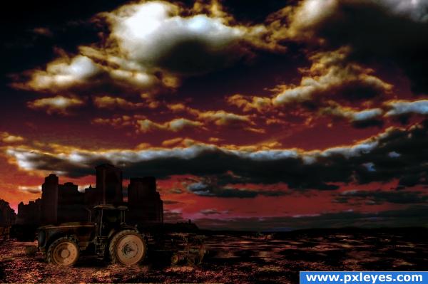
Bad crop this year due to environmental disaster..
(5 years and 3915 days ago)
A very dark image, it;s hard to see your work. Good luck though 
You might want to lighten the tractor a bit for more contrast against the dark buildings, but the color is great! 

too dark but cool color combo indeed
i kinda like the darkness of the tractor... it adds a cool effect to the image because its supposed to be pollution right? ... i rest my case
It's meant to be dark, due to the pollution and dawn, but is indeed too dark along with the city background in low res. I recommend viewing it in high res to see more details.
Howdie stranger!
If you want to rate this picture or participate in this contest, just:
LOGIN HERE or REGISTER FOR FREE

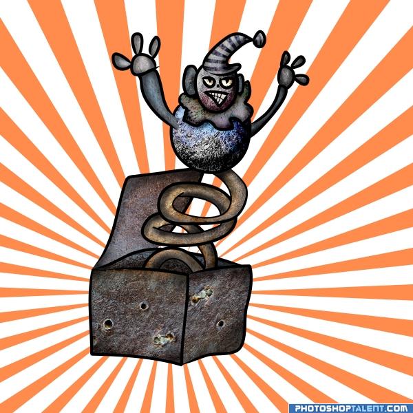
Just thought how will a jack out of the box will look is made from this source... So gave it a try...
No external source use... Just the contest source, photoshop and a little Illustrator...
Would really appreciate advice on how to improve it... Thanks :)
**Edit: Got rid of the black background and the glow... Added a simple orange sunburst...** (5 years and 3950 days ago)
I could see adding a background.. when something is hand drawn it's pretty much done as soon as you submit it.. to add shading or textures or shadow is to alter the piece into something else, It's a fun drawing.. and it's not childish is CHILD LIKE..good luck author
EDIT: It is a compliment, a Photograph can be altered but you can still see the original image, a Hand Drawn image becomes something totally different when you change the pencil marks.. just an observation.. (Like if you gave the Daffy duck a different Nose bill, it would immediately change the illustration, but if you give a photo a new nose, you can still see the original picture, one comes from the mind.. the other comes from real life.. old art theory project I had in college about Comic vs Real Life imagery)
EDIT: WHAT A BACKGROUND.. you weren't fooling around making that one.. woke me right up.. excellent add on to an already excellent piece
I didn't quite get you... Not that childish or child like, but "when something hand drawn...... into something else, It's a fun drawing.."
This is pretty cute 
Answer to the title....'yes'. Good job, author!! 
I bet you had a lot of fun making this.. I would look at suitable 'fun' background also - but dont go over the top - you dont want it stealing the focus of the image. The only thing I can see that may make it better [or worse] you seem to have some parts that look 3 dimesnional and then there are others that just look flat.. eg the body looks to have depth but the neck is flat. Not a lot you can probably do about it - just an observation.. Fun stuff 
yes, you are scary
Good . Instead of black background and glow you can try a nice suitable background for this.
Thanks Aura  ... When I uploaded the image, I was pretty tired and I wasted like more than an hour uploading the sbs( since my net connection was giving me so much trouble)... So I was really "so to say" confused and fatigued
  ... And at animmax and GK, yes I did thought the background was not suitable... Will try to change the background and also will try giving depth if I have time...
cool idea
goood job author. very funy 
cool, nice work 
Howdie stranger!
If you want to rate this picture or participate in this contest, just:
LOGIN HERE or REGISTER FOR FREE

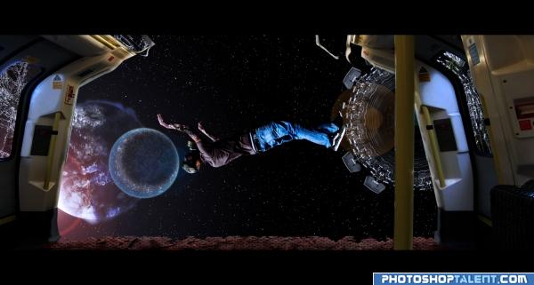
Was just playing around with pictures and came up with this... And I thought it might go with this contest theme... So here it is...
This is my first time creating a space environment... Also I have never been to space :P So I don't how lights really work out there( was too lazy to see any reference either)... So I would very much welcome hints and advice, so I can create much better space environment in the future...
Also there are more than 10 sources used in this work... So I will list theme here...
http://www.sxc.hu/photo/492500
http://www.sxc.hu/photo/716897
http://www.sxc.hu/photo/1196227
http://www.sxc.hu/photo/1176536
http://www.sxc.hu/photo/938993
http://www.sxc.hu/photo/874127
http://www.sxc.hu/photo/964989
http://www.sxc.hu/photo/945506
http://www.sxc.hu/photo/1189372
http://www.sxc.hu/photo/1182942
http://www.sxc.hu/photo/1191524
Also one of the source is graphic in nature... So viewer discretion is advisable...
Also thanks to Ivan Vicencio, Cherilyn Derusha, David Ritter, Raul Baldean and Michelle Dennis for some of the great free stock photo... :D
**note: will provide an sbs soon**
***edit: sbs added and corrected*** (5 years and 3954 days ago)
Dead in less then 90 seconds.. they just did an entire show on this on the Discovery channel about survival in outerspace.. the catches that theme.. good luck
cool love it
good work
great
cool
I don't get the black bars across the top and bottom -- or really much else, for that matter.
Nice blending but if someone where to be caught in space they would actually freeze so he should be icey looking or freeze dried...LOL....Good Luck
Thanks christy for mentioning about the freeze thingy... I did managed a bloated dry look at his hand and neck using the scab source... Will keep in mind the freeze thingy... 
Really cool! I like it!
gl
Howdie stranger!
If you want to rate this picture or participate in this contest, just:
LOGIN HERE or REGISTER FOR FREE
Howdie stranger!
If you want to rate this picture or participate in this contest, just:
LOGIN HERE or REGISTER FOR FREE