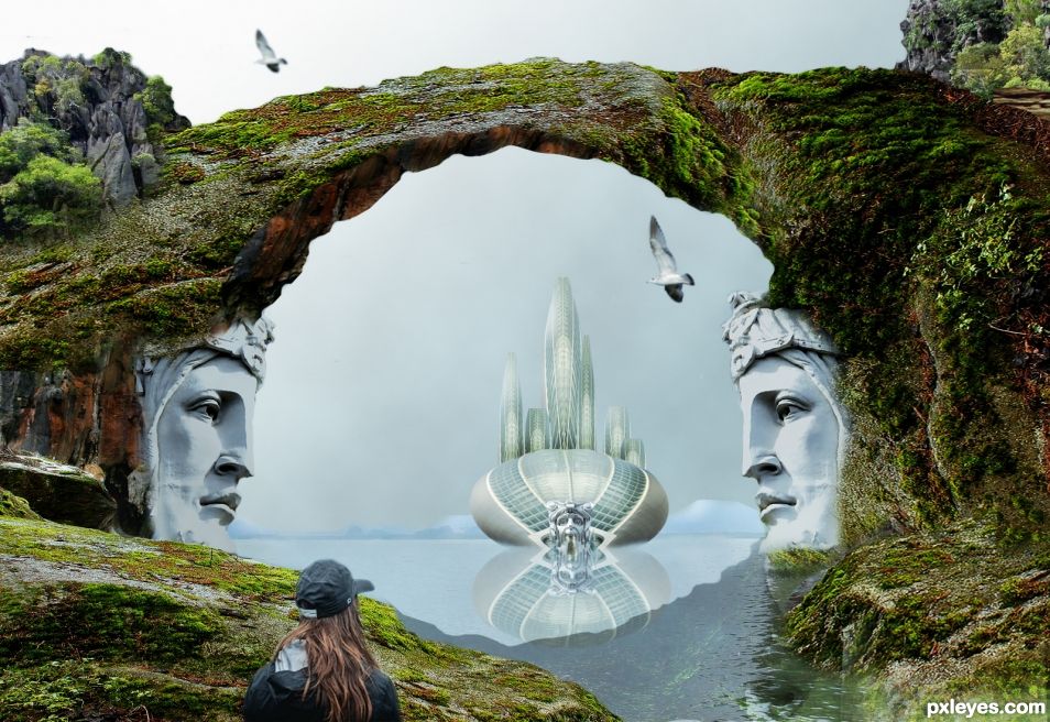
Photoshop 7 again. Doing my best. Images used for this entry are from Pixabay. (5 years and 1454 days ago)
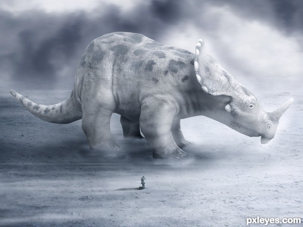
Thanks to: tazzmanian(sxc), inkpenofdeath & anyman82.
motion blur used to give the effect of wind. (5 years and 2896 days ago)
A good marks for the wind effect & wonderful mood you gave
Thanks Sukh!
I agree with my friend Sukh!! Nice mood.
Thanks Daniela!
i think the leg from the back is to far from the other legs to far or to thin
it look good i like it and hope you had add SBS it would be nice to see how fine you work .keep it up good luck
It looks like those old cartoons they showed in grade school to talk about dinosaurs going extinct 
Congrats for your third place, Rafaelll!
Congratulations brother, it's a amazing work! 
Congrats!!
Nice Congrats 
Howdie stranger!
If you want to rate this picture or participate in this contest, just:
LOGIN HERE or REGISTER FOR FREE
(5 years and 2905 days ago)
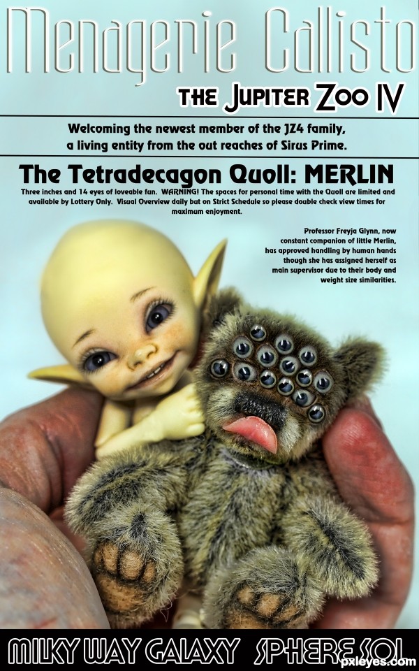
Can't say if it's cute or creepy... good work author!!
The little guy with the pointed/elf ears is so cute.
yeah, i switched faces with the two sources for more clarity, thank you so much 
wow! great work with the toy!
Great find - on both new creatures! Good copywriting. 
very good idea and execution gl
Howdie stranger!
If you want to rate this picture or participate in this contest, just:
LOGIN HERE or REGISTER FOR FREE
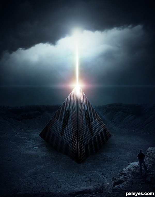
Thanks to Terri Heisele: http://www.sxc.hu/profile/madmaven
I know that is not 100% perfect, unfortunately I had 2 hours to be able to do, but I did my best at this time. Thanks to all the comments! (5 years and 3019 days ago)
Loving this..Great job
Nice! Pretty dang good for 2 hours I'd say.
Thanks guys! \o/
Love the prospective
LOVE IT!!
Good idea, luck
Thank you all!!!
not sure what I am looking at but it is well done, the left and right corner appears to be off the ground, This would work of course if that thingy is landing
best of the bunch i think...good job
Thank you for all the comments, guys!!! You're great!
About the corners of left and right, they really are out, it's like the unidentified object was buried with only one of the tips..
Congrats!!..
Howdie stranger!
If you want to rate this picture or participate in this contest, just:
LOGIN HERE or REGISTER FOR FREE
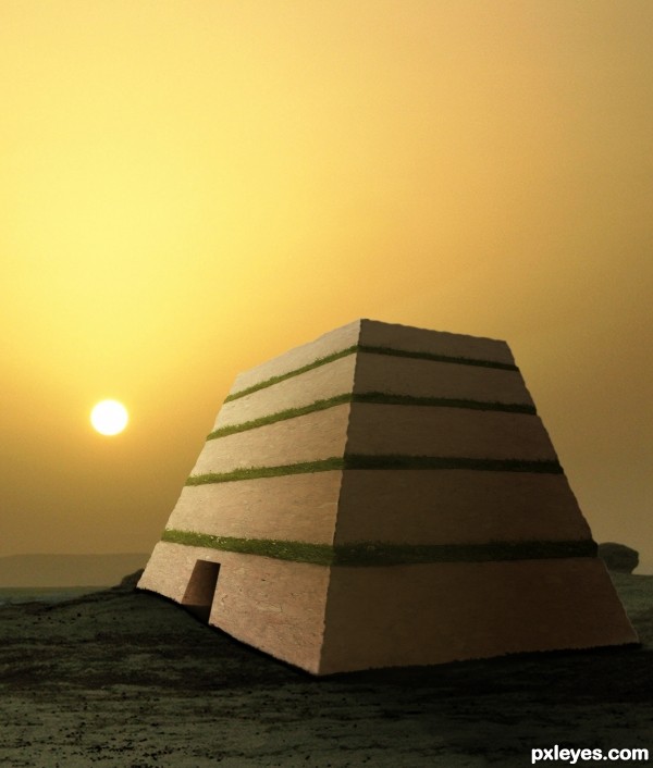
(5 years and 3395 days ago)
i dont get why the corner is so sharp between the shaded and lighted areas. but on the outsides its dull. other wise love the picture. very nice..!! and good idea too
I agree with taintedhockey about the sharpness... But nice work!
author,image is very nice but the difference in the sharpness is to obvious...i am sure that final score will be better if u fix that...best of luck
Why not just make a full pyramid? 
Howdie stranger!
If you want to rate this picture or participate in this contest, just:
LOGIN HERE or REGISTER FOR FREE
Good texture work, but I'd make the reflection match the darker shadows of the object, and roughen up the edges of the rock bridge. Right now they look obviously cut out.
PS 7 is all you need to create good images. Don't let it discourage you! Lots of my entries were made with it.
Thanks Bob, it is always nice to have a comment and suggestions from you. I am doing well. I like PS 7 anyway. I did some changes you told me. Stay well...
Congrats George!! Beautiful image and a good week for you!
Thanks Rein. I did good.. learning from all of you.
Congrats George
Thank you.
Congrats George.
Thank you.
Congrats
Howdie stranger!
If you want to rate this picture or participate in this contest, just:
LOGIN HERE or REGISTER FOR FREE