(5 years and 3264 days ago)

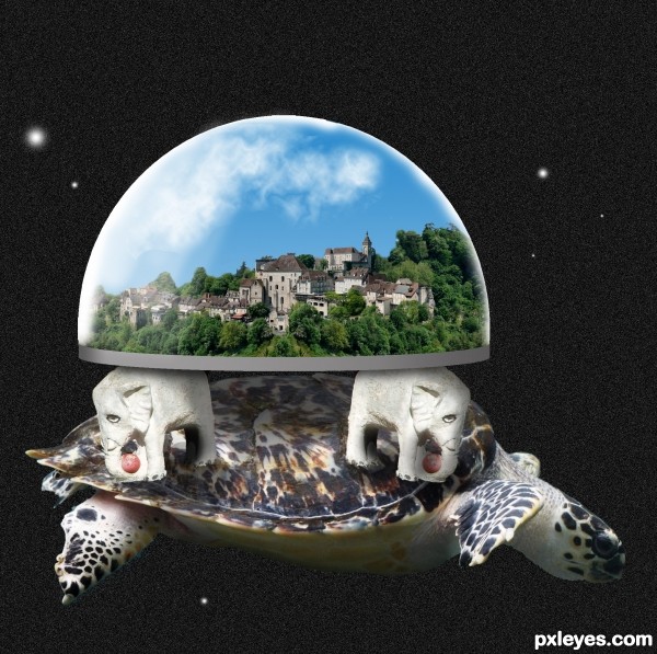
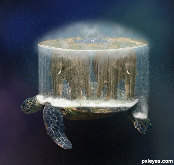
"Great A'Tuin the turtle comes, swimming slowly
through the interstellar gulf, hydrogen frost on his
ponderous limbs, his huge and ancient shell pocked
With meteor craters. Through sea-sized eyes that
are crusted with rheum and asteroid dust He stares
fixedly at the Destination.
In a brain bigger than a city, with geological
Slowness, He thinks only of the Weight.
Most of the weight is of course accounted for by
Berilia, Tubul, Great T'Phon and Jerakeen, the
four giant elephants upon whose broad and
startanned shoulders the disc of the World rests,
garlanded by the long waterfall at its vast
circumference and domed by the baby-blue vault of
Heaven."
Terry Pratchett
(5 years and 3274 days ago)
Cool concept (even if I weren't a Discworld fan). The awesome turtle is the only sharp element, however, so it becomes the focus with Discworld itself fading into the background. I don't get the white band around Discworld. The froth at the bottom of the waterfall could better match the contour of the turtle (most especially on the neck). In hi-res, whitish edges are apparent on the elephants (especially the rear ones) and the lower rear portion of the turtle.
Thank you DanLundberg, I've made some changes. White band is off and fixed elephants and turtle...
Really unique and different floating island idea! The creativity here is the key.
So the world itself is a floating island... Great adaptation of an inspiring mythology!!!
Thanks Pixelkid but the creativity is not mine, but off the master Terry Pratchett. I just tried to put it into an image! 
Thanks Manelic! 
Howdie stranger!
If you want to rate this picture or participate in this contest, just:
LOGIN HERE or REGISTER FOR FREE
like your entry gl
idea is good -- the elephants need to be warped or rotated to fit the shell better and some shadows are needed to get rid of the floating look
The black background makes the dome look too cut and paste flat. Perhaps a starry sky from Nasa.gov would help.
Thanks for the suggestions folks. I've only slightly warpped the elephants and added a bit more noise etc to the background. I'm just a little cautious about putting in a really good background in case in takes away the focus from the main objects.
Howdie stranger!
If you want to rate this picture or participate in this contest, just:
LOGIN HERE or REGISTER FOR FREE