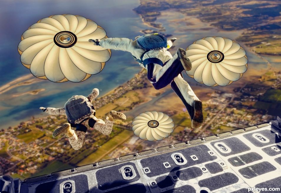
The old timer was turned into parachutes. (5 years and 1257 days ago)
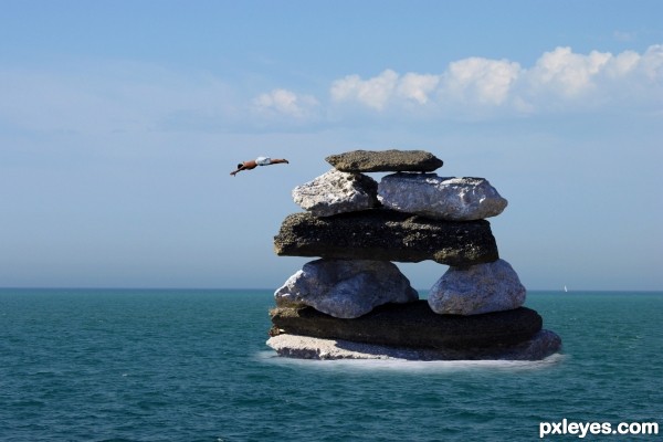
He waited for the longest time to be rescued before he decided it was the only way to get out, as long as he could get himself to jump...
So, I cropped the diver, the stack of stones and the foam at the base and put them together on the water picture. Blended using filters and flattened the layer. (5 years and 2969 days ago)
Author, please note, it is not necessary to add the contest source image to the source links, only external sources.
If I were to nit pick i would say the rocks could use some more blending near the water. Overall looks good. Good Luck!
I like the story.  looks good.
very convincing image. Good luck author.
It almost seems the diver could be rotated slightly more downward. Nice job author! Chalty offers a good suggestion above.
Howdie stranger!
If you want to rate this picture or participate in this contest, just:
LOGIN HERE or REGISTER FOR FREE
The dive pic is my own...;-) (5 years and 3257 days ago)
great idea.. good luck 
Thanks Drivenslush 
I like this a lot 
Thank you Nysoe, means a lot 
Here is a good interpretation of the image.
wow, it doesn' 't look "choped", congratulations, GL!
Howdie stranger!
If you want to rate this picture or participate in this contest, just:
LOGIN HERE or REGISTER FOR FREE
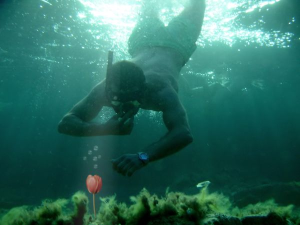
Can you find this on the bottom of the ocean? I don't think so :)
credit to source 1 by "manolo" (5 years and 3673 days ago)
Very interesting idea... Don't you think source image a bit sharp comparing to the background? 
Yup, erikuri has a good point, the flower & bubbles can do with some blur. You also may wanna experiment with a blue-ish photofilter for the flower, so that the colors match better with the background. Good luck!
yes the points above r to think about.. now it looks as if you pasted it.. needs to blend with the rest of the image..
Very very nice work author...
good rework.. its looks better now.. 
the blend is better now 

Howdie stranger!
If you want to rate this picture or participate in this contest, just:
LOGIN HERE or REGISTER FOR FREE
(5 years and 3907 days ago)
Nice. I like the transition between the water and the bubbles.
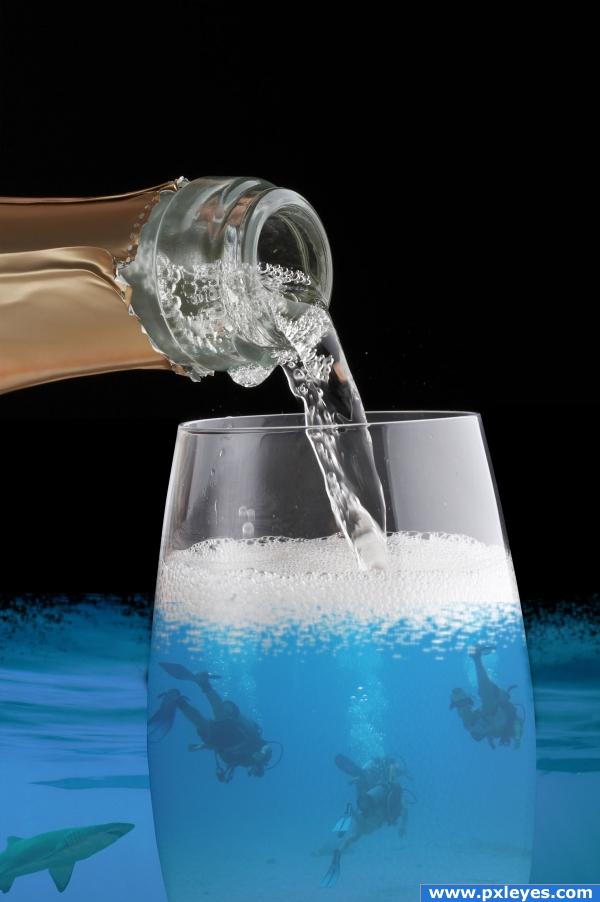
I think the image would make more sense if the oceanwater was confined to the cup, that it looked like all the divers were actually in the glass. Good luck!
i was thinking the same thing ponti
interesting
I like the divers! They all seem to be in the glass to me! Without the ocean water on the outside, the sharks would die.
I agree with ponti and evan...the image is cool, but I'm not quite sure what's going on
I don't think that Photoshopping random photos from this website is anything but art for the sake of art. Why does it have to make sense? Do you like it or not? Are the shadows right? Perspective? Blending? Is it visually appealing? I think it is. But that's just me. I think that it is a good idea.
the divers are in side the glass to protect them from the shark...
Ha-ha-ha, the shark looks really disappointed 
Howdie stranger!
If you want to rate this picture or participate in this contest, just:
LOGIN HERE or REGISTER FOR FREE
With nobody attached to them?
The open parachutes hide the skydivers at that angle.
Ummm...OK...
Awesome job!
Thank you.
Howdie stranger!
If you want to rate this picture or participate in this contest, just:
LOGIN HERE or REGISTER FOR FREE