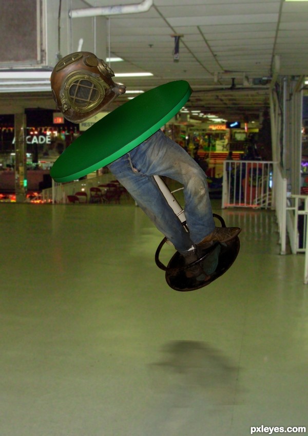
three photos blended together with reflection and shadows (5 years and 3489 days ago)
(5 years and 3497 days ago)
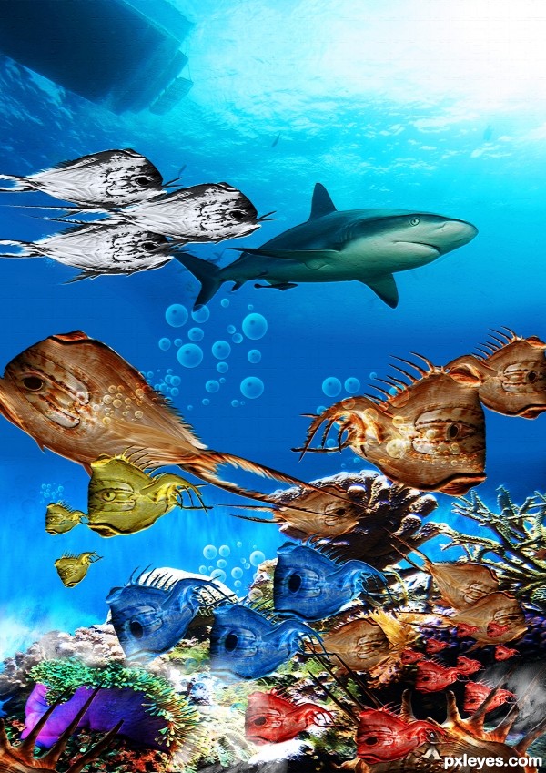
good attempt, but all fishes are in one plane, not feeling the distance. do some light and shade effects (please check the light source and work accordingly)
Howdie stranger!
If you want to rate this picture or participate in this contest, just:
LOGIN HERE or REGISTER FOR FREE
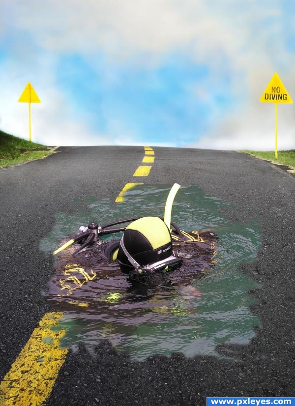
Diver pic was put on a masked layer with a mask. I then I used the no diving sign on a copy of the left sign with sampled colors off the original. Touch ups included the sign shape, snorkel and water shapes all done with masking. A clone layer was use to remove the people. (5 years and 3888 days ago)
Interesting image.. good luck!
wow this looks awsome man
this is neat
I like this, but I think the edges of liquid are too soft. If you make them a bit more crisp with a slight, tight shadow it'll rock! Good job!
nice and well done
good work here, only the edges of the pond could use a bit of a better blending
Howdie stranger!
If you want to rate this picture or participate in this contest, just:
LOGIN HERE or REGISTER FOR FREE
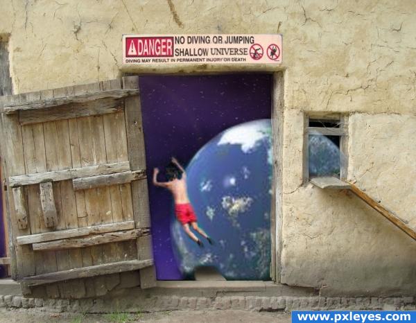
Is the Universe really shallow?
Thanks to:
KS - Danger NO diving
Morellomat - diving boy
Dimitric - earth
from: www.sxc.hu (5 years and 3895 days ago)
Hahaha - not to mention that this lack of atmosphere is freezing!! No humour bar?
That first step is a doozy! If I was to dive into space I would want to be using fins too! Love it.....Good luck.
Earth source is a previously manipulated image. You should be able to find a better one & resubmit...this is too good an idea to be pulled. 
great idea, good use of source. good luck with finding new earth source.
Haha! "Shallow Universe." I like it!
shallow universe.. funny 
Good humour xD
Howdie stranger!
If you want to rate this picture or participate in this contest, just:
LOGIN HERE or REGISTER FOR FREE

(5 years and 3901 days ago)
Sign should be warped out on the sides, not in, to match the curve of the glass.
cool
cool, but the kid looks like he's gonna break his right leg on the egde of the glass 
looks like a bit of the kids head is erased. but nice design and idea!
Howdie stranger!
If you want to rate this picture or participate in this contest, just:
LOGIN HERE or REGISTER FOR FREE
?
?????

is this some kind of game,who will put more question marks...
Howdie stranger!
If you want to rate this picture or participate in this contest, just:
LOGIN HERE or REGISTER FOR FREE