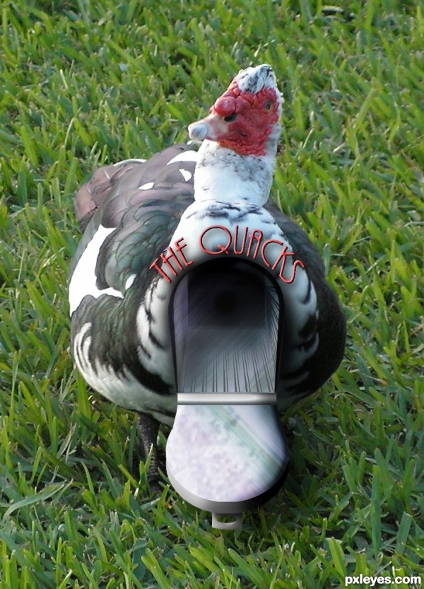
all my photo and built in PS (5 years and 3620 days ago)

Some people are willing to pay almost anything to look beautiful. (5 years and 3888 days ago)
If he kept his head turned to the right I'd be more than willing to.... Oh, wait. This is family friendly? Uh, in that case, nice job. High points for Doc McDreamy.
Maybe rotate the blade so the cutting side is facing downwards?? Maybe feather the opacity around the skull into the face some more? Looks just a bit sudden.. GL.
yeah, i thought of the blade after i did it. 
I think u can better integrate the skull with his face; now it seems a little to the side; it should be in the direction of the man's features (nose, eye, mouth) so I would move it more to the right and lower it and rotate to the right; sexy man by the way
This is really good and has a lot of meaning to it. The skull seems to come out a little too far by his eye but I could be wrong.
setting is good but scull on the head need some more work ,out of face and need some wrap.good luck
It's a good idea, but the skull doesn;t quite match up with the doctor. Good luck, though!
Thank you Hisks for the scapel picture. I put a link from your page the other day to here  http://www.sxc.hu/photo/992504
Howdie stranger!
If you want to rate this picture or participate in this contest, just:
LOGIN HERE or REGISTER FOR FREE
Very Funny
I love the idea!! If I could suggest something...the inside doesn't look very "real" looks CG compared to the rest of the duck. Maybe try adding some feathers around the front edge of the mailbox door since if closed it would be part of the duck again just suggestions...great job and good luck
thats funny.....
Nice job.....love that duck....where can I get a mailbox like it?? Best of luck to you!!
LOL...so funny...beside funny part u did great work here...good luck author
I suppose postman has to run and catch the mailbox to put a letter inside! Nice work, author!
nice work
ha ha .......... very nice .......... all the best to u ..........
congrats once again...
Howdie stranger!
If you want to rate this picture or participate in this contest, just:
LOGIN HERE or REGISTER FOR FREE