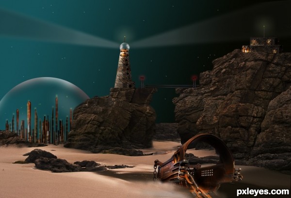
Not so good to create Sci-Fi creatures, but I love the Sci-Fi scenes, so I came out with this idea. Thanks to mqtrf for the pic of the rocks. The rest is imagination and hard work.
I used the source image to create the buildings.
UPDATE: Changes were made, due to suggestions. Made the rocks, background lighter to be seen. Flipped source image. As for the light source...this can be everywhere. There are moons, suns, or simple stars that reflect light from different directions. Just close your eyes and see. (5 years and 3442 days ago)


Too dark. It's very difficult to see all the effort you put into the background.
Also your light source is inconsistent. Something is shining on top of the dome, but on the side of the light house, yet not at all on the hard to discern rocks. Yet the source metal image is lit from the opposite side on the ground, and is throwing off a shadow in the direction of its light source...consistency is as important as making your image light enough to be seen.
Thanks so much MossyB. I did not realize that my image was that dark, it is my monitor, that sends me the wrong brightness... I made the rocks/background lighter, as for the source metal image, I flipped it. Hope the image looks better now.
Cool image, author, I like your buildings, the dome and use of the source on the other elements. However, the huge piece of the source looks like it was just kind of put into the image, and yes, the shadow is off. (They are so tricky and difficult to get, I know!) See the softness of the shadow from the rocks, and how it's very light - try to match that with the source's shadow - very light and blurred. Also, to 'ground' it, try erasing part of the lower side with a soft eraser, and it will look partially submerged in the sand. As far as the darkness now, it has a nice sci-fi feel.
Better, but still too dark just right of the light house and just right of the source image. But overall it's MUCH easier to "read" and appreciate. The domed city especially looks good.
Pearlie, I gave the shadow a softer look, and sunked the metal source image a little into the sand.
MossyB: I lightened the right side of the lighthouse, just a little. I think it looks nicer. Thanks again.
I did not see this before but it looks great on my monitor now, lighting is dramatic and no longer too dark... a complex scene and difficult image to create. Good work!
brilliant....
Thank you for your comments.
very very nice work author...perspective is well made also mood is perfect...only thing that i would like to see on this image is a bit more stars on the sky...i know its now to late, but some nice nebula would be perfect for this...any how i love your entry author and wish u best of luck...
Thanks Eration...I will do the stars and the nebula...Planning to write a tut for this later.
This is really cool. I love the scenery and the colors and the details. Very creative idea.
Howdie stranger!
If you want to rate this picture or participate in this contest, just:
LOGIN HERE or REGISTER FOR FREE