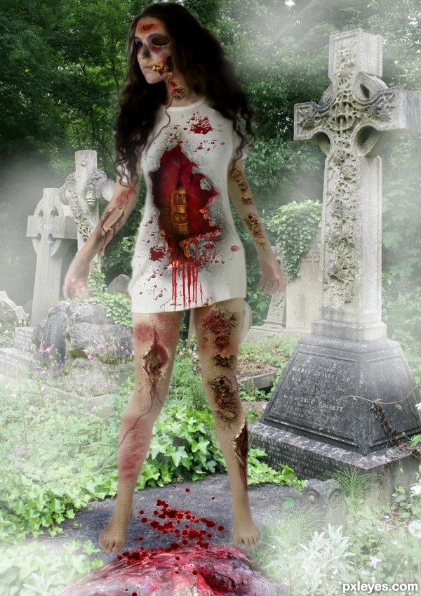
http://trisste-brushes.deviantart.com/art/wounds-25145474 thanks to trisste-brushes (5 years and 2838 days ago)
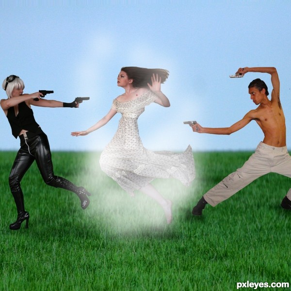
Thanks to cookiekitty-stock for the use of source image 2 (5 years and 3054 days ago)
interesting interpretation... since this is an attempted lifelike scene i will mention a few points on that. The girl with the guns is shadowed as if the light source is on the ground. everyone else is lit from above. both people with guns are missing proper blending and shadowing on the ground to make them appear to be standing in the grass. all figures appear to be flat and just pasted on. and i am not really sure how this is painted to look like an Egyptian style. perhaps view the example given. good luck!
i dont understand what is happening 
Your entry was moved back into the contest by a moderator.
Howdie stranger!
If you want to rate this picture or participate in this contest, just:
LOGIN HERE or REGISTER FOR FREE
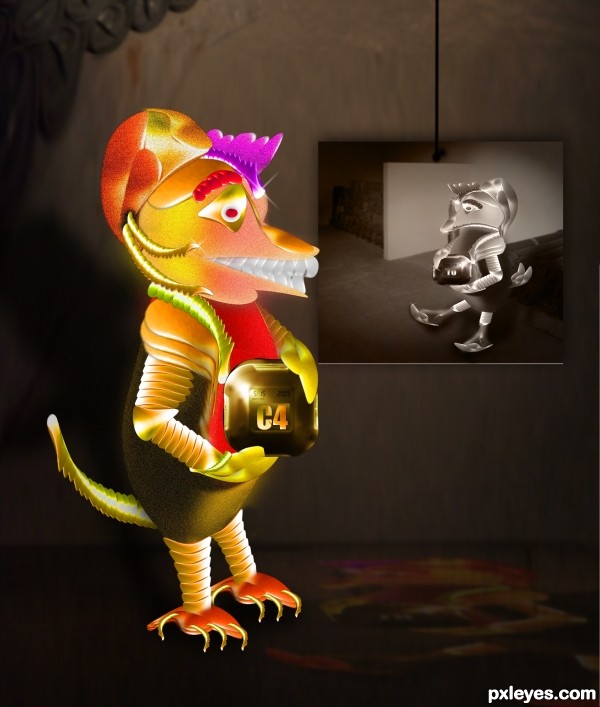
Lol...
UPDATED
used soruce image, and background link
VOTE FOR ME :p
READ : Please suggest me a background image , cuz i have no idea what to do with that :) (5 years and 3084 days ago)
Thank you Nator..
Prrety cool , my fav author..
SBS ... i dont know why it isnt on the sbs ...here is sbs pic...
http://www.pxleyes.com/images/users/a/albevolution/3917/fullsize/4f242f4953541_medium.jpg
Howdie stranger!
If you want to rate this picture or participate in this contest, just:
LOGIN HERE or REGISTER FOR FREE
(5 years and 3088 days ago)
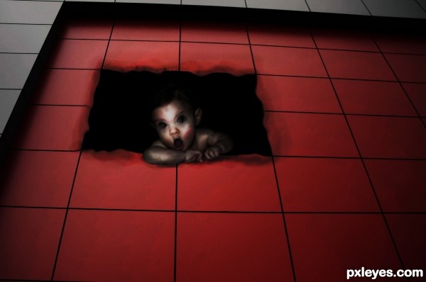
Good idea, but the edges of the tiles should have thickness.
Howdie stranger!
If you want to rate this picture or participate in this contest, just:
LOGIN HERE or REGISTER FOR FREE
(5 years and 3104 days ago)
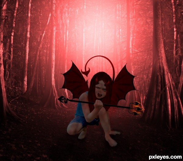
the hair looks really bad in high ress, the hand thats holding the fork is partly erased the fork goes straight thru her thumb and pinky lol, her cutout seems a bit shaky, the colors are okay, I would have added fire behind her though. I think you had a really great idea, the execution just needs to be a little better. holding off my vote for now.
thx for ur comment eladine, ur were right bout the hand lol, missed that, changed that and the hair also, i think the fire bhind here is a personal thing but thx for the suggestion 
yes great improvement author except the thumb the fork now goes behind her thumb instead of her holding it. the pinky is right done now, just use a hard brush to erase some of the thumb and use burn to create a small darker edge where the fork comes out through the bend of her thumb. (hope that made sense) and yes the fire behind her is a personal thing and does not change the quality of your work, just a matter of different taste i think  perhaps if u have the time you could let a tail come from behind her a little bit.
Howdie stranger!
If you want to rate this picture or participate in this contest, just:
LOGIN HERE or REGISTER FOR FREE
She looks too cut and paste, like she is floating above the walk path. The head is also anatomically off, with the face looking too large and far away from the rest of the head and neck.
An interesting concept, but the technical execution needs a bit more attention to detail.
thanks mossy but i didn't touch the head and neck , take a look at the original picture of the model
You have so many sources, hard to find which one. It will help in the future if you title them such as "head and neck," "lungs," "wound," etc. instead of "Source 1," "Source 2," etc...
You're right, the body is unaltered from your source. It then becomes your overall composition that makes it seem too large and poorly placed within the image. This is a visual "illusion" created by the eye's movement from your other elements, colors, and value choices. But since your focus was a zombie effect, more than an optical illusion of distortion, I still stand by my last statement that your technical execution needs work to create a more visually believable balance of the elements used.
ok thanks
Howdie stranger!
If you want to rate this picture or participate in this contest, just:
LOGIN HERE or REGISTER FOR FREE