(5 years and 3463 days ago)
- 1: source 1
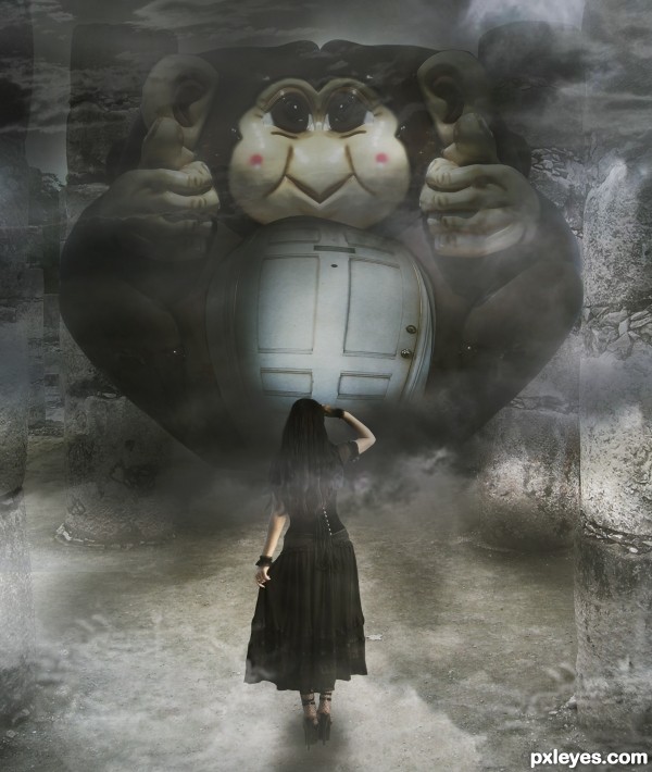
Credits to :
Door - robenmarie
Sky - *B-SquaredStock
Ruins - ~greenleaf-stock
Girl - ~Noree-stock
(5 years and 3469 days ago)
this is really nice! Love the shading from my end. 
nice smoky feel
Well done, I like the mystery here, what's behind that door, and is she brave enough to even get that close = )
Howdie stranger!
If you want to rate this picture or participate in this contest, just:
LOGIN HERE or REGISTER FOR FREE
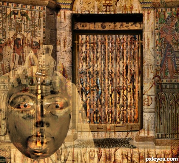
Egyptian creation thxz to jawshoewhah the author of the source image (5 years and 3532 days ago)
It seems to me that any source could have been used to create the door; the contest title seems to have informed this image more than the source itself. The ghostly face might be more compelling if there were dramatic lighting.
I did use the source image for the door - can't you see it ! well I'll have to make it clearer.
Howdie stranger!
If you want to rate this picture or participate in this contest, just:
LOGIN HERE or REGISTER FOR FREE
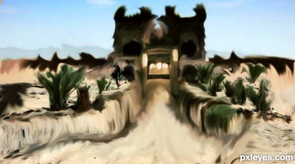
I have painted this content photo , very easy , and beaty :D
Coments , or any critic , wellcome :D (5 years and 3564 days ago)
you missed a bit of smudging on the vase
It looks like a heatwave to me GL author.
intersting idea
thanx Jascha400d for source link...
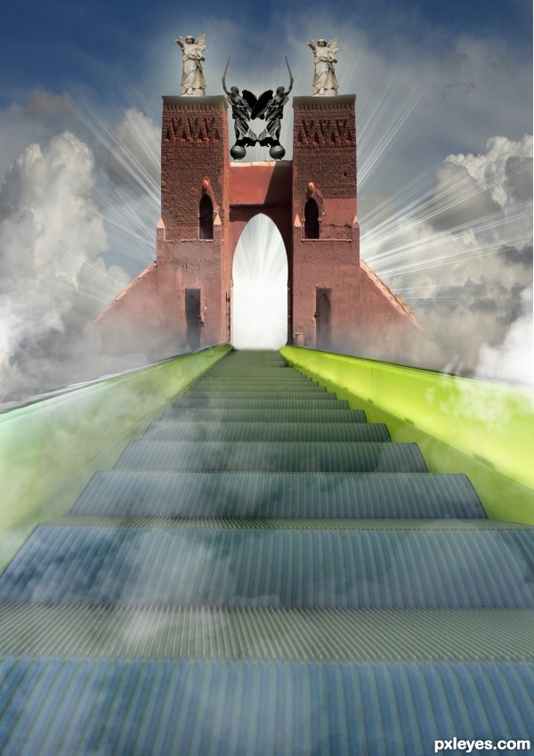
everything looks cool, except the towers. they make me think of some weird horns...
Howdie stranger!
If you want to rate this picture or participate in this contest, just:
LOGIN HERE or REGISTER FOR FREE
(5 years and 3564 days ago)
You really have a lot going on with this image! A couple suggestions, you have the light coming around the towers but not through the doorway, the light should be coming straight through as well. Good Luck
wow
nb, perspectives a bit off. gl
Howdie stranger!
If you want to rate this picture or participate in this contest, just:
LOGIN HERE or REGISTER FOR FREE
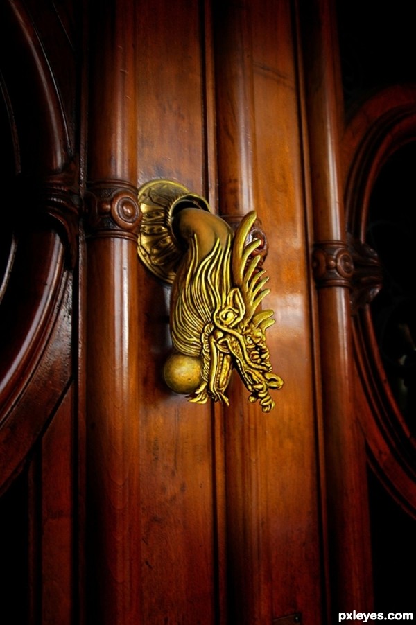
So realistic, that I can hear it knocking...
I agree, great blending job.
Elegant simplicity ... lovely work and so believable.
Very very nice work author...My only one small nit pick is about the color if the dragon head...Watching the rest of the image,brown color of the door,other parts of the knock u could down it just a bit dragon head,just slight reducing of the yellow-gold-ish color...Any how this is awesome entry...best of luck
no light effect on the dragon - since the material s bronce/gold - even though this s dop paint it must ve light effect.., this make more like 3d merge with photo not photorealistic... wrong shadow base on light source that drop on the door...
I Toned the color highlights down a little.
The level of realism here is impressive. Very creative and original use of source.
thanks all for the comments.
thx 4 attention/update - but it s still like 3d merge.., give more light drop - playin w/ texture - fix the shadow of the dragon on door ll make this a brilliant photorealistic lookin... but this got me 100%vote 4 the idea/attention/update - gl author.., this ll stand againts hood ornament 4 photorealistic lookin.., n me think this maybe the winner...
Liking the color and tone
excellent execution Well done & GL
Howdie stranger!
If you want to rate this picture or participate in this contest, just:
LOGIN HERE or REGISTER FOR FREE