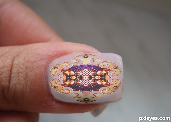
Thanks to leisha for the use of her image (5 years and 3594 days ago)
- 1: Nail
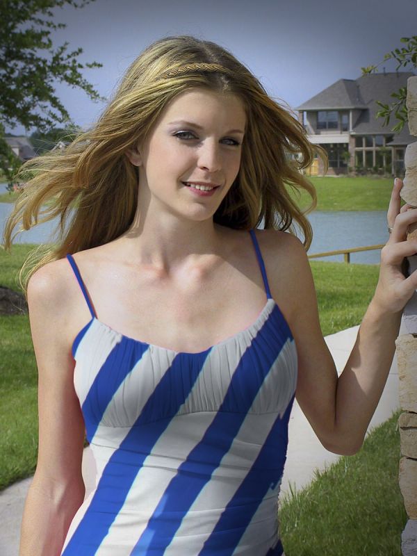
Copied Parts of source over image, used Liquify to change shape. Saved red-channel and pasted over original (later also used for displace effect). Used liquify on face. Pasted parts of source into hair. Transformed shape, added gradient fill. Cleaned up image with clone-brush and brush-tool. Adjusted Hue/saturation. (5 years and 3700 days ago)
nice blend...looks very natural. just erase some visible red on the chop 
Thanx for pointing that out - it's been removed.
very nice blend...good luck author
She got a nice diagonal stripes blouse! 
very well done author... excellent chop
Very nice work all the way around 
Very nice color change, the headband is a pretty nice touch.
Good blend very convincing. GL!
Congrats!! 
Howdie stranger!
If you want to rate this picture or participate in this contest, just:
LOGIN HERE or REGISTER FOR FREE
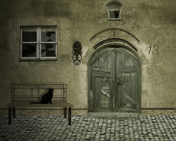
Squad of Sweden Stock-http://sofs-stock.deviantart.com/
moxylyn-http://moxylyn.deviantart.com/
Clickety-Click!-http://bogstock.deviantart.com/
Nadia-http://hope72-stock.deviantart.com/
Resources + Images-http://euphoricdesire-stock.deviantart.com/
Thanks guys for the great resources... (5 years and 3709 days ago)
Bench's leg need shadows too... 
Thanks Erikuri but bench legs have shadow's...Look in high resolution and u will see.Thanks for the comment...
According to your shadow placement the light source is coming from the ground in front of the door...
Of course that coming from the ground,i don't know what u don't understand CMYK
Sorry... 
Shadows are a bit indigestable......Nice work though...
Congrats! 
Howdie stranger!
If you want to rate this picture or participate in this contest, just:
LOGIN HERE or REGISTER FOR FREE
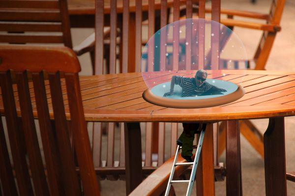
ive never done something like this before so any advice you can give would be helpful. thanks! (5 years and 3724 days ago)
nice done
I think its very good done. Maybe you´d like to flatten the hole a litte bit, so its in proportion to the tables "flatness"...
Haha I love this creative idea
i love it!
the perspectiv is a bit wrong, and the globe isnt very circular, hold shift while drawin your circle with the marquee tool ( if you want a perfect circle) .. Either cool  ,, maybe some shadows would help too ..
nice
you need to add highlights and maybe a glow on the circle, it's too flat looking
Nice idea,very funny
I like this kind of thinking.
I don't get any story here, but it would be surreal if the snow globe were realistic. MaXed is correct that the perspective of the base doesn't quite match that of the table (but I don't agree that the globe itself has to be perfectly circular).
I like the idea of this! The globe does need some work, with highlights and reflections ; )
tin my snow globes defense, not all snow globes are round. also, im not sure i know how to make highlights or reflections 
About the perfect circle .. it wasn't ment to make him make a perfect circle.. just a suggestion.. still needs some shadows i think and the perspective could be worked on .. 
Here is but 1 tutorial on making nice glass balls. http://www.lunacore.com/photoshop/tutorials/tut009.htm
great idea good luck
Cool...lol
Globe is elliptical rather than circular.....Other than that a nice idea and concept.....
wow
Really creative, great job.
Howdie stranger!
If you want to rate this picture or participate in this contest, just:
LOGIN HERE or REGISTER FOR FREE
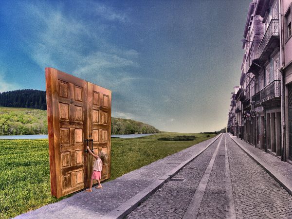
Nature is so near, but really we are so far.
Thanks for view and comments. (5 years and 3728 days ago)
Good idea, but doors are too distorted...
Very surreal  cool...
Howdie stranger!
If you want to rate this picture or participate in this contest, just:
LOGIN HERE or REGISTER FOR FREE
unique nails, but imo the shadow on the nail is too sharp. Maybe blur it bit
Thanks for the comment!
very nice good idea
Very good!!! Looks convincing!
Howdie stranger!
If you want to rate this picture or participate in this contest, just:
LOGIN HERE or REGISTER FOR FREE