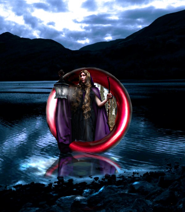
This was a bit tricky because there is three light sources.
The circle I duplicated and rotated it around.
Cathrine Langwagen- Thanks for the stock photo of the lady (5 years and 3855 days ago)

(5 years and 3962 days ago)
great!!
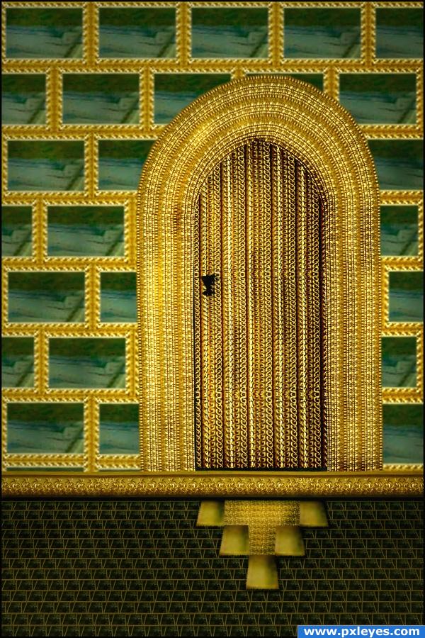
awesome use of source!!! great job (The door mat thingy is kinda small... might want to line it up with the door and make it look more like flooring.. but the overall effect is just wonderful!!)
You did a great job, my one suggestion would be to adjust the perspective of the floor just to make it seem more like a real floor.
Howdie stranger!
If you want to rate this picture or participate in this contest, just:
LOGIN HERE or REGISTER FOR FREE

(5 years and 3969 days ago)
Very nicely done.
very nice 
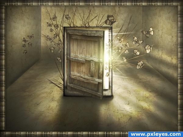
Interesting image...good color, but the frame is a distraction...
Really nice idea and lighting. Agree about the frame. It's not needed. 
wow great job
that's cool - very creative. I wish I had the vision to create somthing like this. Great piece, author.
I LOVE THIS!
I'm in love with the butterflies!  It's such a lovely creation! Good luck
Congrats Jaskier!
Congratulations for 2nd
Congrats!
Thanks for Your comments and votes.
Howdie stranger!
If you want to rate this picture or participate in this contest, just:
LOGIN HERE or REGISTER FOR FREE

(5 years and 3972 days ago)
Nice light & color! 

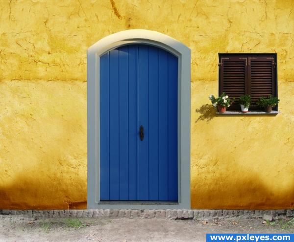
perspective seems slightly off
You should flip the door or the window to make the same lightsource to both
Oops...ditto on the light sources...missed that one somehow, but it's an easy fix.
Reminds me of some South American houses with the bright colors. Argentina? Brazil?
Thanks mqtrf.Totally missed that. Done
looks just like a screen saver my co worker had at work.. only her's was pink... just beautiful!!!
when is a door not a door . . . . . when it's ajar. (is the light on the door from the left - and the flowers cast shadows to the right? Or is it just me . . . . . .?)
nice colour choice
nice
Looks GREAT!
Howdie stranger!
If you want to rate this picture or participate in this contest, just:
LOGIN HERE or REGISTER FOR FREE
If you tone down the highlights on the red circle from the source, this would look much better, You have an interesting idea, but it just doesn't fit in this scene light wise or light source wise. The masking could do with a bit of work as well.
try adding some shadow from the head and the stick because you have light and light will make shadows.
Complement colors, nice
Bad, bad edges...clean this up for a better vote...the idea's not bad. Use pen or lasso tool to extract images neatly.
You can also use liquefy/push tool to make the edges strait. You also might want to put a ripple effect where the ring touches the water.
idea is great but croping is not that good...good luck author
Howdie stranger!
If you want to rate this picture or participate in this contest, just:
LOGIN HERE or REGISTER FOR FREE