(5 years and 2958 days ago)

(5 years and 3278 days ago)
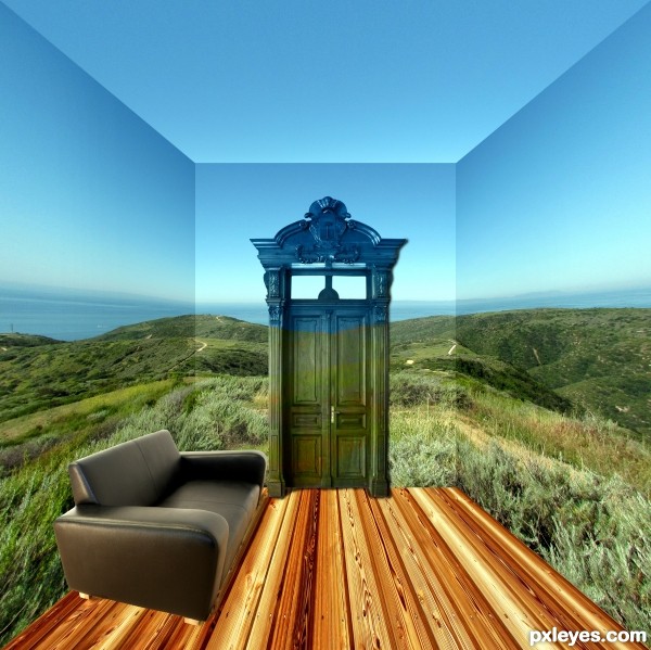
The horizon on the side walls needs to come towards the viewer more. Sofa needs a shadow. Why would the door change color above the horizon?
Thanks for the comments i knew the image wasn't right but couldn't put my finger on it. So thought i would post and see what what constructive comments i would received. Will look at your suggestions tomorrow and repost a revised version.
I like the way the door is painted to match the background. THAT'S why the door changes color!
A shadow underneath the chair, and a bit of toning down the shine on the top would improve this even more.
Well done, author.
OK, I guess I can go along with the paint job theory on the door, but the sofa needs to be reproportioned on the near end, and given a shadow.
Howdie stranger!
If you want to rate this picture or participate in this contest, just:
LOGIN HERE or REGISTER FOR FREE

(5 years and 3806 days ago)
Beautiful....
Great pic, good luck in the comp.
great eye RichieMB. I hadnt seen it. but now is corrected. if you find something else, please tell me. thank you guys for your comments.
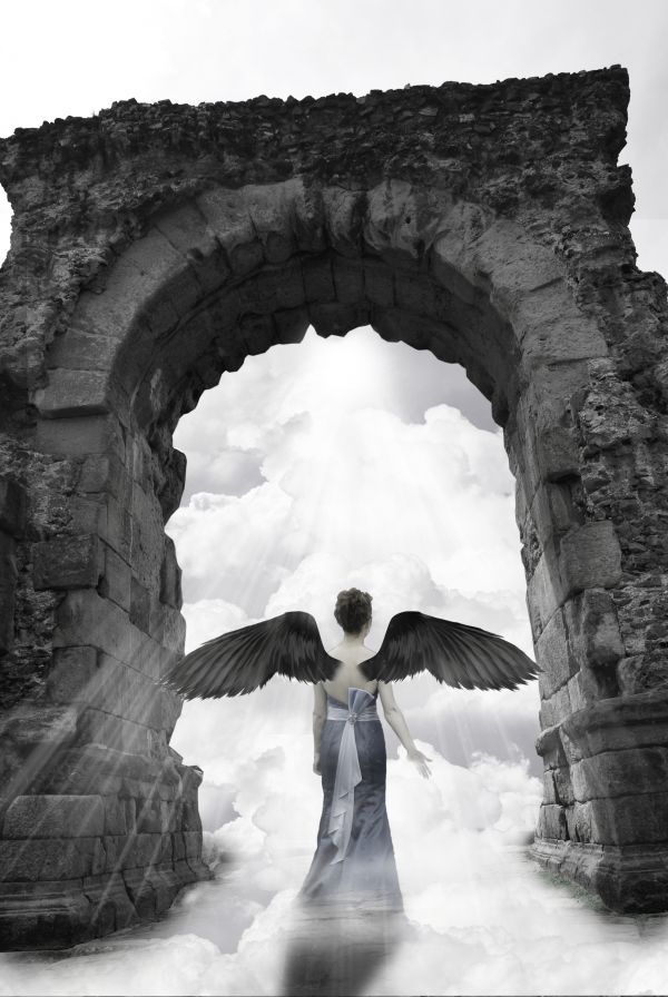
forgive my manners, I forgot to thank: zambyoo7 for his image el puente del diablo; to doogit for the image clouds; to bjearwicke for the image friendship and to voodoo4u2n for the image black wings. thanks again
Nice blending...suggestion...perhaps remove the soft white inside the door way at top center...it doesn't seem to fit. Very nice image, author! 
EDIT: Looks 

Fantastic entry.....Superb work.....
I would have cropped the picture just above the gate, now it just kinds of hangs there.. unless it's meant to be that way? Wings are very hard to blend, I'd have also covered her back with some more dress/hair to make it more realistic. Nice composition overall..
very pretty.. might want to take the hand of the OTHER girls right hand and place it over this girls hand so it doesn't look so cut in half (I think you wanted to look like it blended into the clouds but I can't get my eye to unglue from it.. great job though  (Just a suggestion.. if you like it.. that's cool too
Beautiful,
Nice one but the shadow with the clouds's cut looks weird, also the wings should be more natural blended. GL!
thanks for your comments. fixed tha shadow. added a right hand, tried to blend better the wings, erased the white spot on the top, I hope is better now. I want to thank demordian for the picture of the hand.
I guess it's a door....
it seems quite unused doorway..
Howdie stranger!
If you want to rate this picture or participate in this contest, just:
LOGIN HERE or REGISTER FOR FREE

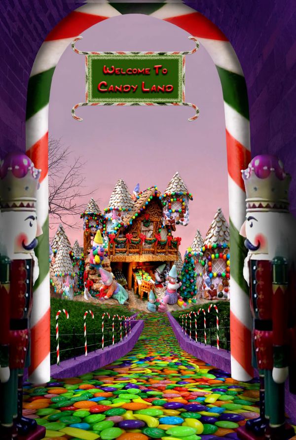
A special place for kids. Thanks to zambyoo7 at pxleyes.com for the doorway photo, to vilhelm at morguefile.com for the candy used to create the street, to jetolla at morguefile for the gingerbread/candy house, to xblackxcreedx at morguefile for the nutcracker photo, and to imagina for the sunset sky. I began with a photo of my own for the sky, but changed it in the end. (5 years and 3821 days ago)
WOW... the road is KILLER.. almost feels like you could lick it..hehehe...SUPER DUPER nick pic, you have so many wondrous textures that the text in the sign is a bit of a let down.. maybe make the word Entering out of the candy land font you used, rasterize it and make it white with a bevel emboss and drop shadow.. do the same with the Candy Land word (bevel,emboss,dropshadow so it matches all the magical textures you've captured... IMHO... ) Kudo's all around.. very fun image
EDIT... YEAH!!!!.. now the sign makes perfect sense.. GREAT JOB
you just ruined my Diet................. rofl.
Well done, You really brought the colours out well and made a very nica image. I agree that the sign looks a little tacked on but otherwise great!
Will work on the sign tomorrow. Thanks for the good suggestions.
I was thinking about doing something like this too. Oh, well. So much for that idea. Looks good. Good luck!
lol really nice i was going to do one like that but wasnt sure how to pull it off 
Driven, you have pushed me into really working on techniques for embellishing text. I think it really did make a world of difference (after 3 hrs), and I thank you for the shove!!
Very good, GL 
great result. Good luck
Great!
Fantastic! 
Congratulations on the end result, you little of the original photo but did a great job. This is a Matte Paiting original.
well done.good luck
Great detail..
Congratulations for 2nd
congrats for 2nd place.... you have brought back my sweet tooth :p
Congrats for your second place, Artgirl!
Congraaaaaaats!!!!!!!!!
Thanks for the votes and nice comments all!
Howdie stranger!
If you want to rate this picture or participate in this contest, just:
LOGIN HERE or REGISTER FOR FREE
oooo, The Little Prince is going to give you a right smack bottom the tree trunk is marvelous
  good luck
thanks Drivenlush
Awesome pretty work!..
Thank you jordyponce for your comment and fav
Howdie stranger!
If you want to rate this picture or participate in this contest, just:
LOGIN HERE or REGISTER FOR FREE