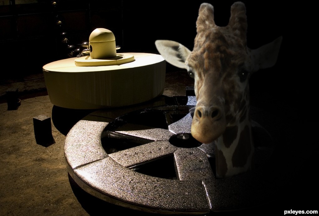
Thanks to Martin Pettitt for the image of the giraffe, and aeruginosa for the image of the sink. (5 years and 3510 days ago)
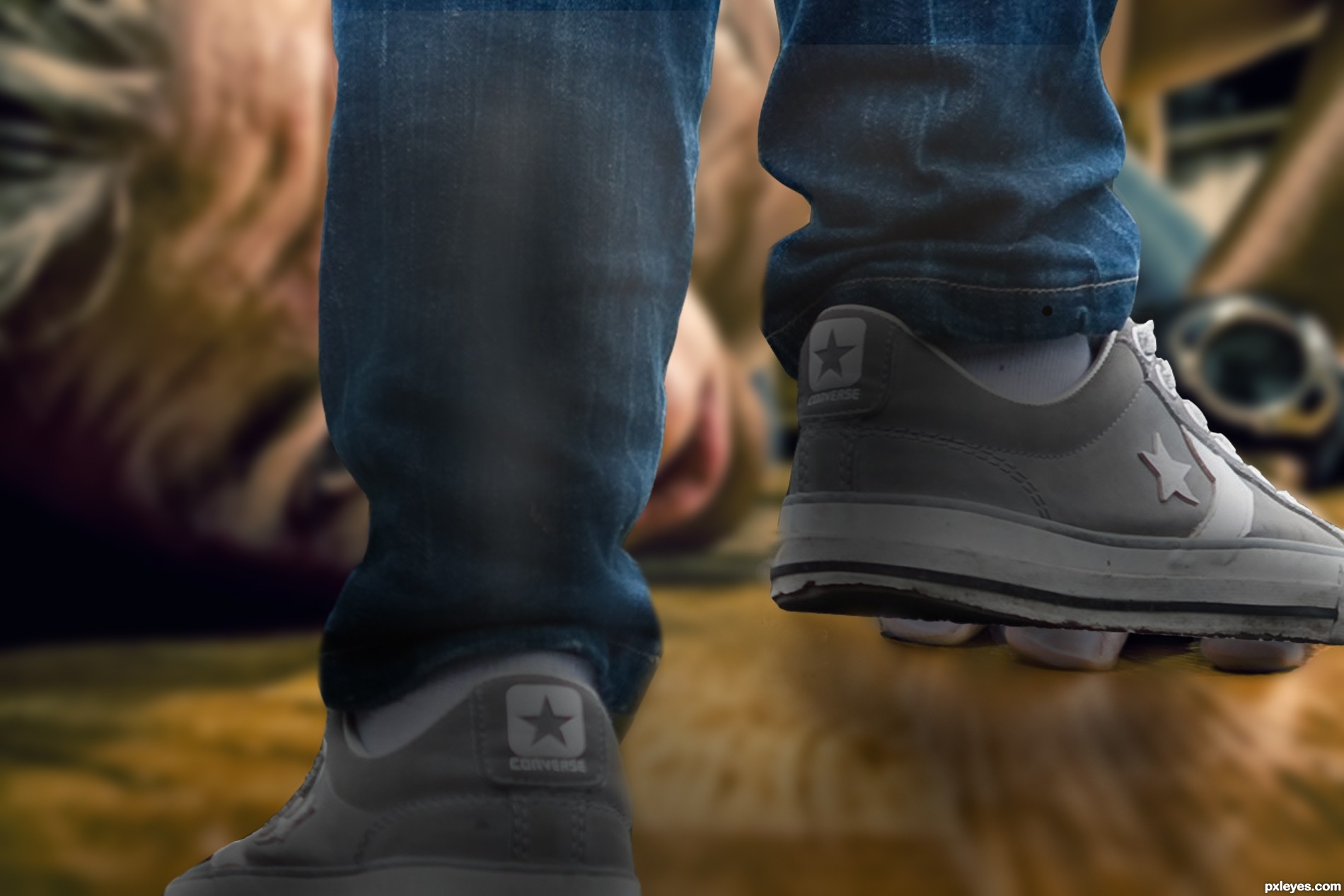
With thanks to andres.thor for the image of the prostrate man. (5 years and 3530 days ago)
Good idea, but edges need cleaning up, especially on the left leg. Part of the background is still there between the jeans & shoe on the right side, and there's some sort of patch beneath the man's eye.
Now for once, CMYK46, you're very wrong - the legs are perfectly cut out, they are in fact seperate legs and clean as a whistle - am going to add them to my sbs now ( thought I'd done that) The patch under the man's eye is just part of him , (his lower lashes I believe) - does look odd though I must admit. I think you can see that if you look at the original pic in SBS's. Off to add the clean cut legs now........
Legs now No. 7 in sbs. Not had time to doctor them so that's how they were and are! 
I can wait for a little apology - but bear in mind that I am booked in fot the "Horse og the year show" NOVEMBER 2011 
This is nitpicking, but on the jeans beneath the man's eye, compare to the source image...there's some sort of irregularity there that looks like it's patched in. And at right of the left shoe, directly below the cuff, there's still a triangular piece of background that the arm of the star is pointing at.
The figure is a bit too sharp in focus. A little Depth of Field blurring would help the visual believability.
The left leg is problematic to this piece. Looking at the DOF blur of the floor and the angle of the camera, that left foot should be slightly larger at the heel, and toe needs to be angled upwards a bit, not "flat" on the bottom edge of the image. Also, the pant leg on the left leg is doing a weird "pinched in" mirror effect at the ankle, and shows an odd gray fade mark running about 10 inches up the back of the leg and stopping.
The light source on the man's face is very strong, striking his chin and lower cheek from the top. This would make the shadows of the legs stronger on the left.
I cannot visually "read" the forearm with the watch on it. It looks like a brushed metal pipe, not a hairy forearm...
Personally, I'd suggest darkening those eyelashes. The light reflection on them is too distracting to your overall image.
MossyB - I'll need a day or two to digest all the info, but thanks for it all the same. CKYM46, I QUOTE "And at right of the left shoe, directly below the cuff, there's still a triangular piece of background that the arm of the star is pointing at." It is in fact the black strap of the man's watch! With regard to the jeans just below the man's eye - it's just where the jeans fold on to the shoe (foot) Baggy jeans man!!
Tomorrow, tomorrow............
LOL...the LEFT shoe! 
THE END! (Baggy jeans and all!) Thanks for all the comments, they really have been appreciated - have simply done my best! I realise it may not be good enough......
Dude, it's a good entry, don't get discouraged, we've all seen a hell lot worse. People here are just trying to help u improve, it would be more unpleasant not to have any feedback.
Very good.
looks great.... you did a good job.... good luck
Aw, thanks George!
Congrats.., very nice entry
Howdie stranger!
If you want to rate this picture or participate in this contest, just:
LOGIN HERE or REGISTER FOR FREE
(5 years and 3584 days ago)
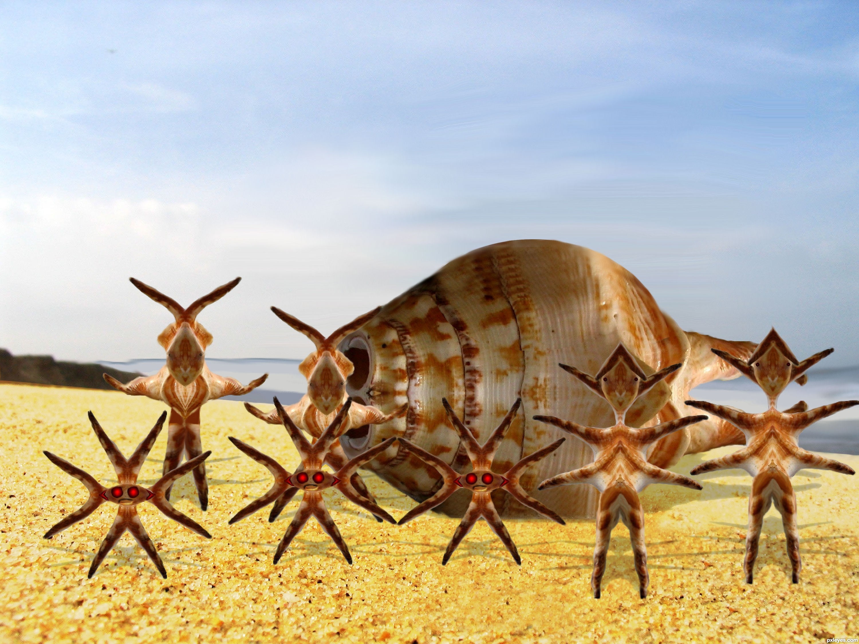
idea is good -- patch of sand in front is showing a bit too much of cloning -- shadows could use some softening -- maybe some spread as they have too hard and edge also they seem a bit too much on top of the sand try a different blending mode maybe overlay with another layer in multiple with a lower opacity
Thanks Alan I did some touch up any better ?
And Thanks Giulia I took care of that I don't know how I missed that
cute little guys...the top of their submarine needs a bit of adjusting, though... the cut is too straight, maybe try to make it more round?
Howdie stranger!
If you want to rate this picture or participate in this contest, just:
LOGIN HERE or REGISTER FOR FREE
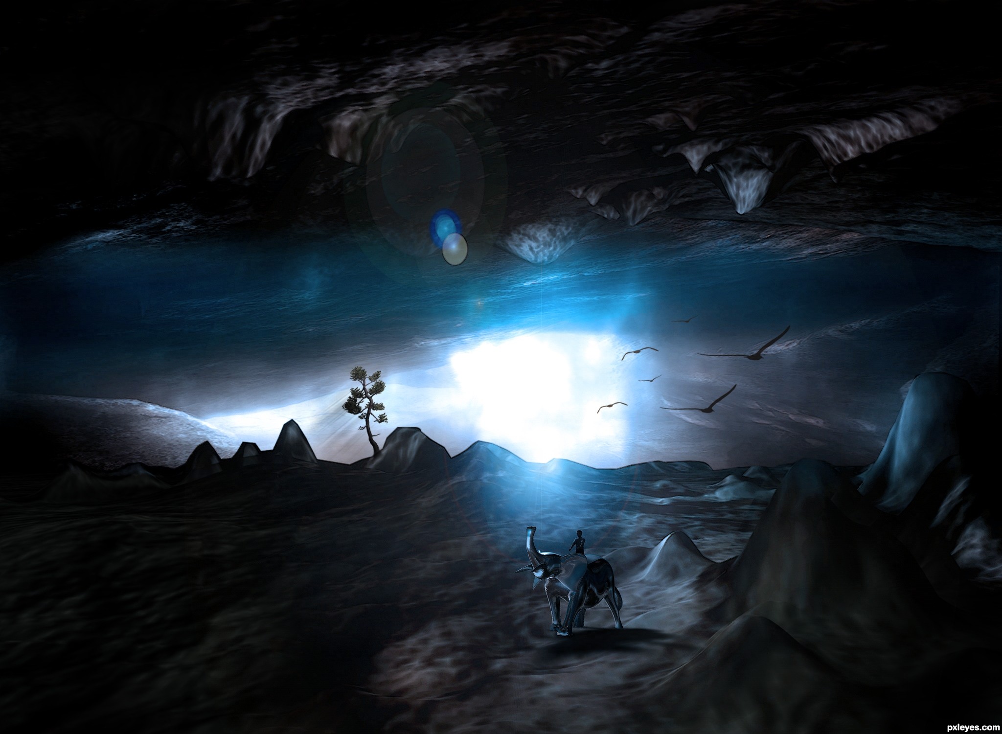
Thanks to ''graceandpeace'' for source 2 (5 years and 3654 days ago)
Nice lighting
great work author...i could say,as always...
coooooooooool
Great work on the lighting effects!

Howdie stranger!
If you want to rate this picture or participate in this contest, just:
LOGIN HERE or REGISTER FOR FREE
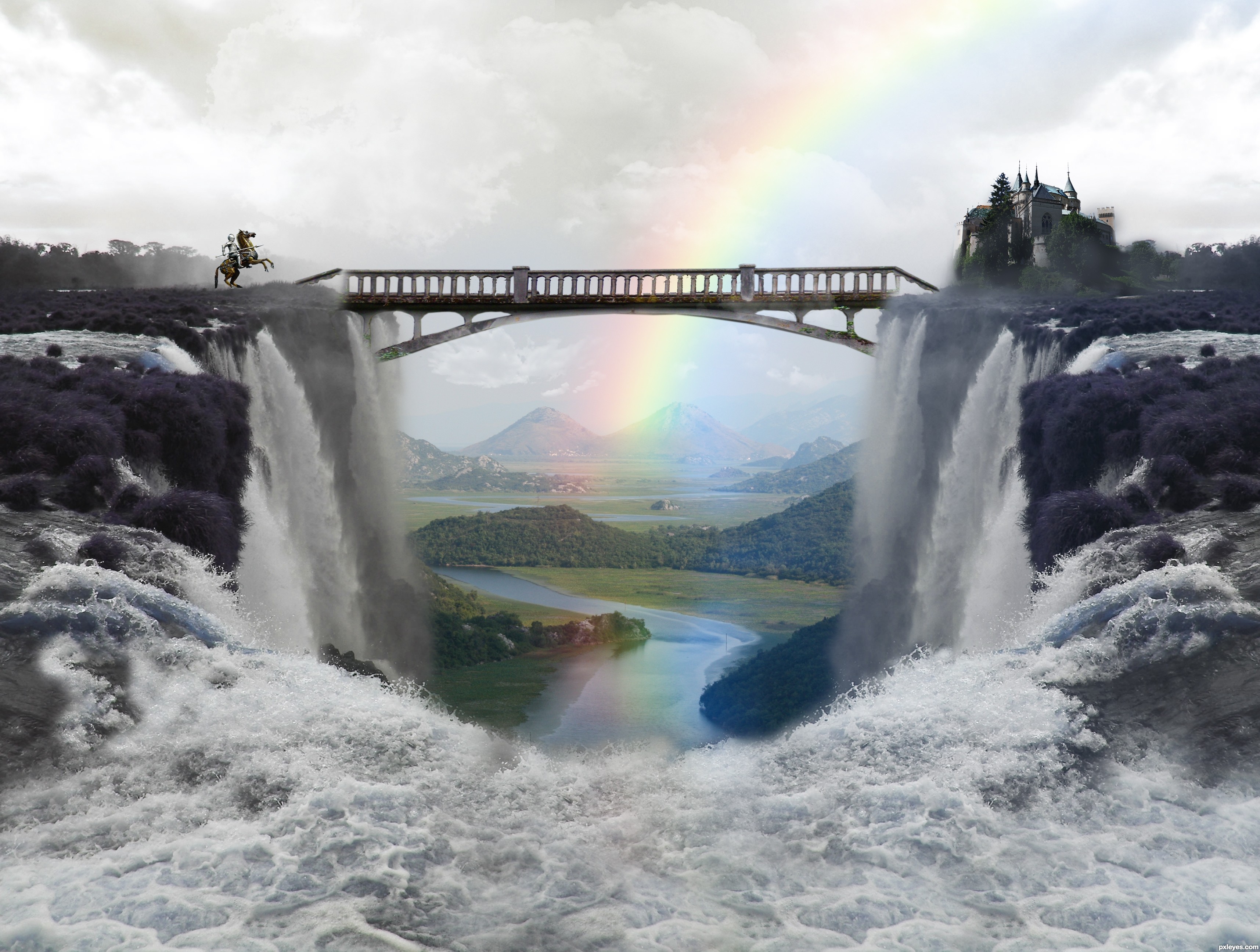
thanks to:
leftfield1 for the RIVER image
jana koll for CHATEAU image
enqe 6560 for MULTNOMAH FALLS image.
kamila t for KNIGHT ON A HORSE image (5 years and 3701 days ago)
very nice!
Not sure about the desaturated foreground, but pretty good image.
thanks CMYK46. the foreground its not desaturated. it has litlle bit of blue, because in turbulent waters you are not suposed to see any color.
I like how you have decided to use the source image..IMO you need to pick a focal point and work around that...too many fuzzy areas and then areas that are in focus...kinda makes it a bit confusing as to where to look...Good Luck
Christy...I dont get it.
You are showing different things at different viewpoints in the image...they shouldn't all be clear...if you want the castle and the horse in focus and the focal point then blend and blur your image to direct the eye to those points...Hope this explains better and it's just my opinion good luck
Nice result, the rainbow adds a lot to the mood of the image. You might fix the blurry parts though. Good luck!
Beautiful entry, author! GL...
GL
nice
good mood... congrats....
Howdie stranger!
If you want to rate this picture or participate in this contest, just:
LOGIN HERE or REGISTER FOR FREE
Photography and photoshop contests
We are a community of people with
a passion for photography, graphics and art in general.
Every day new photoshop
and photography contests are posted to compete in. We also have one weekly drawing contest
and one weekly 3D contest!
Participation is 100% free!
Just
register and get
started!
Good luck!
© 2015 Pxleyes.com. All rights reserved.


should adjust the contrast on the giraffe.. (give it more contrast)
It would blend better with the environment.
GL
With some retouching on the giraffe, this image would hae an excellent looking. Ty addind more contrast, and some shadows at the left side of the neck of the giraffe to make it look a bit less flat
/agree with both above comments, this one is soooo close to being a 9 or 10!!
Thanks folks! Have adjusted shadow as suggested.
very cool work author...i did not see it before changes but now look so good...best of luck
Howdie stranger!
If you want to rate this picture or participate in this contest, just:
LOGIN HERE or REGISTER FOR FREE