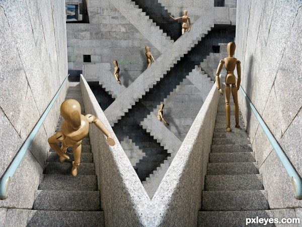
I hope you get confused enough
Only own sources were used :P (5 years and 3618 days ago)

(5 years and 3624 days ago)
very nice done,i like the butterflies
Snake is great butterflies to...good luck
GL
nice job .....................
very nice
Howdie stranger!
If you want to rate this picture or participate in this contest, just:
LOGIN HERE or REGISTER FOR FREE
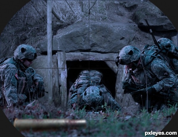
used hue & saturation to change colour of sources, blended edges with soft eraser, used blur on hole source to match 2nd source. added shell with blur and erased for grass blades. Gun sight, eliptical marquee and small brush (5 years and 3637 days ago)
Nice work, good idea for this source. (not sure why the casing is parallel with the viewer, tho.)
Cool! Very nice and creative idea.
very cool author
Great work author...good luck
I don't like anything about war, but it's a well done work. 
Good idea 
''oh.... That could not be happen.........  i wish this is only a hospitality
  ....right'' super cool idea,...... Good luck author

nice work author 
GL
great entry, author...and very cool idea... good luck 
This looks really good, nice blending
Howdie stranger!
If you want to rate this picture or participate in this contest, just:
LOGIN HERE or REGISTER FOR FREE
(5 years and 3673 days ago)
Simple, but effective! 
Simple, but smart.
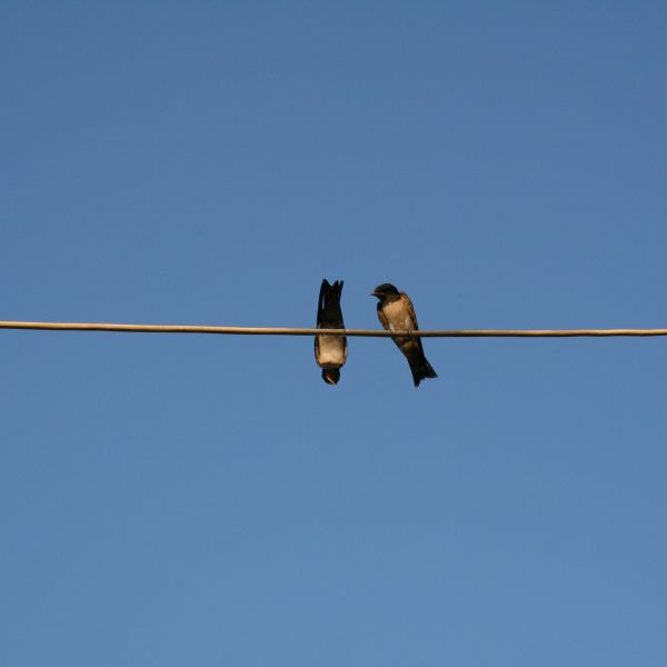
Thank you for the comments. I know it's very simple, but I thought it was cute and funny 
simple and nice......
nice one...good luck
Simple but soo clever! GL! 
Simple but soo clever! GL! 
love it! 
Howdie stranger!
If you want to rate this picture or participate in this contest, just:
LOGIN HERE or REGISTER FOR FREE

thanks to shahiddes for child image (5 years and 3674 days ago)
Wierd science!... 
Most of people did this kind of work always has the problem with the shadow of the rotated part and you're not the exception. If you can solve that problem, I can vote you very high  . In details, that are the shadows on the cheek, the nose, and the eyelash, they should disappear and the shadows on the reverse sides should appear. Can you do that? PS: your skin blending is good. Good luck, author
good work ! 
Agree with langstrum, spot on.
There are still original shadows below the nose and mouth that need to be fixed.
EDIT: there still there.
thanks everyone for ur comments ,,,i made some changes i hope u like it now  ,,,GL everyone
nice blending...
Howdie stranger!
If you want to rate this picture or participate in this contest, just:
LOGIN HERE or REGISTER FOR FREE
Very very nice, like it, GL
very cool
Too many different light sources, but still a nice job. Good luck.
Maybe the different light sources are part of the illusion :P. I like this one, good job.
A lot to like. The illusion might be more compelling, however, if the right-side figure were on the same step level as the left-side figure. Additionally, the I think background is distracting because its dark shadows dominate the center (initial focal point of viewer) but then has no optical-illusion component. A simple stone wall (with maybe a window) with vertical mortar lines consistent with those of the left- and right-side walls might be better as a background. [BTW in background, top figure's left hand should be casting a shadow.]
nice and GL.............
This is very cool!
it is very sweet
it is very sweet
Gud Luck... Very nice
now that soo twisted, nice work
great work !
Great job author...best of luck
A big Escher fan?
I LOVE the Escher quality of this!! Best of Luck and Well Done =)
Great blending and composition shadow work really helps the illusion
Congrats!
Congratulations!
Congratulations for 3rd
congrats
Congrats! for 3rd place
Congrats for 3rd place!
Congratz to 3rd
Congrats for 3rd!!!
congrats........ nice to see u back...
Congratulations!
good wrk... congrats...
Congratulations!!!!!
Howdie stranger!
If you want to rate this picture or participate in this contest, just:
LOGIN HERE or REGISTER FOR FREE