(5 years and 3657 days ago)
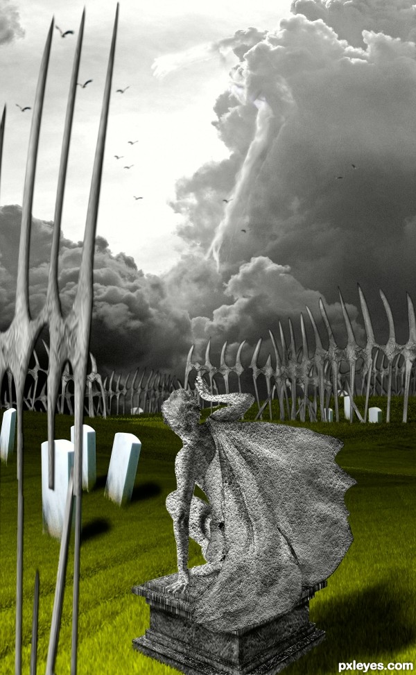
- 1: Statue texture
- 2: Cloud
- 3: Open field
- 4: Tombstones
- 5: Birds
- 6: Men

(5 years and 3657 days ago)

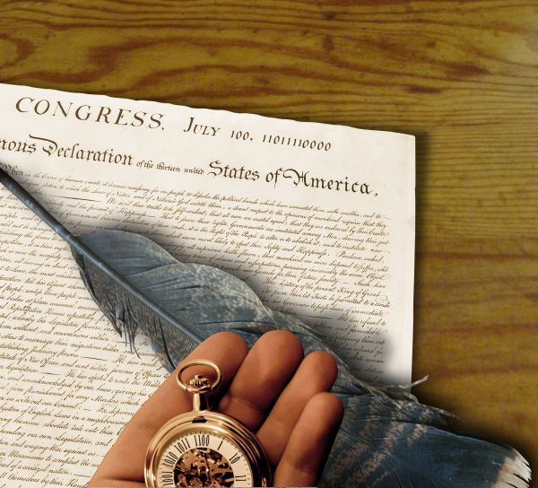
The founding fathers decided another draft was in order. Ok here it goes again. This is the 3rd attempt to get this to load. Thanks to kelly taylor (quill), and Ben Dodson (watch & hand). (5 years and 3744 days ago)
Fantastic work...for me very soul-ish...very well done author...good luck
Creative incorporation of two different items with numerals into a single image for a more complex entry. The perspective on the inkwell is way off, however. (We should be looking nearly straight down onto it.) I also think the watch should cast more shadow on the fingers. I personally would try to arrange the items/crop the image so that the amount of wood desktop (uninteresting background) showing is minimized.
I agree with Danlundberg, the wood desktop is kinda distracting.. the focus should be more on binary stuff..  Good Luck
i think it's a nice concept, maybe the hand is a bit dark, and for the mood you've created maybe the shadow of the hand is also a bit dark  good luck
i think it's a nice concept, maybe the hand is a bit dark, and for the mood you've created maybe the shadow of the hand is also a bit dark  good luck
Thanks for the comments. I may try to crop some wood, but I need distance to make the well work, DL. If I stand at a table with such an arrangement, the well would be at about 18-20". I set up a similar scenario and the container was at about 45 degrees, which is what I shot for with the well. So I have to disagree about the perspective being way off-slightly...maybe. The shadow is an interesting point I should probably soften the hand-to paper shadow, as the watch shadow is fron the original photo. Thanks for the constructive criticism!
Edit: I cropped a bit of wood and softened the hand shadow. I had to move the quill to accomodate the changes. I also reopened in camera raw and warmed the jpeg to give the atmosphere a more candle lit feeling

EDIT AGAIN: Curse you DanLundberg! You were right. The inkwell is history 
..and the composition is better too.
I think it's just fine and also think it's a clean job...hi res is very good...good luck author
...my thought also 
Yes great chop Author go get em  good luck for sure
Congrats! 
Howdie stranger!
If you want to rate this picture or participate in this contest, just:
LOGIN HERE or REGISTER FOR FREE

Thank you the following for the stocks :
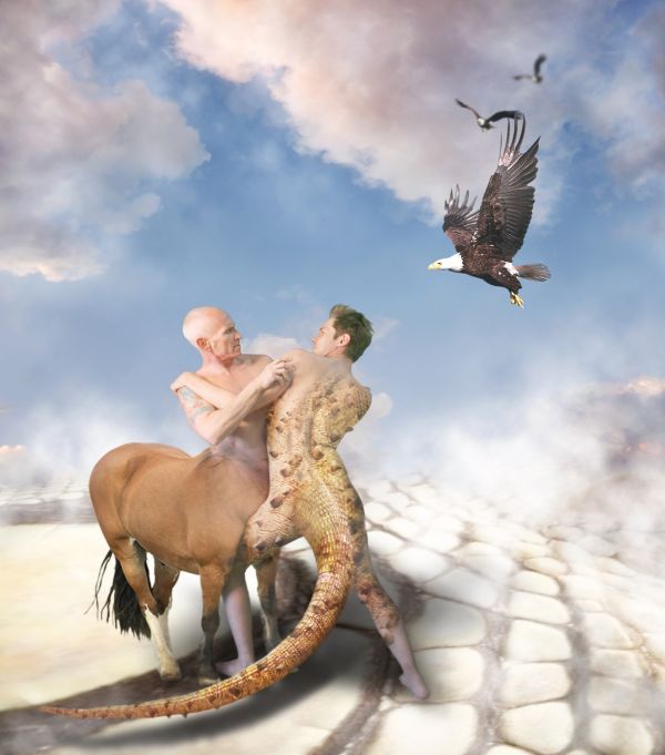
Eagle : http://fairiegoodmother.deviantart.com/art/Flying-Eagles-psd-87034311
Lizard:
http://someonesblues.deviantart.com/art/Lizard-147246269
Horse:
http://dark-dragon-stock.deviantart.com/art/horse-stock-1-53271481
Men:
http://felixdeon.deviantart.com/art/Nude-Male-Fight-151239541
Sky:
http://lemnosexplorer.deviantart.com/art/Sunset-s8-Stock-Image-105789145
Licenced Image by LemnosExplorer.deviantart .com (5 years and 3770 days ago)
ooooooOoo......... who is gonna Win?
this one will probably be my best bet... good job author!!!
wow!
 good to see you again author
Simply superb!... 
Great work...Only few minor observations...u should mask whole legs with iguana skin on lizard man,feet now looks a bit unnatural.And u could create small shadow's under the horse legs,because right now looks like they floating.I know that's the hardest part curing hairs,but horse tail is not cut-ed perfect.Try to fix that author,and this work is gonna be in top 3 110%.Good luck.
Nice idea and put together nicely, one suggestion, consider darkening the contrast to help carry across the emotion of the struggle!
Might have been good to remove the tattoo. Agree with Martrex about the contrast, but everything else is well done! 
ooo nice, but is it a fight or a lovers triste?? 
Perfect work! 
Congrats for your third place, Mayechung!
congrats!!
congrats
congrats !!
Congrats!! 
Congrats!!
Howdie stranger!
If you want to rate this picture or participate in this contest, just:
LOGIN HERE or REGISTER FOR FREE
Credits
Cloud :- http://al-stock.deviantart.com/art/Dark-Cloud3-64851415?q=1&qo=1
Men : http://felixdeon.deviantart.com/art/Male-Nudes-Reaching-153548683?loggedin=1
Bird : http://fairiegoodmother.deviantart.com/art/Flying-Eagles-psd-87034311
Thank you.
Men :
Good idea. A real stone texture would have made it much better.
very mystical and spooky
Howdie stranger!
If you want to rate this picture or participate in this contest, just:
LOGIN HERE or REGISTER FOR FREE