(5 years and 3446 days ago)
- 1: source1
- 2: source2
- 3: thx to lorddarkwolf
(5 years and 3449 days ago)
m.flickr.com/photos/fturmog/2170810567/
Howdie stranger!
If you want to rate this picture or participate in this contest, just:
LOGIN HERE or REGISTER FOR FREE
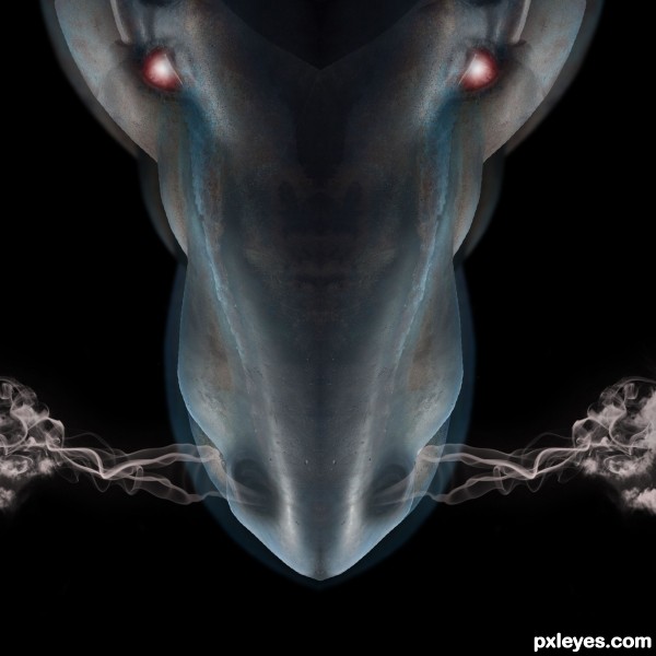
smoke brushes: Revnart Smoke by revn89 at deviantart.com: http://browse.deviantart.com/resources/applications/psbrushes/?q=smoke#/d2lsm1c (5 years and 3457 days ago)
The aura or whatever it is doesn't work for me, but the concept is great. Good luck! 
Fascinating use of source ... love the smoke from the nostrils.
Different and nice. Good luck author !
brilliant work author 
amazing creative....... very nice.
It looks like an x-ray of the dragon... nicely done! 
cool work author
Howdie stranger!
If you want to rate this picture or participate in this contest, just:
LOGIN HERE or REGISTER FOR FREE
Thanx SomeonesBlues, shortcakesnail-Stock, pueang,
(5 years and 3459 days ago)
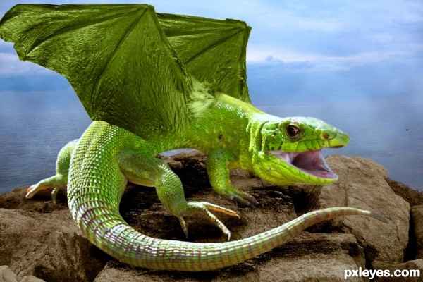
lol i was just thinking shame its got no teeth then i read the title good job theres an outline round the tail and one of the feet tho
Lovely guy ... kinda glad he has no teeth ... he would be pretty fearsome with them.
I do agree with bomby on the edges ... could use a little smooth so the edges blended a little more (try a layer mask; you can blur it a tiny bit and get a gentler edge  ) ... Sweet work otherwise!
Nice. I just think that shadow is too overburnt...
Good stuff.. , blending is nice.., except that portion where wing joins the body.. good luck 
Howdie stranger!
If you want to rate this picture or participate in this contest, just:
LOGIN HERE or REGISTER FOR FREE
my photo and source (5 years and 3460 days ago)
What a sweetheart ... and the title just makes it that much more well, for lack of a better word, precious!
it's really cute... love the expression of the little dude.. 
Howdie stranger!
If you want to rate this picture or participate in this contest, just:
LOGIN HERE or REGISTER FOR FREE
I would discard the drop shadow..

I can't see the point of it ..
Good idea though
gl
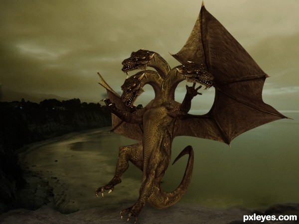
not sure if its just me but the contrast and lighting in the dragon doesn't match with the dull, dark and misty background.
No reason for drop shadow against the background.
ok got rid of the shadow and burned the dragon and made it a bit darker to fit more in the background hope its ok now
I've removed my original comment. I guess the use of the dragons could be within the guidelines - but I will not render an opinion. That's purely for the mods to decide.
Either way, it is a nice final image so what you did chop you did well.
dont know what u trying to say ray, u can see i made this cause the source is a one headed dragon and this one a three headed. By the way ur are reacting i quess u want a sbs with every entry cause everyone can "ripping art from elsewhere and paste it into a new ground", but if u look at the sources first u can see that i didnt do that.
like the work...only comment is, can avoid falling backward.
make it like landing
ok rotated it a bit looks better now
SBS please
Howdie stranger!
If you want to rate this picture or participate in this contest, just:
LOGIN HERE or REGISTER FOR FREE