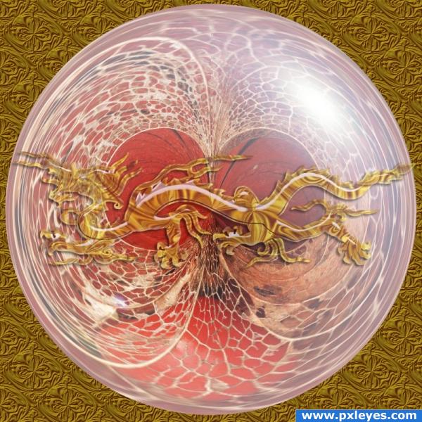
thanks to Lucifer017 for the style
and to Mario for the brush
(5 years and 3910 days ago)
(5 years and 3914 days ago)
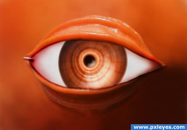
Good idea, looks a bit flat...maybe liquify the bottom to be rounder, and/or spherize.
EDIT: Much better now, but can still improve. Go for it! 
thanks for that CMYK i'm trying that out now
oh man this is terrible... this piece makes me want to be so BAD...I want to POKE IT so BAD..hehehe.. good luck author (very gooey sticky eyeball feeling , excellent job LOL)
nice! makes u fantasize about how the whole creature would look like
Amazing idea and really great work, looks like a real eye o.o
clever thinking.
very nice idea and nice work author 
haha lovely idea...eyeball is bit distorted......thought nice work...GL
haha lovely idea...eyeball is bit distorted......thought nice work...GL
Brilliant idea the outside of the eye is spot on but the eyeball its self looks a bit on the flat side
i'm working on the eyeball now!!!!
great job with the eyelid
cool! but the right side of the eye just doesn't look right. try pushing it in a bit maybe it'll be better 
 Simple but of effect.
blood vessels in the white of the eye are a nice touch!
congrats Reap!!!!!!! 
Howdie stranger!
If you want to rate this picture or participate in this contest, just:
LOGIN HERE or REGISTER FOR FREE
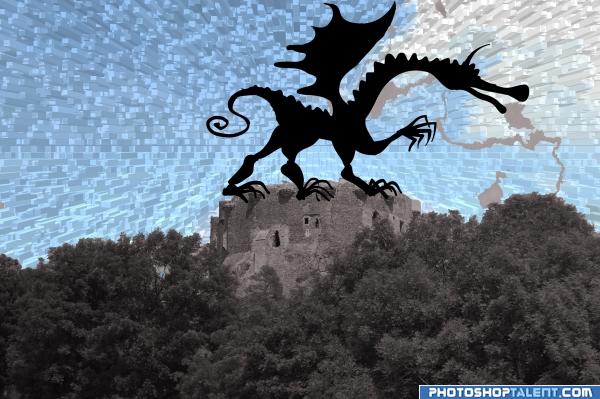
thank to emjvincente for the fine photo (5 years and 3925 days ago)
I've been staring at this one for a little while now and i honestly don't get it! xD No worries, it's a nice image so you shouldn't have any problems :p.
Excellent work..
ahhh.. the good old extrude filter. neat effect... I like the silhouette of the dragon.. maybe tuck in his toes in here and there so he looks more ON TOP of the castle, not just in front of it.. and the smoke trails need a bit of work.. they are looking a bit like torn paper..but if that was your goal.. good luck.. very different approach (Shaping the lines around the cut out of the dragon couldn't hurt either... there's some little bobbles here and there)
:0
clipart feel is there.
good idea
you burned everything out...where is the fire?
Howdie stranger!
If you want to rate this picture or participate in this contest, just:
LOGIN HERE or REGISTER FOR FREE
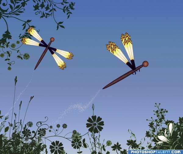
source and ps
thank you redheadstock (5 years and 3934 days ago)
Extremely well done my lady...High marks on this! 
Very sweet and floating..way to retain the source..I love that.. gives it lots of character
nice!!
funny cool


good work
congrats Tap! 
Howdie stranger!
If you want to rate this picture or participate in this contest, just:
LOGIN HERE or REGISTER FOR FREE
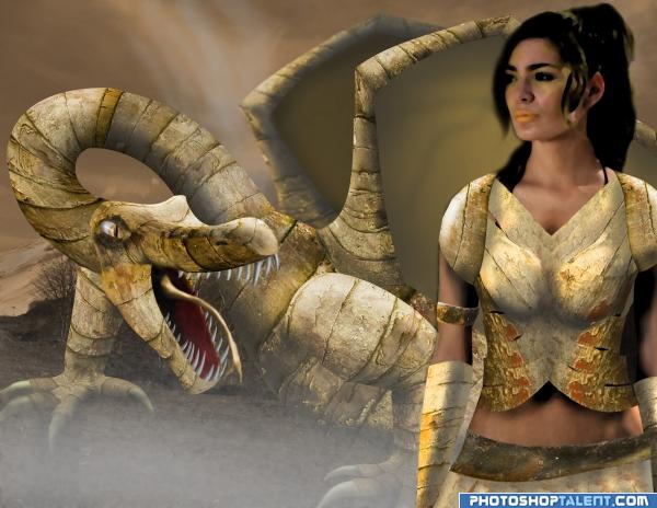
although she doesnt seem to be doing much slaying...couldnt really think of a better name hehe...comments welcome! (5 years and 3943 days ago)
Author.. have the dragon chomping on her head.. come on.. you know you wanna.. LOL.. just kidding.. wonderful work on this.. mad skills
you may load a little bit lower resolution to high resolution... ee... what i said?  good luck!
wow, i love that dragon, but the girl isn't doing much for the image sorry 
tried an effect on the woman to make her blend in a bit more with the rest...thanks for the comments guys!!
Interesting image. Here and there a bit blurry. Up to you, but I'd give the dragon a sharper eye and make some connections from the different parts of the dragon more suitable. If you can remove the blue edges from the woman's hair, would be nice too. I like the mood and colors! Maybe otherwise she's a dragon rider (because of her outfit)? Good luck!
EDIT: eye fixed
waz...i accidently uploaded it without one of the layers on that is near the dragons eyes...hope it looks better now...i didnt notice that edge there before either...ill hop on that asap..
What happened to the inside of the dragon's wings? They don't match the rest of him. The woman's armor or whatever that is should be darker to bring her forward & create depth. SBS needs more work to show how you made the dragon.
Call it Dragon Queen 

work on the woman some 
great job on the dragon; i also like the woman's armor
I also think it would be better if you just have the dragon there  gj
gj
good work! wings need more detailing.
cool mood i like very nice good luck!
Well done.
good...................................................wrk...............
great job like cmyk said sbs should be more detailed like how u made the dragon's teeth and all
I like the woman, but like others have said, she needs a little work. I would focus on the shadows, they seem a bit too dark and her left arm (right for the viewer) is a bit strange. It looks like it's taken you a lot of time and effort to do this. Just a bit more and this image would be even better. Good luck. I'll hold my vote in hopes you're able to make the adjustments. Please don't give up! 
i like dragons 

very creative idea!well done!
congrats
Congrats dude!
Congratulations for 2nd
Congrats!
Congrats on 2nd!
Congratulations!
Howdie stranger!
If you want to rate this picture or participate in this contest, just:
LOGIN HERE or REGISTER FOR FREE
Author, remove reference to your self (entry must be ANON) (beautiful image
thank GolemAura
interesting...
It's just a brush? Source link 3 doesn't work...
Howdie stranger!
If you want to rate this picture or participate in this contest, just:
LOGIN HERE or REGISTER FOR FREE