(5 years and 3177 days ago)

(5 years and 3449 days ago)
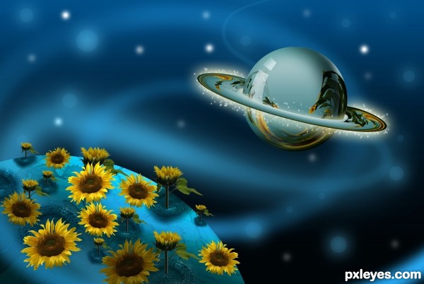
Different and interesting ... has a very comic book feel. I like it.
cool 
nice thinking...edges of the planets are sharp..avoid it
good one
Very nice 
Howdie stranger!
If you want to rate this picture or participate in this contest, just:
LOGIN HERE or REGISTER FOR FREE

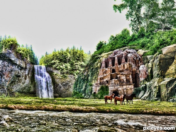
i tried my best to give a manipulated picture with showing the source image in the picture...its my own imagination....and pls support my effort friends..no matter positive or negative the comment, its really going to help me to improve...thanks. (5 years and 3522 days ago)
It's a cool idea to replace the desert with this scenery, the colour of the rocks fits, it's well done but I think that this waterfall needs some improvement- the water is literally disappearing into the ground!  Just a suggestion!
nice one author!
Interesting. Agree with beocity that the waterfall should cascade into some sort of pool. The sky looks like it's missing.
I like the colors of this but the waterfall does seem to vanish ;P
It's really a beautiful image; my suggestion is that you could make a hole where the waterfall hits; this would explain why it vanishes in the ground... or add a lake. And don't forget to upload in hi res, to show the details. GL!... 
very nice...gl
Am I the only one who notices the horizon is crooked?
Am I the only one who notices the horizon is crooked?
Howdie stranger!
If you want to rate this picture or participate in this contest, just:
LOGIN HERE or REGISTER FOR FREE

My favorite thing about this website isn't about winning contests or money, but about seeing what other people can create from another persons picture. And then get inspired by it and then create using your own imagination. (5 years and 3854 days ago)
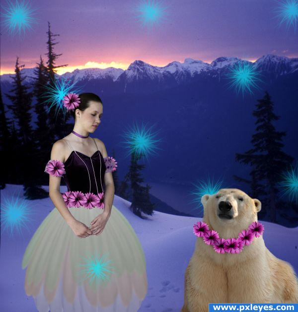
They're floating above the snow...
good point, i didnt mean to do that even though technically a dancer is supposed to "float" across the stage  . I fixed it the easy way, for now. Now I would love to figure out to to not make them float.
cute
use the transform warp to warp the flowrs so they actualy fold a bit with the neck of the bear now they look lasted on 
Howdie stranger!
If you want to rate this picture or participate in this contest, just:
LOGIN HERE or REGISTER FOR FREE
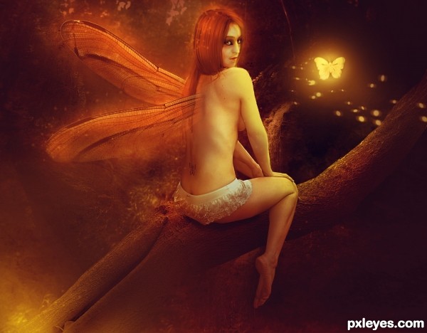
Nice, but 50% orange at best.
Looks very good, i'm not sure about the wing's root in her back tho, needs a better blending, good luck.
if making the wings' root is too much fuss, suggest, you duplicate the wings and do a motion blur or something (of course, you need to vary the opacity and fade certain parts of the motion to make it more realistic)

make butterfly at an angle, now too flat, like stick-on (or a side view of it)
the eyes of the "fairy" is not appealing to me, no eye-shadow perhaps
otherwise.... nice
High res would have been nice ... but without it is hard to say, I do think that the wings need work where they enter her back (that is always a hard part on Fairies ) For the hi res upload, you don't have to make it a huge High res ... anything helps, even 900 X 600 which is not that big and it shows us an uncompressed version. Nice concept though.
Howdie stranger!
If you want to rate this picture or participate in this contest, just:
LOGIN HERE or REGISTER FOR FREE